
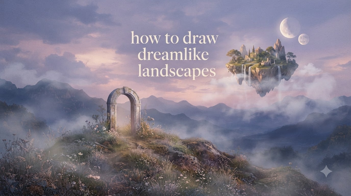
Learning how to draw dreamlike landscapes is one of the most rewarding ways to grow as an artist, because the genre quietly trains every skill you actually need — composition, atmospheric perspective, value control, and color harmony. A dreamlike landscape is a drawing that pairs a believable foreground-to-background spatial structure with one or two impossible, surreal elements — a floating island, a second moon, an upside-down waterfall — and then unifies the whole scene under a soft, ethereal palette that feels more like memory than observation. I’ve spent years sketching dreamscapes in pencil and mixed media, and the same handful of habits keeps producing the dreamlike quality every time. In this guide I’ll walk you through those habits, in order, from supplies to final polish, and I’ll include the exact pencil pressure, palette, and motif choices I’ve found most useful.
This tutorial is for beginners and intermediate artists. You don’t need fancy gear. You only need a graphite set, a blending tool, decent paper, and a willingness to keep your edges soft.
Table of Contents
What Makes a Landscape Look Dreamlike
A landscape looks dreamlike when realistic perspective meets one impossible element, and the whole scene shares a single soft mood. That mood comes from four ingredients working together: warm or cool atmospheric haze, a limited unified palette, softened edges between forms, and at least one surreal motif that the viewer can’t quite place — a floating island, a second moon rising on the same horizon, an oversized key balanced on a hill.
Dreamlike art is closer to a half-remembered dream than a photograph. The world still obeys gravity and light, but something is gently off. That’s the tension you want to preserve.
The related term surreal landscape overlaps heavily with dreamlike art, but surrealism tends to push harder on psychological disturbance — melting clocks, isolated eyes, dead trees in empty plazas. Dreamlike landscapes lean gentler. They borrow magical realism’s restraint: a quiet field with a slow waterfall floating off into a soft pink sky is dreamlike; a melting clock draped over a branch is surreal.
The Four Building Blocks of a Dreamlike Scene
- Atmospheric perspective — foreground objects stay sharp and dark; distant objects fade into soft, lighter values.
- A unified palette — three to five colors that all share a temperature (cool dusk, warm dawn, dusty lavender) so the eye reads the scene as one place.
- Soft edges — almost no hard contour lines; forms bleed into one another with blending stump or finger.
- One impossible motif — floating, repeated, or scaled oddly. One motif is plenty; two starts to feel like a joke.
Supplies You’ll Need to Draw a Dreamlike Scene
You can draw a complete dreamlike landscape in nothing but graphite. Pencil is in fact the recommended medium because soft graphite blends into haze almost by itself. Here is the core kit I use on most of my own dreamscapes.
- Graphite pencils: HB for construction lines, 2B for mid-tones, 4B for shadow, and 6B or 8B for the deepest darks.
- Kneaded eraser: lift highlights softly (clouds, moon glow, mist) by dabbing rather than rubbing.
- Blending stumps or tortillons: two sizes — a fine tip for tree branches, a chunky tip for fog and sky.
- Smooth paper: a 70–100 lb (160–200 gsm) bristol or hot-press watercolor paper. Heavy tooth gives texture, but smooth paper gives mist.
- Drawing board and tape: holds the paper flat so wide blending strokes don’t ripple it.
- Soft brush or chamois cloth: for sweeping the largest sky-to-horizon gradients.
- Optional colored pencil or watercolor: if you want color, dusty watercolor washes over graphite work beautifully. Prismacolor or Faber-Castell polychromos are the colored pencils most beginners gravitate to.
Tip from my own practice: keep three pencils within reach and the rest across the room. Limiting choices stops you from over-rendering.
Surrealist Masters Worth Studying
Spending ten minutes looking at the right artist saves hours of guessing. These four painters invented most of the visual vocabulary you’ll lean on.
Salvador Dalí teaches melting form, impossible shadow, and how to anchor a wild image with precise perspective. Study his horizon lines — they’re always meticulously drawn.
René Magritte teaches scale games (an oversized apple in a normal sky) and the power of a flat, even light. Borrow his calm color blocks.
Giorgio de Chirico teaches long, shadowed plazas and silent architecture. His work is the cleanest reference for how to make a real-looking space feel unsettled.
Rob Gonsalves — the modern magician — is the closest visual cousin to what most people picture when they say dreamscape. His repeated and inverted architecture is a masterclass in impossible geometry done with believable perspective. If you copy one artist first, copy him.
I keep a small folder of these references on my phone and flip through it before every new sketch. Patterns start to show up in your own linework within a month.
Steps to Draw a Dreamlike Landscape
This is the core how-to. Work through these six steps in order. Don’t jump ahead — each step sets up the next.
Step 1: Gather a Mood, Not Just a Reference
Pick a single feeling: twilight calm, fog at dawn, drifting silence. Save two or three reference photos that share that feeling, even if the subjects are unrelated. A mountain photo, a marsh photo, and a single cloud can become one scene.
Step 2: Sketch Three Thumbnail Compositions
In a corner of your paper, draw three tiny rectangles (about 2 by 3 inches each). In each, block in just the largest shapes — land mass, sky mass, a single focal motif. Pick the one that feels calmest and quietest. That thumbnail is your real composition.
Step 3: Lay Down a Light Pencil Underdrawing
With your HB pencil held loosely, sketch the horizon, the main landform, and the silhouette of your surreal motif. Use very light pressure — about 10 percent of your maximum grip. Lines that faint are easy to erase once the dreamy layering goes on top.
Step 4: Build Atmospheric Perspective With Value
Darkest darks sit in the foreground. Mids sit in the midground. The background is mostly light value with soft edges. This single rule is what separates dreamlike from ordinary. Press harder on the foreground trees, softer on the distant hills, and don’t draw hard lines on anything far away.
Step 5: Add One Surreal Motif
Drop in your impossible element — a floating island hanging by a thin chain of mist, a second moon above the first, a doorway that opens onto another sky. Render it with the same value logic as the rest of the scene, so it looks like it belongs there.
Step 6: Soften, Lift, and Unify
Run a clean blending stump along every major edge. Lift a few cloud-light highlights with your kneaded eraser. Squint at the whole drawing. Anywhere the eye snags on a hard line, soften it. This is where the dreamlike quality arrives.
Building Atmospheric Perspective and Mood
Atmospheric perspective is the single most important skill in this whole genre. It’s the reason distant mountains turn pale blue, and it’s the reason your dreamlike landscape will feel deep instead of flat.
The mechanism is simple: more air between the viewer and an object means more scattered light bouncing off dust, water vapor, and air itself. That haze lightens the value (pushes it toward the sky color) and cools it slightly. So distant objects: lighter value, cooler hue, softer edges.
Pencil Pressure Reference
- Hard lines, foreground detail: 60–80 percent pressure, sharp 2B or HB.
- Midground shapes: 30–40 percent pressure, 2B, slightly softened.
- Distant hills: 15–25 percent pressure, HB only, no edges.
- Sky and horizon: 5–10 percent pressure, sharpened HB, blended horizontally.
Test by holding your finished drawing at arm’s length. If the foreground reads dark and the background reads light without you having to study it, your atmospheric perspective is working.
Fog is atmospheric perspective on steroids. To draw convincing dreamlike fog, lay a wide horizontal grade of mid-light value across the whole scene, then lift out shapes with your kneaded eraser — the brightest trees in front, mid-tone hills behind them, almost nothing in the far distance. Fog loves horizontals, so keep all your strokes moving sideways.
Choosing a Color Palette for Dreamlike Scenes
If you add color, treat it as a wash on top of a finished graphite drawing — not as the main event. Two to four colors max, and all sharing one temperature, is the rule of thumb that makes color feel like atmosphere rather than paint-by-numbers.
Three reliable palettes to start with:
- Twilight calm: dusty periwinkle blue, pale lavender, warm peach, soft cream. Use peach only in the light direction.
- Misty dawn: cool grey-green, ivory, blush pink, hint of ochre in the foreground.
- Quiet dusk: indigo, plum, mauve, brushed gold rim light. Save gold for the smallest accents — moon edge, a single leaf.
The simplest way to add color to a graphite drawing is to lay down a very thin watercolor wash (one part paint to eight parts water) over the dry pencil. Graphite resists watercolor in a controlled way, so your values stay visible under the tint. Two thin layers beat one thick one — let each dry fully before adding the next.
Keep saturation low. Saturated color reads as cartoonish; desaturated color reads as remembered. Dreamlike scenes are remembered, not seen.
Adding Surreal Elements: Floating Islands, Double Moons, Impossible Architecture
The surreal motif is what tips a beautiful landscape into a dreamlike one. Limit yourself to one motif per drawing; more than one turns the scene into a Magritte pastiche.
Floating Islands
A floating island works because the eye accepts a familiar form in an unfamiliar position. Sketch the island in the same perspective as the foreground hills below it — same vanishing point, same scale logic. Then hang a soft vertical mist or a delicate root system beneath it so the eye reads it as anchored to something, even if that anchor is just vapor. The most common mistake is making floating islands too symmetrical. Real rocks are awkward. Make yours awkward too.
Double Moons
Two moons read as dreamlike because the brain registers them as wrong but cannot immediately say why. Place the larger moon on the horizon line and the smaller moon higher and slightly offset. Use the same value range for both — same light source, same edge softness — so they look like a pair rather than a moon and a sticker.
Impossible Architecture
A door standing alone in a meadow, a staircase climbing into empty sky, a window frame floating above a lake. Rob Gonsalves’s trick is perspective reuse: have an impossible object share the same one- or two-point perspective as a real building nearby. The eye accepts the impossible because the geometry is consistent.
Twisted Perspective
Escher-style interiors folding into landscapes work too, but only when one or two folds carry the whole image. Confine the twist to a single architectural element (a stairwell, a corridor) and let the rest of the landscape stay conventional. The contrast is what sells the dream.
For each motif, render it with the same atmospheric rules as the rest of the scene: foreground-sharp on a near motif, soft-edged and lighter on a far motif.
Common Mistakes and How to Fix Them
These are the mistakes I made most often when I started, and the ones I see again and again in feedback threads on r/learnart and r/drawing.
Flat Foreground
The #1 complaint in beginner threads. The fix is value contrast, not detail. Push the immediate foreground to the darkest values on the page (4B to 6B) and add one or two crisp edges — a single leaf, a rock corner, a grass blade. A flat foreground is usually a mid-tone foreground. Make it dark and add one hard edge. Done.
Harsh Edges
Hard pencil lines belong only on the closest foreground object. Anything past the midground should fade. Run a clean blending stump along every edge you suspect, then check by squinting.
Muddy Mid-tones
Mud happens when you layer graphite over an already-saturated area. If a region is turning grey-brown instead of staying luminous, lift it with a kneaded eraser and start that area lighter. It’s faster than pushing through.
Overcrowded Scene
More elements do not mean more dreamlike. Aim for one focal motif, one supporting landform, and a quiet sky. If you can’t immediately name your focal motif, your scene is one element too rich.
Compositional Imbalance
Dreamlike scenes read calmer when the focal motif sits roughly at a rule-of-thirds intersection rather than dead center. Shift your focal point left or right a third of the way across the page.
5-Minute Dreamlike Landscape Drills
The fastest way to internalize these habits is five-minute daily sketches. None of these drills are meant to be finished pieces — they are muscle-memory builders.
- Drill 1 — Atmospheric gradient: draw a single rectangle and fill it with a horizontal gradient from dark to light. Add one silhouetted tree. Time yourself. Repeat five days in a row.
- Drill 2 — Floating island speed sketches: draw five tiny floating islands, each five minutes. Vary the silhouette each time. Don’t redraw any of them.
- Drill 3 — One-sky palettes: pick one of the three palettes above and draw only skies for five minutes each — clouds, gradient, single moon. No land.
- Drill 4 — Motif collage: cut three shapes from magazine paper (an island, a moon, an arch). Arrange them on a piece of paper, photograph the result, and redraw what you see in 10 minutes.
After a week of these drills, your longer drawings will look dreamlike without effort. After a month, they’ll look like you.
Frequently Asked Questions
What makes a landscape look dreamlike?
A landscape looks dreamlike when believable perspective is combined with one or two surreal motifs — such as floating islands, double moons, or impossible architecture — and the entire scene is unified with soft edges and a cohesive ethereal palette that evokes memory rather than observation.
What is the difference between surreal and dreamlike?
Surreal art tends to disturb the viewer using psychological imagery, like melting clocks or empty plazas, while dreamlike landscapes borrow magical realism’s restraint. They feel like a half-remembered dream: real enough to trust, soft enough to unsettle.
Which artists are known for dreamlike landscapes?
Rob Gonsalves, Salvador Dali, Rene Magritte, and Giorgio de Chirico are the most studied. Rob Gonsalves is the closest visual cousin to modern dreamscape art. Dali teaches melting forms and impossible shadow, Magritte teaches scale games, and de Chirico teaches long shadowed plazas.
What colors are used in dreamlike art?
Dreamlike art uses limited, desaturated palettes of two to four colors that share a single temperature. Twilight calm uses dusty periwinkle, lavender, peach, and cream. Misty dawn uses grey-green, ivory, blush pink, and ochre. Quiet dusk uses indigo, plum, mauve, and brushed gold accents.
Can you draw dreamlike landscapes in pencil?
Yes. Pencil is in fact the recommended medium for dreamlike landscapes because soft graphite blends into haze almost by itself. A complete dreamlike scene can be drawn using only HB, 2B, 4B, and 6B pencils plus a kneaded eraser and blending stumps, with optional color added as a thin watercolor wash.
How do beginners start drawing surreal landscapes?
Begin by gathering two or three reference photos that share one mood, sketching three small thumbnail compositions, then building a scene with a foreground-to-background value gradient. Add one impossible motif, soften every edge with a blending stump, and unify the scene under a limited palette.
Final Thoughts
How to draw dreamlike landscapes comes down to three quiet habits: keep your foreground dark and your background light, soften almost every edge, and place one impossible element in a believable world. Everything else — palette choice, surreal motif selection, pencil pressure — is in service of those three habits.
Pick one palette from this guide, copy one Rob Gonsalves painting by hand this week, and run the four 5-minute drills over the next month. By the time you finish that month, the dreamlike quality will be showing up in your other drawings too — that’s how quietly these skills transfer. If you want a slow practice companion, keep one sketchbook reserved for dreamscapes only and refill it monthly.
The genre rewards patience more than talent. Every scene is just a well-drawn landscape with a single quiet surprise, and the surprise only needs to be quiet enough to notice.