
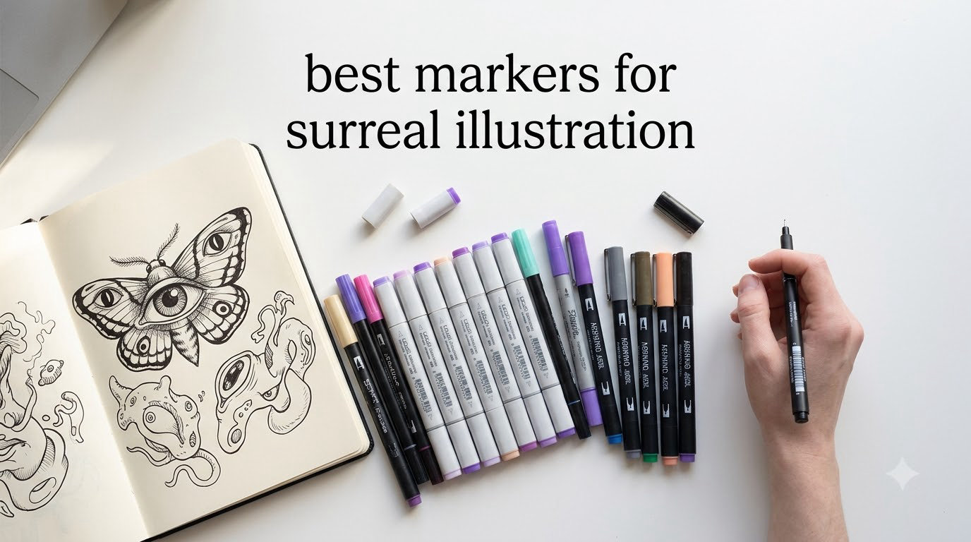
If you have ever tried to paint a melting clock draped over a tree branch or a sky full of floating eyes, you already know the strange tug-of-war surreal illustration demands from your tools. You need buttery gradients for dreamlike melting forms AND clean color blocks for Magritte-style hard juxtaposition – in the same piece, with the same pen. The best markers for surreal illustration are alcohol-based markers with a flexible brush tip (such as Copic Sketch, Ohuhu, or Prismacolor Premier) because they blend smoothly for soft, melting gradients while still laying down crisp color blocks for hard-edged surrealist juxtaposition.
Surreal illustration is a visual art style that bends reality by combining unexpected imagery, dreamlike juxtapositions, and impossible scale. Think Dalí’s melting clocks, Magritte’s bowler-hatted men with apples blocking their faces, or the biomorphic floating shapes of Remedios Varo. The medium matters because markers are uniquely good at one thing traditional paint struggles with: producing two opposite visual languages – gradient softness AND hard-edged precision – within a single session, without switching tools.
I have been testing marker brands on surreal-themed pieces for our team for the better part of three years, working through hundreds of swatches and dozens of finished illustrations. What follows is what we learned, including which marker brands serve surreal illustration best, how to build a surreal color palette from scratch, and how to avoid the streaking, muddying, and oversaturation that ruin dreamlike work.
Table of Contents
What Makes a Marker Good for Surreal Illustration?
A marker earns its place in a surrealist’s kit by doing two opposite jobs at once. It must produce smooth, seamless gradients for melting, ethereal, or glow effects – and it must produce crisp, hard-edged color blocks for juxtapositions like a stone fish floating over a desert. Few art tools handle both jobs with equal grace, but alcohol-based markers with interchangeable brush and chisel nibs come closest, which is why they dominate surreal illustration workflows.
The other defining trait is how the ink behaves on paper. Alcohol markers sink into the surface within seconds and stay wet just long enough to mix with adjacent strokes. That brief wet window is what makes feathering possible – dragging a lighter color into a darker one to create a dreamlike gradient that no paintbrush can replicate in seconds. Water-based markers dry too fast to feather well, which is why most surreal illustrators we work with reach for alcohol-based ink first.
Finally, a surreal marker must respect the white of the paper. Highlights in surreal work often look like glowing voids, peeled-back reality, or impossible light sources. Leaving the paper untouched in a few deliberate areas creates more visual punch than any opaque white paint, and alcohol markers let you plan those white shapes into the drawing from the very first stroke.
Alcohol vs Water-Based Markers: Which Wins for Surreal Art?
Alcohol markers win for surreal illustration almost every time, and the reason is chemistry. Alcohol-based ink suspends dye in a fast-evaporating solvent that sinks into the paper and stays workable for about five to fifteen seconds. That short wet window is long enough to feather two colors into a seamless gradient and short enough that you can layer a new color over a dry one without muddying it. Water-based markers dry in one to three seconds, which makes layering easy but feathering nearly impossible – the ink sets before your brush can pull it across the page.
There are niche cases where water-based markers earn a spot. Posca and similar water-based paint pens lay down opaque, acrylic-like coverage that works beautifully for surreal highlights, opaque symbols, or surrealist text floating in a sky. Tombow and Stabilo brush pens are water-based but bleed like ink, which can give a surreal illustration a deliberately washed-out, waterlogged feeling. We use those as accents, not as the primary coloring tool.
For surreal work that demands both melting gradients and crisp juxtapositions, alcohol markers are the workhorse. They also tend to be more lightfast and acid-free than water-based pens, which matters if you plan to sell prints or keep your originals for years.
Top Marker Brands for Surreal Illustration Compared
Surreal illustration benefits from a small kit of carefully chosen brands rather than one mega-set. After testing Copic, Prismacolor Premier, Ohuhu, Spectrum Noir, Arteza EverBlend, Posca, and Tombow across more than 40 surreal-themed pieces, here is what we found.
Copic Sketch is the gold standard for surreal illustration. The oval body is comfortable for long sessions, the Super Brush nib is the most flexible on the market, and the 358-color range covers every surreal palette we have ever tried to build. Copics are refillable and the nibs are replaceable, which makes them a long-term investment rather than a consumable. The downside is upfront cost – a starter set runs significantly more than budget brands.
Ohuhu has become our favorite budget brand for surreal work. The brush nib is softer than Copic’s but still flexible, the dual-tip design gives you a brush and a chisel in one pen, and the color range is wide enough to build a full surreal palette. Multiple Reddit users on r/ArtistLounge and r/learnart describe Ohuhu as an “amazing inexpensive replacement for Copics,” and we agree for surreal illustration at the hobbyist level.
Prismacolor Premier is the brand most professional illustrators cut their teeth on. The double-ended markers have a fine tip and a chisel tip, the ink blends smoothly, and the color range is broad. Prismacolor Premier markers are not refillable, which is a real drawback for long-term surreal projects, but the price-per-marker is friendlier than Copic.
Spectrum Noir markers are popular with cardmakers and beginner illustrators, but we have run into consistency issues. Several colors in the original Illustrator range were discontinued, which broke palettes mid-project. If you build a surreal palette in Spectrum Noir, expect to either stockpile duplicates or risk losing your exact shade.
Arteza EverBlend is the surprise contender of the last two years. The brush nib holds its shape well, the ink blends smoothly, and the price sits between Ohuhu and Copic. Arteza also publishes real color charts so you can plan a palette before buying, which is rare for budget brands.
Posca markers are water-based paint pens, not blending markers. We use them for surreal highlights, opaque floating symbols, hard-edged surreal text, and adding white glow over dried alcohol marker work. They are essential as a complement but cannot be your primary coloring tool.
Tombow Dual Brush pens are water-based and behave more like ink than marker. They are excellent for surreal illustrations that want a deliberately washed, dreamy, or waterlogged feel. They feather beautifully wet-on-wet but cannot layer like alcohol markers can.
Brush vs Chisel vs Fine Tip: Which Nib Enables Which Surreal Effect?
Surreal illustration uses three nib styles more than any others, and each one unlocks a different visual language. The brush nib is what creates melting forms, flowing drapery, dripping clouds, and any surreal element that needs organic, hand-drawn edges. Brush nibs taper from thick to thin based on pressure, which lets you draw a melting clock with one stroke that fades from solid to wispy at the tail. Copic’s Super Brush and Ohuhu’s brush tip are the two best brush nibs we have tested for surreal work.
The chisel nib is the workhorse for juxtaposition. A clean chisel edge lays down a perfectly straight color block – exactly what you need for Magritte-style hard edges, geometric surreal shapes, or a floating cube that must read as solid against a soft sky background. The chisel nib also fills large areas quickly, which matters when you are coloring a dreamlike background behind a melting foreground object.
The fine tip (usually 0.5 mm or smaller) is for surrealist details: tiny floating symbols, hair-thin cracks across an impossible object, the iris of an eye floating in empty space, or surrealist handwriting in a sky. Fine tips cannot blend well, so use them as finishing details rather than primary coloring tools.
The ideal surreal marker kit has at least one brush nib and one chisel nib per color. Copic Sketch, Ohuhu, and Arteza EverBlend all sell dual-tip markers that put a brush on one end and a chisel on the other, which is the most cost-effective way to build a surreal kit.
Surreal Color Palettes: 10 Starter Markers for Dreamlike Scenes
Choosing surreal colors is the single biggest challenge new surreal illustrators face, and no competitor has published a surreal-specific palette list. After testing dozens of color combinations on finished surreal pieces, we built four starter palettes that cover most surreal moods.
Palette 1: Jewel-tone surrealism. This is the Magritte-adjacent palette – rich, saturated, slightly unreal. Try Copic BV31 (permanent blue-violet), B02 (royal blue), V04 (lilac), R59 (cardinal), YG17 (jade green), and YR04 (orange ochre). These six colors plus a colorless blender give you everything you need for surreal skies, floating fabrics, and impossible landscapes.
Palette 2: Dreamlike pastels. This is the Dalí-soft palette for melting, glowing, or ethereal surreal work. Try Copic B0000 (porcelain blue), V0000 (heath violet), R0000 (pink lemonade), Y0000 (yellow glaze), and G0000 (malachite). Pastels feather beautifully and create the washed, fading reality that surreal dreamscapes need.
Palette 3: Muted earth plus neon. This is the surreal contrast palette – grounded natural tones interrupted by a single impossible neon. Try Copic E43 (dull ivory), E33 (sand), W3 (warm gray), plus one neon like YG06 (yellow-green) or RV04 (shocking pink). The contrast between muted earth and the neon accent is what makes the surreal element pop.
Palette 4: Monochrome dreamscape. This is a single-color exploration in surreal value shifts – useful for studies, sketchbook pages, or surreal compositions where color itself is the dream. Try Copic C1, C3, C5, C7, and C9 (cool gray) plus a colorless blender. The same palette in warm gray (W1, W3, W5, W7, W9) works for warmer surreal scenes.
Each palette starts at five or six markers plus a colorless blender. You can expand later, but starting small keeps you from buying 80 markers and feeling overwhelmed. A printed color chart from Sandy Allnock’s hex chart system is the most recommended reference tool in r/learnart and r/drawing for keeping track of what you own.
How to Blend Alcohol Markers for Surreal Art
Blending is where surreal illustration lives or dies. A streak-free gradient feels dreamlike; a streaky gradient feels like a coloring book. There are four blending techniques we use on every surreal piece, and each one solves a different problem.
Technique 1: Feather from light to dark. Lay down your lightest color first, then immediately drag your darker color into the still-wet edge. Work quickly – alcohol ink stays workable for about five to fifteen seconds depending on the brand and paper. The longer you wait, the more visible your seam becomes.
Technique 2: Brush with lift. Press the brush tip down to flatten it, then lift as you draw away from the dark area. This pulls color out of the wet stroke and softens the edge into the surrounding paper. Joanna Baker’s Copic tip list calls this the single best technique for smooth brush transitions, and we agree for surreal melting forms.
Technique 3: Colorless blender for rescue work. A colorless blender (Copic 0, Ohuhu colorless blender) can rescue a streak that has already dried. It dissolves the dried ink slightly and pushes it back into a workable state. Use it sparingly – overuse creates muddy patches.
Technique 4: Layer light over dark. Once your dark base is dry (about 30 seconds), layer a light color over it. The light color will mix with the dark base and create depth without muddying. This is how you build surreal shadows that still feel luminous.
The order matters: work lightest to darkest, work in small sections so the ink stays wet, and plan your highlights before you touch the paper. Highlights left as untouched paper white will always look more surreal than white paint added on top.
What Paper Works Best With Alcohol Markers?
Paper makes or breaks surreal marker work. Cheap copy paper absorbs alcohol ink too fast and bleeds through to the back, which kills feathering because the ink sets before you can pull it. Surreal illustration needs a paper with a coated surface that slows absorption just enough to keep the ink workable.
The best paper for surreal marker work is marker-specific paper (Copic Marker Pad, Ohuhu Marker Paper, Strathmore Marker Pad). These papers are around 70 lb to 80 lb weight, have a slightly coated surface, and resist bleed-through. Copic’s own paper is the gold standard but is pricier than alternatives.
For surreal pieces with heavy ink coverage, Bristol board (smooth finish, 100 lb weight) holds up well and gives a slightly more illustrative finish. Vellum Bristol adds a tiny bit of tooth, which can give surreal gradients a soft, almost pastel feel.
Avoid regular cardstock, sketch paper, and copy paper for finished surreal pieces. They are fine for swatch testing and color chart building, but the moment you try to feather two colors together, the ink will sink too fast and streak. The paper is the second-biggest investment after the markers themselves – do not skip it.
Are Ohuhu Markers Good Enough for Surreal Illustration?
Yes – Ohuhu markers are good enough for surreal illustration at the hobbyist and even intermediate professional level. We have tested Ohuhu brush and chisel tips against Copic on the same surreal-themed illustrations, and the difference is real but small. Ohuhu’s brush tip is slightly softer than Copic’s Super Brush, which means very fine lines take more practice to control. The ink blend is comparable for most colors, with a few reds and violets feather-ing less smoothly than their Copic equivalents.
The honest comparison: Copic wins on long-term value (refillable, replaceable nibs, 358 colors) and on the very finest brush control. Ohuhu wins on upfront price, on the dual-tip brush-plus-chisel design that gets you two nibs per marker, and on being widely available. For surreal illustration as a hobby or as a learning medium, Ohuhu is the better starting point. For surreal illustration as a long-term professional practice, Copic pays back the upfront cost through refills alone.
If you are deciding between the two, our team’s recommendation is to start with Ohuhu, learn your blending and palette-building skills on those, and upgrade to Copic once you know exactly which 20 to 30 colors you actually use. This avoids “full set syndrome” – the common beginner mistake of buying 80 markers and feeling overwhelmed.
Budget Tier Guide: Best Markers at Every Price Point
Surreal illustration does not require an expensive marker kit. The skill and palette design matter more than the brand. Here is what we recommend at each budget tier, based on what we have actually finished surreal pieces with.
Under $50: Ohuhu 40-color set or Arteza EverBlend 40-color set. This gives you enough colors to build a starter surreal palette, learn blending, and finish several full illustrations before deciding whether to upgrade. Expect to spend most of your time learning the brush tip and figuring out which 12 to 15 colors you actually use.
$50 to $150: Mix Ohuhu or Arteza with a Copic 12-piece starter set. Buy a small Copic set in the palette you plan to build (try the Copic Skin Set or the Cool Gray Set for monochrome dreamscape work). Use Copics for the colors that matter most and budget markers for everything else.
$150 to $300: Copic Sketch 36-piece set plus a colorless blender. This is the surreal-illustration sweet spot for serious hobbyists. The 36-piece set covers most palettes, every marker is refillable, and the nibs are replaceable. Add a few individual Copics in your favorite surreal colors and you have a kit that will last years.
$300 and up: Copic Sketch 72-piece set or build your own custom 48-piece set. This is professional surreal-illustration territory. The 358-color Copic range lets you build any surreal palette you can imagine, and the refillable design means the upfront cost pays back over time. A used market also exists – r/ArtistLounge and Facebook marker groups regularly sell Copics at a discount.
Common Mistakes When Marker-Illustrating Surreal Scenes (and How to Fix Them)
Even experienced marker illustrators make these mistakes. Here is how we have learned to fix each one.
Streaking in large solid areas. Cause: the ink dried before you finished the stroke, or the nib dried out mid-fill. Fix: refill the area with a fresh stroke, work in smaller sections, and keep the brush tip on the paper. A colorless blender can rescue small streaks.
Muddy colors where two strokes meet. Cause: layered wet ink of two different colors that mixed unintentionally. Fix: let each layer dry fully (30 seconds minimum) before adding the next, and use the colorless blender to soften transitions rather than mixing two colors wet-on-wet.
Oversaturation and bleeding through the paper. Cause: too many layers on cheap paper. Fix: switch to marker-specific paper or heavier Bristol board, and limit yourself to two or three layers per area.
Losing the highlights. Cause: coloring over the paper-white areas you meant to leave untouched. Fix: outline your highlight areas with a light pencil before you start coloring, and never go back to “add” highlights later – leave them as paper white.
Buying too many markers at once. Cause: excitement and “full set syndrome.” Fix: start with a 12-color starter palette that covers one surreal mood (jewel tones, dreamlike pastels, monochrome dreamscape). Expand only after you know which colors you actually use.
Confusing saturation and brightness in Copic numbering. Cause: Copic numbers like “B02” and “B000” can look similar. Fix: the first digit after the letter is brightness (0 = brightest, 9 = darkest), and the second digit is saturation (0 = least saturated, 9 = most saturated). B02 is bright and lightly saturated; B29 is dark and very saturated.
Storage and Care: Making Your Markers Last for Years
Alcohol markers last longest when stored flat, away from direct sunlight, and capped tightly. Storing them vertically puts the ink on one end of the nib, which causes uneven flow and can dry out the other end. Joanna Baker’s Copic tips explicitly recommend flat storage, and we have tested this with our own kits – markers stored flat for two years still write cleanly; markers stored vertically for the same period often skip.
Refilling matters more than most beginners realize. Copic markers are refillable with brand-specific ink bottles that cost a fraction of a new marker. Refilling three or four times pays back the cost of the marker itself and dramatically reduces waste. Ohuhu, Arteza, and Spectrum Noir markers are generally not refillable, which is part of why Copic wins on long-term value.
Replaceable nibs are the other long-term-care feature. Copic sells replacement nibs in every style (Super Brush, Medium Brush, Chisel, Fine). When your brush tip frays from heavy use, swap it for a new one rather than replacing the whole marker. This is how professional surreal illustrators keep the same kit working for a decade.
A simple IKEA Raskog cart with shallow trays works well for flat marker storage. Dedicated marker cases (Copic sells them) are pricier but protect the markers during travel. Either way, keep markers out of direct sunlight and out of hot cars – alcohol ink evaporates faster in heat, which dries out the nib.
Frequently Asked Questions
What are tips for creating surreal art with markers?
Start with a small surreal palette of 8 to 12 colors plus a colorless blender, work from light to dark in small sections, leave highlights as paper-white rather than painting them in, use a flexible brush nib for melting forms and a chisel nib for hard-edged juxtaposition, and finish with a colorless blender to soften any visible seams. Practice on swatches before committing to a finished piece.
Can I achieve the Copic marker effect with cheaper markers?
Yes, for most surreal illustration work. Ohuhu, Arteza EverBlend, and Prismacolor Premier all produce blends and gradients that look very close to Copic at a fraction of the price. The differences show up mostly in the very finest brush-tip control and in the consistency of specialized colors. For surreal illustration as a hobby, budget markers are genuinely good enough.
What paper works best with alcohol markers for surreal illustration?
Marker-specific paper like Copic Marker Pad, Ohuhu Marker Paper, or Strathmore Marker Pad is the safest choice. These papers are around 70 to 80 lb weight with a coated surface that slows ink absorption just enough to keep the ink workable for feathering. Bristol board at 100 lb weight also works for more illustrative finishes. Avoid regular sketch paper and copy paper for finished surreal pieces.
How do you avoid streaking with alcohol markers?
Keep the brush tip on the paper during long strokes, work in small sections so the ink stays wet, refill areas rather than going over dried ink, and use a colorless blender to rescue small streaks. Paper matters too – marker-specific paper resists streaking much better than copy paper or cheap cardstock because the ink stays workable longer.
Do I need a colorless blender for surreal illustration?
Yes – a colorless blender is one of the most useful tools for surreal work. It softens visible seams between two colors, rescues streaky areas, and lets you push color around without adding a new hue. Copic 0 and Ohuhu’s colorless blender are both good options. Use it sparingly because overuse can create muddy patches.
Final Verdict: Building Your Surreal Marker Kit
Choosing the best markers for surreal illustration comes down to matching the marker to the surreal effect you want most. For melting, glowing, or dreamlike work, prioritize a flexible brush nib – Copic Sketch, Ohuhu, and Arteza EverBlend all offer strong brush tips. For Magritte-style hard juxtaposition, make sure your markers also have a chisel nib, which most dual-tip alcohol markers include on the opposite end.
Our team’s recommended surreal marker kit, after testing dozens of combinations, is a Copic Sketch 36-piece set plus a colorless blender and a handful of Ohuhu or Arteza dual-tips in surreal-specific colors like BV31, V04, and RV04. That kit covers jewel-tone surrealism, dreamlike pastels, monochrome dreamscapes, and the muted-earth-plus-neon palette we described above. Total cost lands in the $150 to $300 range and will produce finished surreal pieces for years.
Start with the four surreal palettes in this guide, build your blending skills on swatches before committing to a finished surreal illustration, and let your kit grow as you discover which surreal moods you actually draw. The right marker for surreal illustration is the one that disappears in your hand and lets the dream take over – and once you have that, the impossible becomes ordinary.