
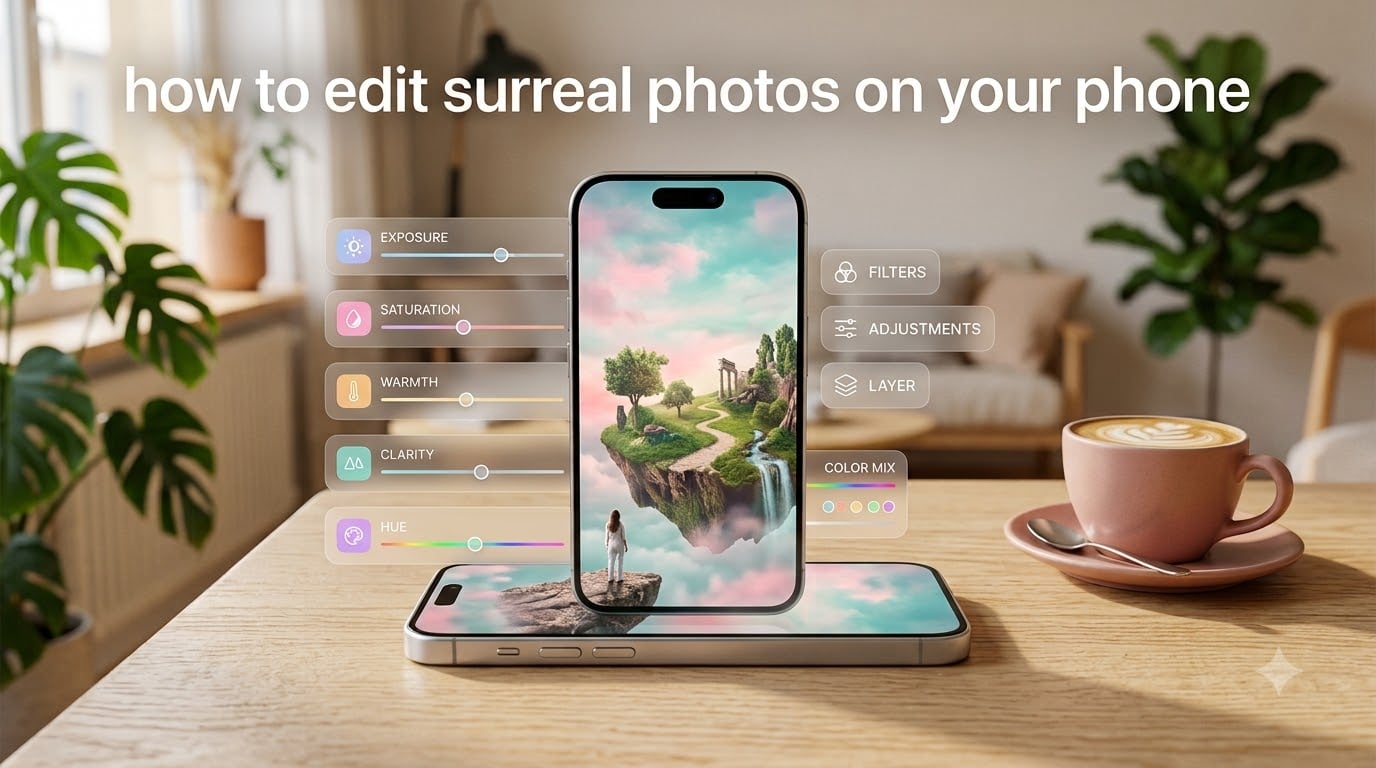
If you’ve ever stared at a dreamy, otherworldly photo on Instagram and wondered how on earth someone created it on a phone — I get it. For months I assumed surreal edits required a desktop, a Wacom tablet, and at least five years of Photoshop training. Then I started experimenting on my own iPhone, dragged my partner’s Samsung into the mix, and broke every “you need a DSLR” rule in the book. Within a few weeks I was producing floating islands, double-exposure self-portraits, and color-graded dreamscapes that genuinely surprised me.
That whole journey — the apps, the slider values, the mistakes, the breakthrough edits — is what I’m going to walk you through in this guide on how to edit surreal photos on your phone. By the end you’ll have a clear workflow, specific settings to start with, and five core techniques you can mix and match to build your own style. I’ll cover both iPhone and Android, both free and paid apps, and the small handful of habits that separate “fake-looking AI mush” from “wow, is that a real photo?”
Table of Contents
What Surreal Photography Actually Means in 2026
Surreal photography is the visual language of dreams, contradictions, and “this shouldn’t exist but somehow does.” The art movement started in the 1920s with photographers like Man Ray and Lee Miller, who used double exposures, solarization, and unexpected juxtapositions to crack open everyday reality. A classic surreal photo makes you pause — a face emerging from a wall, a person holding the moon, an apple the size of a house in a quiet kitchen.
On a phone, the definition loosens up a bit. Today’s mobile surreal photography is less about literal Dalí reproductions and more about mood: dreamlike colors, floating subjects, mismatched scales, soft dreamy blur, and color palettes that don’t exist in the natural world. The good news? Your phone is genuinely enough. I regularly see phone-only surreal edits on Behance and Adobe’s community gallery that hold their own against desktop work from a decade ago.
The Essential Apps for Surreal Phone Editing
There are five apps I keep installed at all times for surreal work. Each does one job better than the others, and they’re all free (or have a generous free tier) so you can build a complete workflow without paying anything upfront.
Lightroom Mobile (Free on Both Platforms)
Lightroom is the workhorse for color grading — the single most important part of any surreal edit. The mobile app gives you sliders for exposure, contrast, saturation, vibrancy, hue shifts, color mixers, and selective masking. The free tier is more than enough for surreal work. iPhone and Android versions are nearly identical, so your edits transfer seamlessly if you ever switch phones.
Snapseed (Free, iPhone and Android)
Snapseed by Google is my go-to for selective blur, double exposure, and quick tonal adjustments. The “Selective” tool lets you tap a point and brighten or saturate just that area — perfect for spotlighting one part of a surreal scene. The “Lens Blur” tool is the fastest way to fake tilt-shift miniature worlds.
PicsArt (Free Tier, iPhone and Android)
When you need to actually cut a subject out and paste it into another photo, PicsArt is the simplest tool for the job. Its cutout tool uses AI to grab edges in one tap, and it has layers, blend modes, and double-exposure tools built in. The free tier is enough for most surreal work; the paid Gold subscription unlocks extra effects but isn’t required.
Photoshop Express (Free Tier, iPhone and Android)
Photoshop Express sits between Lightroom and PicsArt. It’s cleaner than PicsArt for basic composites, has solid spot-healing for removing distractions, and includes decent noise reduction that helps surreal edits feel cohesive instead of over-processed.
VSCO (Free Tier, Both Platforms)
VSCO is my final-step color grading pass. Its presets are designed by working photographers, and a handful of them — particularly in the moody/desaturated families — give surreal photos that final “something” Lightroom can’t quite nail on its own.
Free vs Paid at a Glance
If you’re starting out, you can do 90% of surreal editing with the free tiers of Lightroom, Snapseed, and PicsArt. The only real paid feature I’d consider is the PicsArt Gold subscription if you start doing heavy compositing weekly, or a Lightroom subscription if you want RAW editing and selective AI masking. Until you hit those limits, keep your money in your pocket.
5 Surreal Editing Techniques That Work on Any Phone
The fastest way to make a photo look surreal is to combine two or more of the techniques below. Here’s the overview; I’ll walk through each one with specific settings in the next sections.
- Heavy color grading — push hues, drop contrast, add grain for a vintage dreamlike mood.
- Compositing — cut out a subject from one photo and place it in another, paying attention to lighting.
- Selective blur and tilt shift — soften backgrounds or isolate a band of focus for a miniature dream world.
- Perspective tricks — forced perspective, mirrors, and reflections to bend scale and reality.
- Solarization and abstract effects — flip tones, push into psychedelic or graphic territory.
Technique 1: Color Grading for a Surreal, Dreamy Look
Color grading is the cheapest, fastest surreal trick. A single 60-second color grade can take a normal sunset and turn it into a painting from another planet. In Lightroom Mobile, here’s the starting recipe I use — tweak each number until it matches your photo’s mood:
- Exposure: -0.20 to -0.50 (slightly underexposed for mood).
- Contrast: -30 to -50 (lower contrast is the secret — it kills realism).
- Highlights: -40.
- Shadows: +30 to +50 (lift them to flatten and dreamify).
- Whites: -20.
- Blacks: +20.
- Vibrancy: +40 to +60.
- Saturation: -10 (counterintuitive, but tames saturation while vibrancy pops).
- Grain: Amount 25, Size 25 (this is non-negotiable for the film-dream feel).
Then go to the Color Mixer’s hue tab and shift individual colors. My go-to surreal palette: push blues toward teal (hue +20), push greens toward yellow-green, and pull magentas toward pink. This is the “lean into teals and purples” approach I see recommended constantly in photo editing forums, and it works.
If you want a more cinematic feel, add a graduated filter at the top of the frame and drop the exposure by -0.7 with the dehaze slider at +15. This adds a moody sky without touching your subject.
Technique 2: Compositing Multiple Photos Together
Compositing is where surreal photo editing crosses from “filter” into “art.” The basic idea: cut a subject out of one photo and drop them into a completely different scene. The trick that 90% of beginners miss is matching light direction, color temperature, and shadow.
Here’s the workflow I follow in PicsArt for a clean composite:
- Open your background scene in PicsArt and tap “Add Photo.” Pick the photo that contains your subject.
- Use the Cutout tool. Tap the subject and let the AI grab it. Refine the edges with the brush — zoom in and clean up hair, stray pixels, and fuzzy borders.
- Place the subject on your background. Resize with two fingers to match perspective. A subject closer to the camera should be larger.
- Set the layer blend mode to “Normal” at first to position, then experiment with “Multiply” or “Overlay” if your lighting feels off.
- Lower the Opacity slightly (90–95%) to soften the cut edges and blend naturally.
- Open the result in Snapseed’s Selective tool to brighten or darken small areas so the light on your subject matches the background’s light source.
- Final pass: open in Lightroom Mobile, apply the color grade from Technique 1 to the whole image. This unifies lighting and ties the composite together.
Lighting match is the make-or-break detail. A subject lit from the left pasted into a scene lit from the right will look pasted in no matter how clean the cutout is. Always shoot your subject photo with a clear dominant light source, and always shoot your background with the same direction in mind.
Technique 3: Selective Blur and Dreamy Effects
If you want your photo to feel like a memory rather than a snapshot, selective blur is your friend. There are three flavors I use regularly, and each one creates a slightly different surreal mood.
Tilt-Shift / Miniature Effect
This is the classic “the world is a tiny model” look. In Snapseed, open your photo, tap Tools → Lens Blur. Set the blur strength around 60, the transition around 30, and use the pinch gesture to narrow the in-focus band across the middle of the frame. Top-down photos of streets, fields, or crowds look most convincing. Once you apply the blur, add +20 saturation in Lightroom Mobile to push the toy-like feel.
Soft Dreamy Blur (Orton Effect Style)
For a soft glow over the whole image, duplicate your photo in PicsArt, set the top layer to “Screen” blend mode at 25–35% opacity, and run a strong Gaussian-style blur on the top layer. This creates that “fairy tale memory” softness. Combine it with the color grade from Technique 1 and you have a one-tap dreamy photo.
Radial Spotlight Blur
Selectively blur everything except your subject using Snapseed’s Lens Blur with a small focal point. Tap to set the in-focus area on the subject and let the rest fall off into blur. This is the technique behind a lot of “floating object” surreal photos where a single item is razor-sharp and everything else is a watercolor wash.
Technique 4: Perspective Tricks and Forced Perspective
Perspective tricks happen at capture time, but the editing is what sells them. The classic idea: make two objects appear to be at the same scale by playing with distance, angle, and lens compression. The classic example is “holding up” the sun or moon with your hand.
For the edit, you’ll need to:
- Crop tight to remove reference points that break the illusion.
- Use Snapseed’s “Perspective” tool to nudge verticals and horizontals until everything lines up convincingly.
- Add a slight vignette in Lightroom (-25 amount) to draw the eye to the focal point.
- Color grade the subject and background to match — if the moon is warm and your hand is cool, the brain rejects the image immediately.
Mirrors and reflections are another perspective classic. When shooting through a mirror on your phone, angle the phone slightly so the mirror doesn’t reflect your own phone into the shot. Then in PicsArt, use the healing tool to remove any fingerprints or frame edges. The result reads as a portal rather than a reflection.
Technique 5: Solarization and Abstract Effects
Solarization (sometimes called the Sabattier effect) is one of the oldest surrealist techniques and it’s gloriously easy to fake on a phone. The effect partially inverts tones so dark areas become light and edges glow. The mood is graphic, psychedelic, and unmistakably retro.
In Snapseed, open your photo, tap Tools → Tune Image. Push the Ambience to +100, Highlights to -100, and Shadows to +100. Then drop Contrast to around -50 and Brightness up by +40. The image will look weirdly inverted in places — that’s the effect. Boost Whites to +80 to push the glow.
For a less intense version, apply the same sliders at half strength and finish with a desaturation of -40 in Lightroom. For a more graphic poster feel, push Clarity to +60 in Lightroom after applying the Snapseed pass.
Abstract effects don’t need to start from a recognizable photo, by the way. Take a deliberately blurry shot (move the phone during capture), then layer it at 40% opacity over a sharp version of the same scene in PicsArt. The result is a layered, painterly image that reads as surreal even though it’s just two exposures of the same moment.
A Complete Step-by-Step Surreal Edit on Your Phone
Here’s one full edit I made recently, end to end. It took about 15 minutes from opening the camera to exporting the final image.
Step 1: Capture the Subject
I shot a self-portrait against a plain white wall, lit from the left by a window. I deliberately wore a colorful jacket so it would pop in the final composite. I used the phone’s portrait mode to slightly blur the background.
Step 2: Capture the Background
Later that afternoon, I took a wide shot of a beach with dramatic clouds, lit from the same left direction as my portrait. I made sure the horizon was level and used the camera’s grid lines to keep it straight.
Step 3: Cut Out the Subject in PicsArt
I opened the beach scene, added the portrait as a layer, used the Cutout tool on myself, and placed myself standing on a rock in the mid-ground. I resized slightly so my scale matched a person actually standing at that distance.
Step 4: Blend the Layers
I set the cutout layer opacity to 92% to soften the edge, then used Snapseed’s Selective tool to brighten my face (since the original portrait lighting was slightly dimmer than the beach light).
Step 5: Color Grade in Lightroom
I applied the standard surreal recipe — contrast -40, highlights -40, shadows +40, vibrancy +50, grain at 25/25. Then I shifted blue hues toward teal and magenta hues toward pink. The whole image unified into one dreamy palette.
Step 6: Final Touch in VSCO
I ran a moody preset at 60% strength to add a final filmic tint, then exported at full resolution.
The final image looked like I’d traveled to a fantasy coastline. In reality, I’d stood in my living room and snapped a window. That’s the whole magic of surreal phone editing.
Common Mistakes to Avoid
Every surreal beginner trips over the same handful of mistakes. Here’s what to watch for.
- Over-editing. If your photo looks “filtered,” pull back. Real surrealism feels subtle; the viewer shouldn’t notice the edits, only the mood.
- Mismatched light direction. Always check that the light on your subject matches the light in the background. Eyes are surprisingly good at catching this even when the brain doesn’t realize why an image feels wrong.
- Too much contrast. Lower contrast is more dreamlike. Higher contrast is more dramatic. For surrealism, drop it.
- Skipping grain. Grain unifies digital edits and removes that “too clean, too AI” feel. Don’t leave it out.
- Ignoring color temperature. A warm subject on a cool background (or vice versa) breaks the illusion. Color grade the whole image together at the end.
- Forgetting to crop. A clean crop removes reference points that betray the composite. Cut out anything that gives away the trick.
- Using too many effects at once. Pick two or three techniques per photo. Stacking four or five makes the image muddy and exhausting to look at.
Frequently Asked Questions
How to make a photo look surreal?
To make a photo look surreal, start by dropping contrast by 30 to 50 points in Lightroom Mobile, then push vibrancy up by 40 to 60. Add grain at around 25 amount and size for a dreamy film feel. Next, shift blue hues toward teal and magenta toward pink in the Color Mixer. Finish with either selective blur in Snapseed or by compositing the photo onto a new background in PicsArt. The combination of flat contrast, pushed colors, and either blur or compositing is what separates surreal from a regular filter.
How do I edit my photos to look dreamy?
Dreamy photos rely on three things: lower contrast, lifted shadows, and soft selective blur. In Lightroom Mobile drop contrast to -40, raise shadows to +40, and add grain at 25 amount. Then in Snapseed use the Lens Blur tool with a soft transition (around 30) to gently blur the edges of the frame while keeping the subject sharp. For a more magical feel, duplicate the photo in PicsArt, blur the duplicate strongly, and set it to Screen blend mode at 30 percent opacity over the original.
Does Android have a built-in photo editor?
Yes. Modern Android phones, especially Samsung Galaxy and Google Pixel devices, ship with capable built-in editors. Samsung Gallery includes portrait effects, color filters, and a basic spot-fix tool. Google Photos on Pixel devices includes a powerful editor with selective adjustments, sky replacement on newer models, and AI-powered suggestions. For dedicated surreal effects, Snapseed (which Google owns) is free on Android and handles blur, double exposure, and selective adjustments without needing anything else.
What app can I use to make my photos look dreamy?
For dreamy photos on iPhone or Android, the best free combination is Lightroom Mobile for color grading, Snapseed for selective blur and double exposure, and PicsArt for compositing. Lightroom handles the flat-contrast, lifted-shadow color grade. Snapseed handles dreamy blur and softening. PicsArt handles combining multiple photos into a single surreal scene. VSCO is a strong optional fourth app for adding film-like final presets. None of these require a paid subscription to produce strong surreal results.
Final Thoughts on Surreal Phone Editing in 2026
Learning how to edit surreal photos on your phone isn’t really about any single app or technique — it’s about building a workflow that lets you experiment quickly. The five techniques in this guide (color grading, compositing, selective blur, perspective tricks, and solarization) cover 95% of the surreal looks you’ll see on social media. Mix two or three together and you’ll have a style that’s distinctly yours within a few weeks.
Start small: pick one photo, apply the Lightroom color grade from Technique 1, see how it feels. Add a soft blur. Try cutting out a subject and placing it somewhere impossible. Each edit takes 10 to 20 minutes, and each one teaches you something the last one didn’t. By the time you’ve done a dozen surreal edits, you’ll have an intuitive sense of which slider, which blend mode, and which cropping pulls the dreamlike mood out of any starting image.
Your phone is more powerful than the desktop suites surrealist photographers used a generation ago. The only thing standing between a normal snapshot and a surreal photo is the workflow above — and now you have it.