
Have you scrolled past photos that felt strange, familiar, and slightly off, and wondered how people make them? That unsettling, nostalgic feeling is the whole point of weirdcore. Learning how to make weirdcore edits of your photos is easier than you think, and you only need a phone, a free editor, and a little patience.
We tested dozens of apps, filter combinations, and editing workflows to put together this guide. By the end, you will know what weirdcore actually is, which visual elements define it, and how to recreate that lo-fi surreal mood in your own pictures. No expensive software required.
Table of Contents
What Is the Weirdcore Aesthetic
Weirdcore is a surreal internet aesthetic built around lo-fi photography, amateur graphics, and intentionally low-quality visuals. The whole goal is to make the viewer feel uneasy, nostalgic, and a little disoriented, like waking up from a dream they cannot fully remember.
You will usually see washed-out colors, heavy grain, compression artifacts, and odd bits of cryptic text floating on top of otherwise ordinary scenes. The feeling is sometimes called anemoia, a kind of nostalgia for a time or place you have never actually been.
The Core Feeling Behind Weirdcore Imagery
At its heart, weirdcore is about emotional response, not technical perfection. A weirdcore image should make you pause and wonder whether something is slightly wrong, even when nothing obvious is off. The blank hallway, the empty playground at dusk, the warped family photo, these are the kinds of scenes that work best.
If your photo makes someone ask, “Why does this feel so familiar and so strange at the same time?” then you have nailed the vibe.
How Weirdcore Differs from Dreamcore and Other Aesthetics
Weirdcore often gets lumped in with dreamcore, but they are not identical. Dreamcore leans softer, more pastel, and more genuinely dreamy, almost peaceful. Weirdcore has a sharper edge. It borrows dreamcore’s surrealism but layers in dread, glitches, and an early-2000s digital decay.
Think of dreamcore as a half-remembered nap and weirdcore as a corrupted file from an old family computer. Both share liminal spaces and quiet settings, but weirdcore adds the digital rot, the static, and the cryptic warnings.
A Brief Look at Where Weirdcore Came From
Weirdcore started showing up on early Tumblr and image boards around the mid-2010s. People began collecting screenshots of strange places, broken web pages, and old family photos, then re-editing them with extra grain and strange captions. By the early October 2026, the aesthetic had spread to TikTok, Pinterest, and Reddit’s r/weirdcore community.
The look pulls heavily from even older sources: Windows 98 error screens, dial-up loading bars, old VHS tapes, and 90s educational software. Anything that feels digitally old and emotionally quiet fits right in.
Visual Elements That Define Weirdcore Edits
Before you start editing, it helps to know which visual cues your eye should be trained to look for. Weirdcore is not just blurry photos. It is a specific combination of low fidelity, strange subjects, and cryptic overlays. Here is what to focus on.
Lo-Fi Quality and Intentional Imperfections
The lo-fi part is non-negotiable. Weirdcore images look like they were saved and re-saved a hundred times, dragged through bad Wi-Fi, and squished into a tiny resolution. Compression artifacts, JPEG noise, and pixelation are features, not bugs.
Do not be afraid to make your photo look worse. Drop the resolution, save it as a low-quality JPEG a few times, and let the artifacts build up. That digital dirt is what sells the look.
Color, Grain, and Texture Choices
Color in weirdcore tends to lean muted, faded, or just slightly off. Slightly too-green whites, dusty pinks, dull blues, and a general sense of the color being washed out by time. Heavy film grain and VHS scanlines push the effect further.
If you are using a grain filter, turn it up higher than feels natural. If your photo still looks crisp and clean, you have not gone far enough.
Cryptic Text and Retro Typography
Cryptic text is one of the most recognizable weirdcore ingredients. Short, vague, slightly threatening phrases floated over the image, like “do you remember?”, “it is still here”, or “you should not have come back”.
Font choice matters. Stick to retro pixel fonts, old Windows system fonts, or anything that looks like it came out of a 90s software box. Red text on a darker image is the classic combination, and it is the one the r/weirdcore community swears by.
Subject Matter: Liminal Spaces and the Uncanny
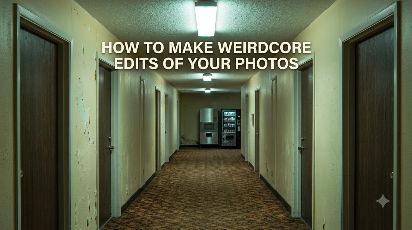
Subject matter is half the battle. Empty malls at night, hallways that go on too long, playgrounds with no children, motel rooms lit by buzzing fluorescents. These liminal spaces feel familiar and lonely, which is exactly the emotional sweet spot weirdcore wants.
But mundane objects work too. A warped family photo, an old computer on a desk, a half-eaten slice of cake on a paper plate. The point is the feeling of something everyday that has been quietly left behind.
How to Make Weirdcore Edits: Step-by-Step Tutorial
This is the part no competitor is really covering. I am going to walk you through the exact workflow I use, starting from a fresh photo and ending with a finished weirdcore edit. You can follow along on your phone or in a free desktop editor.
Step 1: Find or Take the Right Base Photo
Start with something ordinary. A parking lot at golden hour, a hallway in your house, a foggy window, or even a portrait shot against a plain wall. The weirder the lighting and the emptier the scene, the better. Avoid anything too clean, colorful, or busy to begin with.
If you do not have a photo handy, walk around your neighborhood for ten minutes and shoot anything that feels still. Weirdcore rewards patience and observation.
Step 2: Add Compression Artifacts and Lower the Resolution
Open your photo in any editor and shrink it down. If your original is 4000 pixels wide, resize to something like 600 pixels wide. Then export it as a low-quality JPEG, around 30 to 50 percent quality. Re-import that compressed version and save it again. Two or three rounds of this builds up the digital grit you want.
This step feels wrong, because you are deliberately destroying your photo. That is the point.
Step 3: Layer in Grain, Blur, and Distortion
Add a heavy grain or noise filter on top of your compressed image. Most apps let you crank grain up to 60, 80, or even 100 percent, and that is the right ballpark for weirdcore. Then add a light gaussian blur, just enough to soften edges without losing the subject.
If your app supports it, layer in a subtle chromatic aberration or RGB shift. Even a one or two pixel offset gives that glitchy, broken-monitor feel.
Step 4: Shift Colors for That Unsettling Mood
Drop the saturation a little, then push individual color channels around. Pull blues slightly toward green, push reds toward orange, or crush the shadows so the blacks go inky and heavy. The goal is a palette that feels just slightly wrong, like a memory replayed through a faulty projector.
If your editor has a curves or levels tool, gently flatten the contrast. Weirdcore hates punchy, modern HDR-style contrast. Everything should feel slightly faded.
Step 5: Add Cryptic Text in a Retro Font
Pick a phrase that feels vague, slightly ominous, or emotionally loaded. Keep it short. Three to seven words is the sweet spot. Drop the text onto your image in a pixel font or an old system font. Set it in red, off-white, or pale yellow. Lower the opacity a touch if you want it to feel half-burned into the image.
Common phrases that work: “are you still here?”, “it remembers you”, “turn back”, “you forgot again”, or just a date that never happened. Anything that hints at a story without explaining it.
Step 6: Save and Share Your Weirdcore Edit
Export the finished piece as a JPEG, but not at full quality. Saving once more at 70 to 80 percent quality adds one final layer of compression, which actually helps the look. Then post it wherever your audience lives, whether that is Instagram, TikTok, Pinterest, or your own art page.
Watch how people react. If you get “why does this feel so off?” comments, you have done it right.
Best Free and Paid Apps for Weirdcore Photo Editing
You do not need Photoshop to make weirdcore edits. Most of the heavy lifting can be done in free apps on your phone, and a couple of desktop tools give you extra control if you want it. Here is what I recommend based on actual testing.
Free Mobile Apps for Quick Weirdcore Edits
PicsArt is the workhorse for most weirdcore creators. It has solid grain, glitch, and chromatic aberration tools, plus an overlay library full of VHS and scanline effects. Snapseed, which is also free, is great for the color and curves work in Step 4. For pure glitch and distortion, Glitch Lab on Android and Glitch Art Studio on iOS give you surprisingly deep control.
If you only want one app, start with PicsArt. It covers about 80 percent of what you need in a single workflow.
Desktop Tools for More Control
GIMP is the obvious free desktop choice, and it handles layers, curves, and channel mixing beautifully. Photopea, which runs in your browser, is a solid Photoshop clone that needs no install. If you want to go paid, Photoshop and Affinity Photo both let you script batch weirdcore effects, which is useful if you are building a whole series.
For pure retro VHS vibes, DaVinci Resolve’s free color grading tools can crush and shift colors in ways phone apps cannot match.
Weirdcore Editing Tips and Common Mistakes to Avoid
After making dozens of weirdcore edits, I have learned a few things the hard way. Here are the tips that actually move the needle, plus the mistakes that flatten the whole vibe.
Tips for Getting the Look Just Right
Less subject, more empty space. Weirdcore thrives on quiet, slightly empty compositions. If your photo is full of action, the surrealism gets lost. Try to leave a lot of negative space around your subject, especially room for cryptic text.
Stack your effects. One filter alone rarely does it. Compression plus grain plus a slight color shift plus a font overlay is what creates the full weirdcore feeling. Treat it like layering paint, not switching on a single Instagram filter.
Use real references. Spend an hour scrolling r/weirdcore and saving the posts that hit you hardest. Then reverse-engineer what they did. You will start to see the same handful of techniques repeated, which makes them easier to copy and remix.
Mistakes That Break the Weirdcore Vibe
The biggest mistake is over-editing in the modern style. Heavy HDR, sharp clarity, vivid saturation, and crisp edges all fight against the aesthetic. If your edit looks like it could be a stock photo from 2024, you have gone too clean.
The second biggest mistake is using the wrong fonts. Sleek modern sans-serifs, neon script fonts, and anything that screams current design trend will pull the viewer straight out of the weirdcore mood. Stay retro, stay pixelated, stay a little ugly.
Finally, do not over-explain your text. A weirdcore caption should feel like a fragment, not a sentence. The moment the meaning is clear, the mystery evaporates.
Frequently Asked Questions
What is the weirdcore aesthetic?
Weirdcore is a surreal internet aesthetic that uses lo-fi photography, retro graphics, and cryptic text to create a feeling of unease, nostalgia, and disorientation. It often features empty liminal spaces, compression artifacts, and short, ominous phrases overlaid on otherwise ordinary photos.
Is weirdcore a real aesthetic?
Yes. Weirdcore is a recognized online aesthetic with its own community on Reddit, Tumblr, and TikTok. It has been catalogued on aesthetics wikis, studied by design publications, and produced ongoing visual styles since the mid-2010s.
What apps do I need to make weirdcore edits?
You can start with free mobile apps like PicsArt, Snapseed, and Glitch Lab. For desktop work, GIMP and Photopea cover most needs without any cost. Paid options like Photoshop and Affinity Photo add more advanced control but are not required.
What is the difference between weirdcore and dreamcore?
Weirdcore leans darker and more digitally decayed, with glitches, static, and ominous text. Dreamcore is softer, more pastel, and more genuinely dreamy. Both share surreal liminal spaces, but weirdcore adds an unsettling digital-rot edge.
How do I find good base photos for weirdcore edits?
Look for empty, quiet scenes: hallways, parking lots, playgrounds at dusk, motel rooms, or any place that feels still. Take your own photos during foggy weather or low light, or browse royalty-free image sites for liminal space shots.
Final Thoughts on Making Weirdcore Edits
Learning how to make weirdcore edits of your photos is less about technical skill and more about cultivating a mood. Once you understand the core ingredients, lo-fi quality, strange subjects, muted color, and cryptic text, you can mix and match them across hundreds of images without ever feeling stuck.
Start with one photo today. Compress it, grain it up, add a single line of cryptic text in red, and post it. You will learn more from that first attempt than from any amount of theory. Weirdcore rewards experimentation, and the only wrong move is not trying at all.