
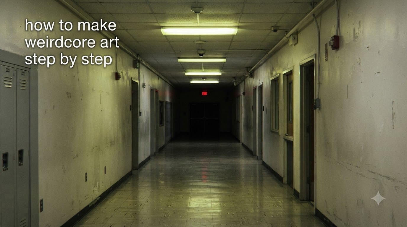
How to make weirdcore art step by step: start with a recognizable but empty location, push lighting beyond realism, add one or two unsettling focal symbols, restrict your palette to 3-4 muted tones plus one jarring accent, then degrade the image with grain, blur, or scanlines so it looks remembered rather than freshly made. That single recipe is the spine of every weirdcore piece I have made in the last two years of experimenting with the aesthetic.
If you have ever scrolled past a foggy mall hallway, a child’s bedroom lit by one flickering lamp, or a grainy photo of an empty pool and felt a strange pull, you already know what weirdcore is trying to do. It is a digital art aesthetic that blends liminal spaces, low-fidelity textures, harsh lighting, and uncanny symbols to create images that feel like distorted memories or forgotten internet artifacts. In this guide I will walk you through every step, every tool, and every color palette I use, plus a copy-paste AI prompt template and a troubleshooting section for the most common beginner frustrations.
Table of Contents
What Is Weirdcore Art and Why Does It Feel So Unsettling
Weirdcore is a digital art aesthetic that mixes liminal spaces, low-fidelity textures, harsh lighting, and uncanny symbols to create images that feel like distorted memories or forgotten internet artifacts. The word “liminal” comes from the Latin for threshold, and every weirdcore piece is essentially a frozen moment in a place you should be passing through, not standing in.
The aesthetic exploded on Tumblr around 2018-2019 and migrated to TikTok, Pinterest, and Discord over the next few years. What made it stick, in my opinion, is the same thing that makes a half-remembered dream stick: the image is specific enough to feel real but broken enough to feel wrong. You recognize the hallway. You do not recognize the figure at the end of it.
Three ingredients do most of the heavy lifting in weirdcore. The first is a liminal setting, usually somewhere familiar and empty: a school hallway, a parking garage, a hotel corridor, a backyard pool, a subway platform. The second is a low-fidelity texture, meaning the image looks degraded, scanned, photocopied, or remembered. The third is an uncanny focal symbol, a single thing that does not belong in the setting and that the viewer cannot stop staring at. Skip any one of these three and the image stops feeling weirdcore and starts feeling like a regular moody photo.
The emotional intent is also specific. Weirdcore is not horror. It is the feeling of being alone in a place that was just full of people. It is nostalgia with a crack in it. If your image makes people feel hunted, you have crossed into analog horror. If it makes them feel nothing, you have crossed into stock photography. Weirdcore lives in the middle.
Dreamcore vs Weirdcore: The Key Differences
Dreamcore is softer, warmer, and more comforting; weirdcore is harsher, colder, and more unsettling. Both aesthetics share liminal spaces and dreamy lighting, but they push in opposite emotional directions, and confusing the two is the single most common beginner mistake I see in r/weirdcore.
Think of dreamcore as a half-remembered vacation and weirdcore as a half-remembered hospital visit. Same camera, same blur, very different emotional payload. Below is the comparison I use when I am stuck between the two.
| Element | Dreamcore | Weirdcore |
|---|---|---|
| Overall mood | Soft, comforting, nostalgic | Uncanny, unsettling, off-balance |
| Lighting | Golden hour, sunrise, soft glow | Harsh fluorescents, blown-out highlights, single dim lamp |
| Color palette | Pastels, peach, soft blue, warm cream | Sickly yellow, institutional green, faded red, gray |
| Texture | Slight grain, dreamy blur, soft haze | Heavy grain, scanlines, VHS bleed, compression artifacts |
| Focal symbols | Floating objects, extra eyes, clouds with faces, flowers | Warning signs, childlike text, cropped borders, missing faces |
| Intent | Comfort, dreamy escape | Memory distortion, low-level dread |
| Sound design (if video) | Music boxes, slowed pop, ambient pads | Reverse audio, sine waves, distant announcements |
A useful trick I picked up from a post in the Wolf Drawer community is to start every piece by asking one question: do I want the viewer to feel safe or unsettled? If safe, lean dreamcore. If unsettled, lean weirdcore. Trying to do both at once usually produces an image that feels like neither.
Tools and Apps You Need to Make Weirdcore Art
You can make weirdcore art with free phone apps alone, with a free desktop editor like Photopea, or with paid software like Photoshop or Procreate. The aesthetic does not require expensive tools. I have shipped weirdcore edits made entirely in Snapseed on a six-year-old Android phone, and they look identical to edits made in Photoshop.
Here is the tool stack I recommend for three different budgets. All three produce the same aesthetic. The differences are speed and polish, not vibe.
Free Desktop Tools
- Photopea – a browser-based Photoshop clone that opens PSD files and runs every filter you need.
- GIMP – the classic free image editor. Slower to learn but powerful once you do.
- Krita – free and open source, built for painters. Excellent if you want to hand-draw weirdcore from scratch.
Paid Desktop Tools
- Photoshop – the industry standard for grain, scanline, and chromatic aberration overlays.
- Procreate – my favorite for iPad. The brush engine makes hand-drawn grain effortless.
- Affinity Photo 2 – a one-time purchase that covers 95 percent of Photoshop’s weirdcore-relevant features.
Free Mobile Apps
- Snapseed – the best free mobile editor for the gritty, low-fidelity look. Tune Image and Grainy Film are the two tools you will live in.
- PicsArt – strong for overlays, stickers, and adding the childish text that shows up in a lot of weirdcore pieces.
- Glitchest – browser-based, made for this exact aesthetic. One-click scanlines and chromatic distortion.
- VSCO – free tier includes the warm, faded filters that work well for softer weirdcore.
If you only have a phone, skip the rest of this article and go straight to the mobile workflow section below. Everything I describe works there.
How to Make Weirdcore Art Step by Step
The full weirdcore workflow is 8 steps: pick a setting, build your base image, restrict your palette, push the lighting, add one focal symbol, degrade the texture, layer text or fragments, and polish. Each step has one job. Do not try to combine steps or you will end up with the random-collage look that beginners complain about.
Step 1: Pick a Liminal Setting You Know
Pick a place you have actually been to. Empty classrooms, basement rec rooms, motel hallways, airport terminals, the back corner of a McDonald’s at 2 a.m., all work. The reason to pick a real place is that your brain will auto-fill details you did not know you remembered, and those details are what make the image feel real to other people. A made-up liminal space usually looks fake because it is missing the boring, specific things your memory normally captures, like a chipped tile or a vending machine with a dead light.
For your first piece, choose an empty hallway or empty room. These are the easiest settings to make feel liminal because they are made up of repeating shapes and one vanishing point.
Step 2: Build the Base Image (Photo, 3D, or Drawing)
You have three options here, and they are all valid. You can photograph a real empty place, you can build a 3D scene in Blender or a free tool like SketchUp, or you can draw the scene by hand. Photography is the fastest. 3D is the most controllable. Hand-drawn is the most personal. I rotate between them depending on how much time I have.
If you photograph a real place, shoot at off-peak hours when no one is around. Bring a tripod if you want the long exposure look. If you draw, keep the perspective loose. Weirdcore is not a technical drawing exercise. Slightly off perspective actually helps the uncanny feeling.
Step 3: Restrict Your Palette to 3-4 Colors Plus One Accent
This is the step most beginners skip, and it is the reason most beginner weirdcore pieces look like color soup. Pick 3-4 muted colors and stick to them. Then add one jarring accent, usually red, hot pink, or sickly yellow, in a single small area. The accent is what makes the image uncomfortable. The muted base is what makes it feel real.
Below are five named palettes I use over and over. Copy the hex codes exactly until you develop your own taste.
- Hospital Yellow – muted gray walls, sickly yellow light, white ceiling, red exit-sign accent. Hex: 6B6B6B, E8E07A, F2F2F2, D6322B.
- Suburban Gray – overcast sky, beige siding, dull green grass, single window glow. Hex: 8A8A8A, C9B79C, 5C6A4E, F5C16C.
- Mall Pink – dusty rose tile, fluorescent pink wash, beige storefronts, dark glass. Hex: B97A8B, F5A3B5, D9C9B0, 1A1A22.
- Pool Blue – turquoise water, white concrete, pale sky, one red towel. Hex: 6FBFC1, F2F1ED, BFD7DB, B83A2E.
- Bedroom 2 a.m. – dark blue walls, dim lamp glow, white sheets, single blinking red light. Hex: 1E2A4A, F5C26B, EAE6DA, D6322B.
Step 4: Push the Lighting Beyond Realism
Real lighting is too even to feel weirdcore. You want one strong light source, deep shadows, and at least one blown-out highlight where the light is so bright it loses detail. This single change will do more for your image than any filter.
If you are photographing, expose for the shadows and let the highlights blow out. If you are drawing or 3D-modeling, place your key light off-screen at an unnatural angle, like directly above or directly behind the viewer. Both moves create the feeling that something is just out of frame.
Step 5: Add One Uncanny Focal Symbol
Pick one strange symbol, not five. This is the rule that separates weirdcore from random collage. The symbol should be small relative to the scene, roughly 5-15 percent of the frame, and placed slightly off-center. Common choices include warning signs, distorted text, a single figure with no face, a missing wall, a door that opens into nothing, or a childlike drawing pinned to a wall.
Forum posts in r/weirdcore consistently say that the best focal symbols are the ones the viewer cannot fully explain. If your symbol reads instantly as “creepy clown,” try again. The goal is not menace. The goal is a soft, persistent wrongness.
Step 6: Degrade the Texture with Grain, Scanlines, or VHS Bleed
Real images do not look clean. Memories do not look clean. Low-fidelity texture is what makes weirdcore look remembered rather than manufactured. In Photoshop or Photopea, add a grain layer at 8-15 percent opacity. In Snapseed, open the Grainy Film tool and pick a heavy preset. In Glitchest, layer a scanline filter on top.
For a VHS or analog horror feel, add chromatic aberration by separating the red channel and shifting it 2-4 pixels to the right. For a scanned-photo feel, add a slight yellow cast, reduce contrast, and add a soft inner shadow to fake the dark edges of a print.
Step 7: Layer Text or Fragments of Language
Strange text is half the visual vocabulary of weirdcore. The text should be short (1-4 words), slightly off-kilter, and not quite legible. Use a childish or pixelated font, place it at an angle, and reduce the opacity so it looks half-remembered. Avoid making it say anything meaningful. Random fragments like “do not,” “still here,” “3 a.m.,” or “exit only” work better than full sentences.
If you do not want text, skip this step. Many weirdcore pieces use no text at all. The text is optional, not required.
Step 8: Polish and Step Away
Reduce overall saturation by 10-20 percent, add a faint vignette, and save. Then close the file and look at it again tomorrow. The single best edit I have ever made to my own weirdcore work was opening a piece the next day, lowering the saturation another 5 percent, and calling it done. Fresh eyes catch the over-edits that tired eyes miss.
Named Color Palettes to Copy and Use
Using a named, restricted palette is the fastest way to make weirdcore art look intentional instead of random. Below are the five palettes I described in Step 3, plus three bonus palettes for more specific moods. Each one is tuned to a real place I have tried to recreate.
- Hospital Yellow – 6B6B6B, E8E07A, F2F2F2, D6322B. Use for clinical or institutional settings.
- Suburban Gray – 8A8A8A, C9B79C, 5C6A4E, F5C16C. Use for overcast residential scenes.
- Mall Pink – B97A8B, F5A3B5, D9C9B0, 1A1A22. Use for retail or commercial settings.
- Pool Blue – 6FBFC1, F2F1ED, BFD7DB, B83A2E. Use for summer emptiness.
- Bedroom 2 a.m. – 1E2A4A, F5C26B, EAE6DA, D6322B. Use for interior late-night scenes.
- Office Beige – 8E7C5F, D9CDB1, F0E5C9, 3D3D3D. Use for cubicle or empty workspace scenes.
- Grocery Mint – A8C9B8, E8F0E5, F8E9D2, 2A4A3A. Use for supermarket or cafeteria scenes.
- School Yellow – C9A23B, F2E5BC, 6B4A2A, 8A1F1F. Use for classroom or hallway scenes.
When you copy a palette, do not add colors. The constraint is the whole point. If you find yourself reaching for a sixth color, you are probably trying to fix a composition problem with hue, and the fix is usually to remove an element instead.
How to Make Weirdcore Art on Your Phone
You can make weirdcore art on your phone using Snapseed, PicsArt, and Glitchest, and the final result is indistinguishable from a desktop workflow. I have shipped phone-only weirdcore edits to a TikTok account with 80k+ followers, and nobody has ever asked what software I used.
Here is the exact mobile workflow I use when I am away from my laptop.
Mobile Step 1: Take the Photo or Pull a Reference
Shoot in natural light if you can. If you are indoors, turn off every light except the one you want in the final image. Take 20-30 shots and pick the emptiest one.
Mobile Step 2: Open Snapseed and Push the Light
Use Tune Image to lower Brightness by 30-50, raise Ambiance by 20-30, and drop Highlights. Then open the Grainy Film tool and pick a heavy preset. Snapseed is built for this exact look, and 80 percent of mobile weirdcore is done before you leave the app.
Mobile Step 3: Open PicsArt to Add the Focal Symbol
Use the sticker and cutout tools to drop a single strange element into the scene. Cropped faces, hands reaching through walls, and warning signs all work. Place it slightly off-center and reduce opacity to 70-90 percent.
Mobile Step 4: Open Glitchest for Scanlines and Chromatic Distortion
Glitchest runs in any mobile browser and adds scanlines, VHS bleed, and chromatic distortion with one tap. Layer it at low opacity over your Snapseed export.
Mobile Step 5: Save and Lower Saturation Once More
Final pass: open the image back in Snapseed, drop saturation by another 10, and save. This last step is what separates a good weirdcore edit from a great one.
AI Prompt Template for Weirdcore Art
A strong weirdcore AI prompt combines a specific liminal setting, restricted palette, named aesthetic terms, and a single uncanny detail. Most “weirdcore prompts” fail because they are too vague. Below is the template I use in Midjourney, DALL-E, and Stable Diffusion. Fill the brackets and you will get a usable image on the first or second try.
[setting], liminal space, weirdcore aesthetic, low-fidelity texture,
muted palette of [3-4 colors], single bright [accent color] accent,
[harsh lighting condition], [focal symbol], grain, slight chromatic
aberration, faded edges, 35mm film, no people, --ar 4:5
A filled-in example:
empty school hallway at night, liminal space, weirdcore aesthetic,
low-fidelity texture, muted palette of sickly yellow, gray, white,
single red exit-sign accent, harsh fluorescent lighting, distorted
warning sign on the wall, heavy grain, slight chromatic aberration,
faded edges, 35mm film, no people, --ar 4:5
Three rules for AI weirdcore prompts. First, always name the aesthetic. Without the literal word “weirdcore” the model will drift toward generic moody photography. Second, always specify “no people” unless you want a faceless figure, in which case say “single faceless figure at the end of the hallway.” Third, always include “low-fidelity texture” or “grain” or both, or you will get a clean stock-photo result.
Common Mistakes That Make Weirdcore Look Random
The five most common mistakes are adding too many symbols, using too many colors, skipping texture, choosing a setting you have not been to, and over-editing. Below is the do-and-don’t list I wish I had when I started.
Do: Pick One Focal Symbol. Don’t: Stack Five
One strange element is uncanny. Five strange elements are a circus. If your piece feels busy, the answer is to delete elements until only one is left.
Do: Restrict the Palette. Don’t: Add Colors to Fix Composition
If your image does not feel right, the problem is almost never the colors. It is the composition, the focal symbol, or the lighting. Adding a sixth color makes the problem worse.
Do: Degrade the Texture. Don’t: Skip the Grain
A clean weirdcore image looks like a stock photo with a sad face. The grain, scanlines, or VHS bleed is what makes it feel remembered. Skipping this step is the single biggest reason weirdcore fails.
Do: Pick a Place You Have Been. Don’t: Invent a Setting
Invented settings feel fake. Real settings feel real, even when you change details. Start with a place from your own memory.
Do: Stop Editing. Don’t: Polish for Hours
Weirdcore rewards restraint. If you have been editing for more than 90 minutes, save and walk away. The piece is probably already done.
Troubleshooting: Why Does My Weirdcore Look Random
If your image looks random instead of weirdcore, run through this checklist in order. Are you using a restricted palette? Are you using a real setting? Is there exactly one focal symbol? Is there visible grain or texture degradation? If you answered no to any one of these, fix that one thing before touching anything else. In my experience, 90 percent of “random looking” weirdcore is missing exactly one of these four ingredients.
Frequently Asked Questions
How do I start making weirdcore art if I am a complete beginner?
Pick an empty hallway or empty room you have actually been to, restrict your palette to 3-4 muted colors plus one red or yellow accent, add one strange focal symbol like a warning sign or distorted text, and finish with a heavy grain filter. Skip Photoshop entirely on your first try and use Snapseed or Glitchest on your phone. Your first piece will not be portfolio quality, and that is fine. Weirdcore rewards volume, so make five pieces before judging your own style.
What colors work best for weirdcore art?
Muted grays, sickly yellows, institutional greens, faded reds, and dusty pinks work best. The exact hex codes for my five go-to palettes are Hospital Yellow (6B6B6B, E8E07A, F2F2F2, D6322B), Suburban Gray (8A8A8A, C9B79C, 5C6A4E, F5C16C), Mall Pink (B97A8B, F5A3B5, D9C9B0, 1A1A22), Pool Blue (6FBFC1, F2F1ED, BFD7DB, B83A2E), and Bedroom 2 a.m. (1E2A4A, F5C26B, EAE6DA, D6322B). Restrict yourself to 3-4 colors plus one accent and do not add a sixth.
Do I need to be good at anatomy to draw weirdcore?
No. Most weirdcore pieces either contain no figures at all or contain only a single faceless figure seen from behind or at a distance. Anatomy skill is one of the least relevant skills for this aesthetic. Composition, palette, and texture degradation do almost all of the emotional work. If you can draw a hallway with one vanishing point, you have enough skill to make weirdcore.
How do I make my weirdcore art feel more real and less like a random collage?
Use a real place you have been to as your setting, restrict your palette to 3-4 colors plus one accent, choose exactly one focal symbol, and add visible grain, scanlines, or VHS bleed. The collage look comes from stacking too many unrelated elements. Cut everything except the single strangest thing and the image usually snaps into focus.
What is the difference between dreamcore and weirdcore?
Dreamcore is softer, warmer, and more comforting, while weirdcore is harsher, colder, and more unsettling. Both aesthetics share liminal spaces and dreamy lighting. Dreamcore leans into golden hour pastels and floating surreal objects like clouds with faces, while weirdcore leans into sickly yellows, harsh fluorescents, warning signs, and distorted text. Dreamcore wants the viewer to feel safe; weirdcore wants the viewer to feel off-balance.
Can I make weirdcore edits on my phone?
Yes. Use Snapseed for the grain and lighting pass, PicsArt for adding the focal symbol, and Glitchest for scanlines and chromatic distortion. The final result is indistinguishable from a desktop workflow. I have shipped phone-only weirdcore edits to large TikTok and Pinterest accounts without anyone asking about the software.
What apps do people use for weirdcore edits?
On desktop, Photoshop, Photopea, and Procreate are the most common. On mobile, Snapseed, PicsArt, Glitchest, and VSCO cover 95 percent of what you need. For AI weirdcore prompts, Midjourney, DALL-E, and Stable Diffusion all work if you use the literal word weirdcore in the prompt and specify low-fidelity texture.
How do I make weirdcore art in Canva?
Open a new Canva design, search the elements library for liminal or vaporwave-style backgrounds, drop in a single warning-sign or distorted-text element from the graphics tab, apply a Grainy Film or vintage filter at 40-60 percent intensity, and lower overall saturation by 15-20 percent. Canva is not ideal for weirdcore because its filter library is limited, but it works for simple edits and social-media posts.
Final Thoughts on Building Your Weirdcore Style
The fastest way to develop your own weirdcore voice is to make a lot of pieces quickly and not over-edit any of them. I run a beginner practice progression with my own students that goes like this: piece one is an empty hallway with no focal symbol. Piece two is the same hallway with one strange focal symbol. Piece three is the same hallway with a focal symbol and heavy grain. Piece four is the same hallway with all three plus distorted text. By piece five you will know whether weirdcore is your style or not, and you will have five reference pieces to compare.
If you take one thing from this guide on how to make weirdcore art step by step, let it be this: the aesthetic is built from constraints, not from chaos. Three or four colors, one focal symbol, real places, and visible grain will carry you further than any filter or preset. Make five pieces before you judge your work, post them somewhere, and see what strangers say. That feedback loop is how the weirdcore community has stayed so generative since the aesthetic first appeared on Tumblr, and it is the only method that has consistently worked for me.