
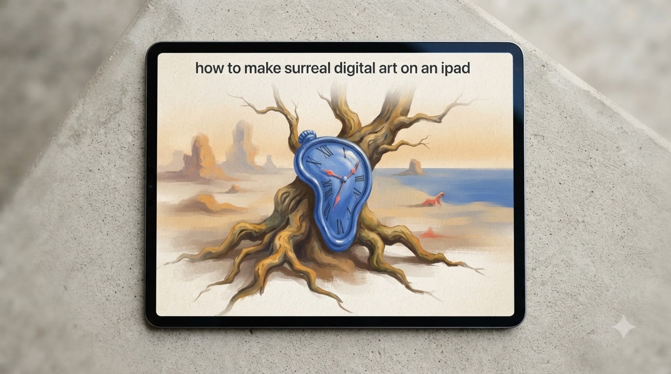
Surreal digital art is a modern art form that uses iPads, Apple Pencil, and apps like Procreate to create dream-like, often impossible imagery inspired by the surrealism movement pioneered by Salvador Dalí and René Magritte. In this 2026 walkthrough, I will show you exactly how to make surreal digital art on an iPad, from choosing hardware and apps to mastering blending modes, building mood boards, and finishing a dreamlike composition that feels intentional rather than random.
Over the past two years I have tested dozens of iPad models, three Apple Pencil generations, and every major drawing app while building a portfolio of surreal portraits and dreamscapes. What follows is the workflow I wish I had on day one. Whether you are a hobbyist who has just bought an iPad for Christmas or a working illustrator looking to branch into surrealism, this guide gives you the tools, the principles, and the step-by-step process to start producing work you are proud of.
Table of Contents
Surrealism 101: History and Principles Every Digital Artist Should Know
Surrealism began in 1924 when French poet André Breton published the Surrealist Manifesto. The movement rejected logic and reason, instead celebrating the unconscious mind, dreams, and unexpected juxtapositions. Dalí’s melting clocks in The Persistence of Memory and Magritte’s floating apples in The Son of Man are textbook examples, and they remain the visual vocabulary most digital artists borrow from today.
The third giant you should study is Zdzisław Beksinski, whose haunting, biomechanical dreamscapes defined a Polish strand of surrealism in the 1970s and 1980s. Where Dalí played with soft shapes and Magritte with clean illusions, Beksinski painted textured nightmares that feel almost sculptural. Together, these three artists give you a north star for color, scale, and atmosphere.
What separates surreal art from merely strange art is intent. A random combination of objects is strange. A surreal combination pushes an emotional or psychological idea. If a melting clock represents the fluidity of time, the image works. If the clock is just melting for shock value, it falls flat. Before you open Procreate, write one sentence describing the feeling or thought your piece will explore. That sentence is the spine of your composition.
The Three Principles That Guide Every Surreal Image
Juxtaposition is the first principle. Place two unrelated objects in the same frame and the brain immediately tries to connect them. A fish walking through a desert, a violin with tree roots, a door opening onto an ocean. The tension between familiarity and impossibility is where the dream lives.
Distortion is the second. Stretch, shrink, melt, or invert scale. Dalí’s clocks were not melted to look gross; they were melted to communicate that time is not rigid. When you distort a recognizable object, you force the viewer to see it freshly.
Atmosphere is the third. Soft light, fog, long shadows, and muted color palettes tell the viewer they are not in ordinary reality. Beksinski painted with heavy grain and warm haze. Magritte used flat daylight. Pick one atmospheric note per piece and carry it consistently.
Choosing the Right iPad and Apple Pencil for Surreal Digital Art
Your hardware shapes your ceiling. I have used the iPad Air, the iPad Pro 11 inch, and the iPad Pro 12.9 inch for surreal work, and the difference is real, especially once your pieces exceed 8,000 pixels on the long edge. The short answer is that any modern iPad paired with an Apple Pencil will let you make surreal digital art, but the iPad Pro 12.9 inch remains the best large-canvas option in 2026.
iPad and Apple Pencil Compatibility Table
| iPad Model | Best Pencil Match | Pressure Levels | Tilt Support | Best For |
|---|---|---|---|---|
| iPad Pro M4 (11 inch) | Apple Pencil Pro / Pencil USB-C | Full | Yes | Portability plus power |
| iPad Pro M4 (13 inch) | Apple Pencil Pro / Pencil USB-C | Full | Yes | Studio surreal paintings |
| iPad Air M3 / M2 | Apple Pencil Pro / Pencil USB-C | Full | Yes | Budget-friendly portability |
| iPad (10th gen and newer) | Apple Pencil USB-C (1st gen via adapter) | Full | Yes | Hobbyists, students |
| iPad mini (A17 Pro) | Apple Pencil Pro | Full | Yes | Sketchbook surreal studies |
The Apple Pencil Pro is the right Pencil for almost every surreal artist in 2026. It adds barrel roll, squeeze gestures, and haptic feedback, all of which Procreate 5.3 and later support. If you are on a tighter budget, the Apple Pencil USB-C is a solid fallback that still gives you full pressure and tilt.
Storage matters more than most guides admit. A 6000 by 4000 pixel surreal painting with 40 layers and full Time-lapse recording can balloon past 1.5 GB. I recommend 256 GB minimum and 512 GB or higher if you keep references, brushes, and timelapses locally. Cloud storage offloads the worry but adds latency to your workflow.
Best Apps for Surreal Digital Art on iPad
Procreate is the default choice for most surreal artists, and for good reason. It pairs custom brush engines with a layered blend mode system that mirrors what desktop apps offer. But it is not the only path. Here are the apps that actually deliver surreal results on iPad, in my experience after switching between them for months at a time.
Surreal Art Apps Comparison
| App | Layer Blend Modes | Custom Brushes | Time-lapse | Best Use Case |
|---|---|---|---|---|
| Procreate | All major modes | Yes, deep studio | Built in | All-around primary work |
| Adobe Fresco | Full set | Yes plus live brushes | No | Painterly surreal portraits |
| Clip Studio Paint | Full set plus more | Yes, vector options | Yes | Comic and manga surrealism |
| Autodesk Sketchbook | Most major modes | Yes | Yes | Free option for beginners |
| Linearity Curve | Limited | No (vector) | No | Magritte-style flat surrealism |
Procreate remains my primary because the brush engine and Time-lapse recording together create a social-ready workflow. I can paint a 6 hour surreal piece, scrub the recording, and post a 30 second reel the same day. Adobe Fresco wins when I want watercolor-style washes or oil textures that feel painterly. Clip Studio Paint is unbeatable for comic-panel surrealism and precise line work. Linearity Curve is the secret weapon for any artist who loves Magritte’s flat, graphic look and wants clean vector lines.
Yes, you can make surreal art on iPad without Procreate. Adobe Fresco and Autodesk Sketchbook are both capable, and both have free tiers. The trade-off is that you lose the Time-lapse community that grew up around Procreate. For your first surreal piece, pick the app you already own, finish the work, and only switch if you hit a wall you cannot climb.
Setting Up Your Digital Workspace and Canvas
Open Procreate and tap the plus icon to create a new canvas. For most surreal pieces I work at 6000 by 4000 pixels at 300 DPI, which prints cleanly at 20 by 13 inches and gives enough resolution for cropping. If your iPad is older or you are running low on storage, drop to 4000 by 3000 at 300 DPI. Anything below 2000 pixels on the long edge will look soft on retina displays.
Switch the color profile to sRGB unless you know your end use is print. sRGB keeps the screen preview honest, and it sidesteps the muddy color problem that plagues new surreal artists. sRGB also plays well with Instagram, X, and most portfolio platforms. If you plan to print on a calibrated wide-gamut monitor, switch to Display P3.
Before you draw a stroke, set your gesture controls. In Procreate, tap the wrench icon, then Prefs. I turn on Quick Menu for the four-finger tap, activate Apple Pencil scribble for Undo, and disable touch so my palm does not leave marks. These three settings save me hours every week. Time-lapse recording lives in Video under the wrench; turn it on now so you do not forget later.
Building Mood Boards and Finding Surreal References
Mood boards are where surreal art succeeds or fails. A good board is not a dump of pretty pictures. It is a focused collection of references that share one emotional or visual thread. When I plan a surreal portrait, my board usually holds 12 to 20 images: two color studies, three to four texture references, three photographs of the dominant object, and a handful of dreamlike paintings by artists I admire.
I build my boards in Pinterest and PureRef. Pinterest is great for collecting; PureRef is great for arranging on a second monitor or side-by-side with Procreate on the iPad. Inside Procreate itself, you can drag and drop a Reference panel from the wrench menu. I keep a Reference companion panel open to one screen while I work on the canvas.
What to look for in references is less about copying and more about vocabulary. Collect lighting you love, skin tones that feel right, textures that match your mood, and at least one photo of a place or object you have never seen in a painting before. Strange objects you cannot name are gold for surrealism. They give you the raw material for an image the viewer has to interpret.
What Makes Art Surreal Rather Than Just Strange
This is the question I get asked most often on social media. Strange is a collage with no thesis. Surreal is a collage where every element serves a single feeling or idea. If your melting clock, your floating apple, and your fish walking in the desert all point to the same sentence, you have made surreal art. If they point in three different directions, you have made a strange image that confuses the viewer.
A useful test is the elevator pitch. After you finish a piece, describe it in one sentence without naming the elements. If the sentence sounds interesting, the image works. If the sentence sounds like a list of objects, you need to tighten the concept and remove or rework the elements that fight the idea.
Layer Manipulation Techniques for Surreal Compositions
Layers are how surrealism is actually built. Most finished surreal pieces have 30 to 80 layers, organized into tight groups for subject, background, atmosphere, and color grade. Without that organization, you cannot iterate. With it, you can try five skies in five minutes and keep the strongest.
Name every layer or group as soon as you create it. Tap the layer, choose Rename, and use short labels like “Sky,” “Face,” “Clock,” “Vignette.” A blank layer named “Layer 47” is a future you will hate. I keep a consistent palette: blue for environment, yellow for subject, red for atmosphere, green for color grade.
Clipping masks are the second technique you must master. Tap a layer, then tap it again and choose Clipping Mask. Anything you paint on that layer will only appear where the layer below it has pixels. Use clipping masks to add shadow to a subject without bleeding onto the background, or to texture a single shape without affecting neighbors. Clipping masks replace what Photoshop users call “creating a layer mask.”
Alpha lock is the cousin of clipping masks. Swipe right on a layer with two fingers to enable Alpha Lock. Now you can shade or texture only inside the existing silhouette of that layer, without creating a mask. I use Alpha Lock for atmospheric color, edge lighting, and adding cracks or veins to a single object.
Layer opacity and group blending round out the toolkit. Drop a layer to 60 percent to soften a texture. Switch the whole group’s blend mode to Overlay to unify elements into one lighting scheme. These two moves are how your “weird collage” becomes a “painting that makes sense.”
Blending Modes for Surreal Effects
Blending modes are the single biggest leap in surreal art quality. The right mode can turn a flat photo into a glowing atmosphere, merge a hand-drawn element with a photographic background, or push a face into the uncanny valley. The wrong mode makes everything muddy. This section is your cheat sheet.
Surreal Blending Modes Cheat Sheet
| Blend Mode | What It Does | Best For Surreal |
|---|---|---|
| Multiply | Darkens, removes white | Shadows, weather, vintage |
| Screen | Brightens, removes black | Light leaks, glowing aura |
| Overlay | Boosts contrast both ways | Unifying textures to subjects |
| Soft Light | Gentle contrast boost | Atmosphere, fog, dream haze |
| Hard Light | Strong contrast, like Overlay on hard | Dramatic skies, broken light |
| Difference | Inverts overlapping colors | Magritte flat surrealism |
| Exclusion | Soft Difference | Dalí color play, dual exposure |
| Add | Brightens, saturates | Glows, energy, sparks |
| Subtract | Darkens, desaturates | Underwater, shadow, dust |
Multiply is where I start. Any time I drop a texture or weather onto a piece, Multiply blends it into the existing tones without flattening the highlights. Screen is its opposite and is perfect for the soft glow of dream light. Overlay and Soft Light are my two defaults for unifying a group of layers into one atmosphere.
Difference and Exclusion are the surrealist modes. They create color shifts that look almost impossible. I use Difference sparingly, usually on a single accent layer, because it can dominate an image. Add and Subtract give you digital brightening and darkening that no traditional medium can match, and they work beautifully on particle layers like dust or fireflies.
If you feel overwhelmed, pick Overlay and Soft Light. Learn them well. They will solve 80 percent of your blending problems. After a month of working only with those two, branch into Multiply for shadows and Add for glow. The full toolkit comes naturally after that.
Brush Techniques and Custom Brushes
Brushes are personal. What I use daily is different from what another surreal artist uses, and that is healthy. But there is a starter kit that every surreal artist benefits from, regardless of style. Let me walk you through the brushes that earned a permanent home in my studio.
The 6B Pencil is your sketching and value tool. Set it to a low opacity, around 20 percent, and use it for the initial block-in of your subject. The grain comes from the texture layer underneath, which is why I always drop a paper-texture layer first. The 6B Pencil is also my favorite brush for adding rough atmospheric lines that feel hand-drawn rather than digital.
A spatter or scatter brush gives you instant atmosphere. Beksinski’s paintings live and die by textured surfaces, and a spatter brush at low flow can replicate that look in two minutes. Try the Studio Pen under Sketching brushes for hair-thin surreal lines, and the Soft Airbrush under Airbrushing for fog and distant light.
Smudge brushes are how you blend without flattening. I keep three: a hard round smudge for detail, a soft cloud smudge for atmosphere, and a textured smudge for skin. Move your brush in slow, deliberate strokes. Fast smudging creates mud, slow smudging creates buttery transitions.
Custom brushes become your signature. Procreate’s brush studio is a full editor. Open it, duplicate a brush you already like, and tweak Shape, Stroke, Apple Pencil pressure, and Grain. My signature surreal brush is a tweaked 6B with reduced spacing, increased pressure opacity, and a paper grain source. I built it in 20 minutes, and it has shipped on every surreal piece since.
Color Theory and Surreal Palettes
Surreal palettes are emotional cues. A desert scene with cobalt blue sand reads as eerie. The same desert with warm ochre reads as nostalgic. Magritte’s flat daylight usually uses desaturated earth tones with one accent. Beksinski leans into deep reds and browns. Dalí plays with cyan sky against warm flesh.
Pick one dominant and one accent. Two colors, used deliberately, are stronger than seven. The dominant fills the background and most surfaces. The accent appears only where you want focus, usually on the subject’s face, the melting clock, or the one impossible object that defines the piece.
Complementary colors create the most surreal tension. Orange and cyan, red and teal, yellow and purple. Complementary pairs feel wrong because they live opposite each other on the color wheel, and that wrongness is exactly the dreamlike quality we want. Use them at high saturation in a small area of the image and let the rest of the piece carry muted versions of the same hues.
Avoid the muddy color trap by limiting your palette early. Pull five swatches in the Procreate color disk and commit to using only those five colors plus white and black. If a sixth color sneaks in, delete it. Surrealism rewards restraint.
Composition and Dreamlike Imagery Rules
Composition is the silent author. Viewers feel a balanced composition without knowing why, and they feel a confused composition the same way. Surreal art lets you break more rules than realism, but the rule-breaking must be intentional. Here is the structure I rely on.
The rule of thirds still works. Place your subject’s eyes or your dominant impossible object on the upper third line. Off-center placement feels alive; centered placement feels iconic. Magritte centered his subjects often, which is why his work feels ceremonial. Dalí usually off-centered, which is why his feels restless.
Scale distortion is your best friend. Make one element too big. Make another too small. A tiny human walking through a giant bedroom reads as dreamlike even if everything else is realistic. Scale distortion tells the viewer that the laws of physics are not in charge.
Empty space creates tension. Leave at least 30 percent of your canvas low-detail. Fog, sky, gradient. The empty space gives the impossible elements somewhere to breathe. A surreal piece packed edge to edge feels chaotic; a surreal piece with quiet zones feels intentional.
Visual metaphor is the final rule. Every surreal piece should ask the viewer to make one connection. Door opens to ocean: transition. Melting clock: time. Floating apple: hidden identity. If the metaphor is clear, the image holds in memory. If it is not, the image is a curiosity, not a surreal statement.
Step-by-Step Surreal Project Walkthrough on iPad
This is the workflow I follow for every surreal piece. The 14 steps below took years to refine and will save you months of trial and error. Open Procreate, create a 6000 by 4000 canvas, and walk through them with me.
Step 1: Write the one-sentence idea. Before any stroke, write down the feeling or thought your piece will explore. “Time slips when you are asleep.” “Memory is a door.” “The desert dreams of water.” This sentence is the spine. Every later decision either serves it or gets cut.
Step 2: Sketch the frame. Use the 6B Pencil at 20 percent opacity and draw a loose thumbnail of the composition. Where is the subject? Where is the impossible element? Where is empty space? Spend 5 minutes, not 50. The thumbnail is a map, not a painting.
Step 3: Pull references. Open a Reference companion panel in Procreate and drop in three photographs and two paintings. These references keep your proportions honest and your colors grounded, even in a dreamlike piece.
Step 4: Block silhouettes. On a new layer, paint the silhouettes of your main shapes in flat gray. Do not detail. Just shape. Get the relationships right. The biggest surreal mistakes happen because the artist details before the block-in is solid.
Step 5: Color block. Add a layer below the silhouettes and fill the background with your dominant color. Use the Procreate color disk to keep your palette to five swatches. This step sets the mood.
Step 6: Layer the second element. Bring in the impossible object. A floating clock, a second sky, an extra hand. Place it on its own layer group. Offset it from the subject to create depth. The second element is what makes the piece surreal.
Step 7: Apply a blending mode. Switch the second element’s group to Overlay or Soft Light. Watch the colors unify. If the result feels too strong, drop the group opacity to 60 or 70 percent. If it feels weak, try Multiply or Add.
Step 8: Add texture. Drop a paper-texture layer at the top, set it to Multiply at 30 percent. Add a spatter layer for atmosphere. Beksinski’s signature surface look comes from this kind of stacked texture.
Step 9: Refine lighting. On a new layer set to Overlay, paint the light direction with a low-opacity soft airbrush. Pick one light source and stick to it. Mixed light sources ruin surreal compositions faster than any other mistake.
Step 10: Add dreamlike atmosphere. Use a large soft brush at low opacity to add fog, haze, or glow around the subject. Dream atmosphere is the difference between surreal and just odd. A thin haze sells the idea that the scene is not in ordinary reality.
Step 11: Selective sharpen and soften. Sharpen the focal element and softly blur the background or peripheral objects. Use Procreate’s Sharpen and Motion Blur filters in Adjustments. Selective focus pulls the eye exactly where you want.
Step 12: Final color grade. Add a Curves or Color Balance adjustment layer at the top. Push the dominant color slightly cooler or warmer. A 5 to 10 percent shift is all you need. This is the cinematic final pass that ties everything together.
Step 13: Export the Time-lapse. Tap Video in the wrench menu and export a 30 second Time-lapse. Drop the resolution to 1080p if you are sharing to social media. Save the original PNG or PSD separately for archival.
Step 14: Share and reflect. Post the Time-lapse and the final piece side by side. Note which steps felt slow, which felt fast, and which blending modes gave you the look you wanted. That reflection is how the next piece gets better than this one.
Common Beginner Mistakes to Avoid
Every surreal artist I have coached makes the same handful of mistakes in their first year. I made all of them myself. Here is the list that will save you the most time, with the fix for each one.
Mistake 1: Mixing too many concepts. If your one-sentence idea is “time slips when you are asleep,” you do not also need a floating door, a third eye, and a fish in the desert. Pick one impossible element and let it carry the metaphor. Fix: return to the one-sentence idea and delete every element that does not serve it.
Mistake 2: Muddy colors. Muddy colors come from too many colors in too small an area. Fix: limit your palette to five swatches plus white and black. If a sixth color appears, remove it.
Mistake 3: Ignoring lighting consistency. A face lit from the left cannot share a canvas with a clock lit from the right and a sky lit from behind. Pick one light direction. Fix: paint a quick lighting diagram before you detail.
Mistake 4: Over-blurring the entire piece. Beginners often add a Gaussian blur to “make it dreamlike.” The whole image turns soft and the focal point disappears. Fix: sharpen the focal element. Selective focus creates the dream; universal blur removes it.
Mistake 5: Skipping the mood board. Painting without references leads to flat lighting, weird anatomy, and colors that fight each other. Fix: spend 20 minutes building a focused board before you open a blank canvas.
Mistake 6: Over-relying on filters. Glitch filters, dispersion, chromatic aberration. They look exciting for ten seconds and dated after a year. Fix: use filters sparingly and only on accent layers, never on the whole image.
Mistake 7: Treating AI generation as a finished piece. AI can sketch ideas, but the result is not yours. Viewers can tell, and so can you. Fix: use AI as a mood board tool or a thumbnail source, then paint the final piece yourself.
Mistake 8: Forgetting the Time-lapse. You will forget. I forgot for a year. Fix: turn on Time-lapse recording the moment you create the canvas. The recording is your portfolio and your learning journal.
Final Touches, Exporting, and Sharing Your Surreal Art
Exporting is where most surreal artists lose detail. Procreate defaults to PNG at full resolution, which is what you want for archival. For social media, export a 4K PNG, then resize to 1080 pixels for Instagram or 2048 pixels for X. Avoid JPEG unless storage is critical; JPEG softens the smooth gradients that make surreal work feel polished.
If you work in Adobe Fresco or Clip Studio Paint and want to round-trip into Photoshop, export as PSD. Procreate 5.3 preserves layer groups, blend modes, and most adjustment layers on PSD export. Most artists I know keep a master PSD and publish PNGs.
Portfolio platforms worth your time in 2026 are Behance, ArtStation, and Instagram. Behance rewards long-form projects and gives you discoverability for surreal searches. ArtStation rewards atmospheric pieces and concept art. Instagram rewards Time-lapses and short reels. Cross-post the same finished piece with three different aspect ratios, and let the algorithm do its work.
Frequently Asked Questions
How do I create surreal art in Procreate?
To create surreal art in Procreate, write a one-sentence idea, build a mood board of references, sketch a thumbnail, then block silhouettes on a 6000 by 4000 canvas. Add your impossible second element on its own layer group, set the group blend mode to Overlay or Soft Light, and unify the colors. Finish with a paper texture at Multiply, a soft light haze, and a final Curves adjustment. The full 14-step workflow is detailed above.
What apps can I use to make surreal digital art on iPad?
Procreate is the most popular choice because of its brush engine, blend modes, and Time-lapse recording. Adobe Fresco works well for painterly surreal portraits, Clip Studio Paint handles comic and manga surrealism with vector options, Autodesk Sketchbook is a free alternative for beginners, and Linearity Curve is the right pick for Magritte-style flat vector surrealism. Pick the app you already own and finish a piece before switching.
Can I make surreal art on iPad without Procreate?
Yes. Adobe Fresco, Clip Studio Paint, and Autodesk Sketchbook all support layers, blend modes, and custom brushes. The trade-off is that you lose the Time-lapse community and Procreate’s brush studio depth. For your first surreal piece, finish the work in the app you already own. Switch only if a specific feature, such as vector layers or live brushes, becomes essential to your style.
What brushes do I need for surreal art on iPad?
Start with the 6B Pencil for sketching and value, a spatter brush for atmospheric texture, a soft airbrush for fog and glow, and a smudge brush for blending without flattening. Build one signature custom brush in Procreate’s brush studio by duplicating the 6B and tweaking spacing, pressure opacity, and grain source. Most surreal artists use fewer than ten brushes consistently.
How do surrealist artists like Dalí create dream-like imagery?
Dalí combined soft, melted shapes with sharp detail, used long shadows and warm Mediterranean light, and pinned every image to a single psychological idea, such as the fluidity of time. Magritte used flat daylight and clean juxtapositions like a floating apple in front of a face. Beksinski painted with heavy grain, deep reds and browns, and biomechanical figures. Study their palettes, lighting, and one-sentence ideas before you draw.
Is iPad good enough for professional surreal digital art?
Yes. The iPad Pro M4 paired with Apple Pencil Pro delivers the pressure, tilt, and low latency that professional surreal work demands. Procreate’s brush engine and blend mode system match what desktop apps offer for paintings up to 8000 pixels. Many working surrealists ship client pieces directly from iPad. The iPad’s main limitation is file management for very large projects, which cloud storage handles well.
How do I use blending modes for surreal effects?
Start with Overlay and Soft Light on a layer group to unify elements. Use Multiply on textures to darken and remove white, Screen on glow layers to brighten, and Difference or Exclusion on a single accent layer for the impossible color shifts that define surreal work. Add brightens and saturates for energy and glow. Drop the group opacity to 60 percent if the effect feels too strong.
Conclusion
Learning how to make surreal digital art on an iPad is less about fancy techniques and more about clear intent. Pick the one feeling you want to communicate. Choose your iPad, Apple Pencil, and app based on the texture and workflow you need. Build a focused mood board. Stack your layers with names. Lean on Overlay and Soft Light to unify, Add and Screen to glow, and Difference sparingly for the surrealist jolt. And always, always keep your Time-lapse recording on so you can show your work and learn from it.
Your first surreal piece will not be your best, and that is exactly the point. The 14-step workflow above is a scaffold. Once you have run through it once, every step becomes faster and more intuitive. In a month you will have a small collection of surreal pieces, in three months you will have a portfolio, and in a year you will have a recognizable style. Open Procreate, write your one-sentence idea, and start.