
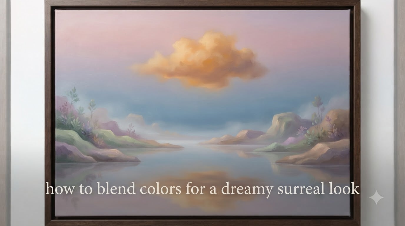
If you have ever stared at a Salvador Dali melting clock or a Rene Magritte cloudy sky and wondered how artists make color feel like a dream, the answer lives in color blending. Learning how to blend colors for a dreamy surreal look is less about realistic painting and more about bending the rules of light, temperature, and atmosphere until reality softens into a vision.
In this guide, I will walk you through the surrealist color theory behind that effect, the exact tools and brushes you need, and step-by-step blending techniques you can use in acrylic, watercolor, oil, and digital apps like Procreate and Photoshop. You will also get four mood-based color palettes with hex codes, plus the mistakes I see beginners make every single day.
Table of Contents
What Is a Dreamy Surreal Look in Color Blending?
A dreamy surreal look is a painting or digital artwork where colors melt into each other so softly that the boundaries between objects, light, and shadow seem to dissolve. It is the visual signature of surrealism, where familiar scenes feel like half-remembered dreams.
Blending in this style is different from blending in realistic painting. In a portrait, you blend skin tones to make them look natural. In a dreamy surreal piece, you blend colors to make reality look uncertain. The colors should feel like they are breathing, shifting, or glowing from inside the canvas.
Think of the hazy deserts in Dali’s persistence of memory paintings, or the soft blue clouds floating through Magritte’s skies. Those effects come from smooth color transitions, muted saturation, and a careful balance between warm and cool tones. Once you understand that the goal is atmosphere over accuracy, every technique in this article will start to make sense.
Surrealist Color Theory Basics for Dreamy Effects
Surrealist color theory is a loose set of principles used by 20th-century artists like Dali, Magritte, Leonor Fini, and Giorgio de Chirico to give their impossible scenes an emotional charge. Three ideas matter most: analogous color harmony, color temperature, and atmospheric perspective.
Use Analogous Colors for Smooth Blends
Analogous colors are three to five hues that sit next to each other on the color wheel, like soft rose, dusty pink, and lavender blue. Because they share underlying pigment, they blend without turning muddy. This is the single biggest reason surreal palettes feel dreamy rather than chaotic.
When you try to blend opposite colors on the wheel (complementary colors) directly on the canvas, they often desaturate into a brownish gray. Save complementary pairs for visual tension in focal points, and build your dreamy base from analogous schemes.
Control Color Temperature for Atmosphere
Warm colors (reds, oranges, golden yellows) push forward and feel intimate, even nostalgic. Cool colors (blues, soft greens, lavender) recede and feel distant, melancholic, or cosmic. Most dreamy surreal paintings lean cool overall, with a small pocket of warm light drawing the eye.
In my own paintings, I usually pick one warm accent color, like a pale peach or dusty gold, and let everything else drift in cool muted tones. This single rule fixes more “flat looking” art than any brush technique ever will.
Leverage Atmospheric Perspective
Atmospheric perspective is the idea that distant objects appear paler, cooler, and lower in contrast than near objects. Surrealists borrowed this from landscape painting to create dreamlike depth without hard edges. As elements recede, drop the saturation, push the hue toward blue, and soften every transition.
Tools and Materials for Smooth Color Blending
You do not need a huge kit to get a dreamy surreal look, but the right brushes and mediums make the blending process much easier. Here is what I keep within reach for acrylic, watercolor, and digital work.
Traditional Painting Tools
- Soft synthetic brushes: A round or filbert size 6 to 10 is the workhorse for general blending. Look for brushes labeled “soft blend” or “filbert.”
- Mop or hake brush: Wide, soft, and floppy. Perfect for smoothing large gradients like skies and background haze.
- Fan brush: Useful for softening edges and creating soft texture in clouds or fabric.
- Glazing medium: Extends drying time for acrylics and lets you build transparent layers without streaks.
- Slow-drying medium or retarder: Especially important if you want wet-on-wet blending in fast acrylics.
- Palette knife: For mixing large batches of consistent color on the palette before applying.
Digital Painting Tools
- Procreate or Photoshop: Both have soft airbrushes, smudge brushes, and gradient maps that mimic traditional blending.
- Low-opacity brush (10-30%): The single most important setting for dreamy digital blends.
- Smudge tool or finger smudge brush: For dragging wet digital pigment into soft transitions.
- Gradient map adjustment layer: In Photoshop, this lets you remap a grayscale value into a full dreamy palette in seconds.
- Soft round brush with “transfer” enabled: Pressure-sensitive flow gives the same feeling as a loaded traditional brush.
Step-by-Step Blending Techniques for a Surreal Finish
Below are the five core techniques our team returns to most often when creating dreamy surreal paintings. Each one starts with a verb and ends with a clear visual result so you can pick the right method for your medium and mood.
Step 1: Plan Your Palette Before You Touch the Canvas
Choose three to five analogous colors and one small accent color. Pull swatches in your reference app or paint them on a scrap card. Decide which color is your lightest, which is your darkest, and where the warm accent will sit. Planning ahead is what separates muddy painting from intentional surreal atmosphere.
Step 2: Lay a Soft Underpainting
Thin your first layer with water or medium so it is almost translucent. Block in your main shapes with your mid-tone color. This soft base gives every later layer something to melt into, which is exactly what makes blending feel dreamy rather than spotty.
Step 3: Wet-on-Wet Blend for Soft Edges
Wet-on-wet means applying wet paint into an area that is still wet, allowing the pigments to flow into each other. Load two brushes with different colors, drop them side by side on a damp surface, then sweep a clean soft brush through the boundary in one long stroke.
This works best in watercolor and oils because they stay wet longer. In acrylic, you can fake it by misting the surface with water or using a slow-drying medium.
Step 4: Glaze in Thin Transparent Layers
Glazing is the surrealist’s secret weapon. Mix a tiny amount of pigment with a lot of glazing medium or water, then brush it over a dry layer. The first color shows through, but the new hue shifts the whole area toward your target temperature.
Build two to four glazes for the dreamiest results. Each one should be barely visible on its own. The painting will start to glow from underneath, which is the exact luminous quality you see in Dali’s skies.
Step 5: Scumble to Soften Without Losing Texture
Scumbling is dragging a broken, semi-dry layer of lighter paint over a darker area. It creates soft, cloud-like transitions while keeping a hint of texture. Use a stippling or soft fan brush and very little pigment on the bristles.
This is great for cosmic backgrounds, misty horizons, and any area where you want atmosphere but not a flat finish.
Step 6: Soft Brush or Smudge Tool for Digital Finishing
In Procreate or Photoshop, set your soft round brush to 10-20% opacity and gently layer colors together. Use the smudge tool sparingly to drag one hue into its neighbor. The trick is to build slowly, stroke by stroke, rather than smearing everything at once.
Dreamy Surreal Color Palettes by Mood
Here are four mood palettes I have used in recent surreal illustration work. Each comes with hex codes you can drop straight into Procreate, Photoshop, Krita, or any design app. Pick one based on the emotion you want the painting to evoke.
Palette 1: Melancholic Twilight
Use this for quiet, introspective scenes: empty plazas, fading sunsets, solitary figures against a hazy horizon.
- Dusty Mauve: #B89BAF
- Soft Lavender: #C4B5D9
- Cool Slate Blue: #7A89B3
- Pale Pearl: #E8E2EE
- Warm Accent (dim amber): #D9A87A
Palette 2: Cosmic Dream
Use this for space, dream sequences, and cosmic surrealism. The deep cool tones create an instant sense of scale and mystery.
- Deep Indigo: #2E2A5A
- Midnight Blue: #3D4A8A
- Soft Periwinkle: #8A8FCC
- Starlight Lilac: #D2CCE8
- Warm Accent (pale gold star): #EAD9A6
Palette 3: Romantic Haze
Use this for soft portraits, floral surrealism, and nostalgic landscapes. Warm and cool tones blend in a delicate pink-to-peach range.
- Blush Pink: #E8B7B8
- Dusty Rose: #C68F94
- Soft Peach: #F0C8A2
- Cream: #F5E8D5
- Cool Accent (dusty sage): #9CA89B
Palette 4: Nostalgic Soft
Use this for vintage surrealism, faded photographs, and dreamlike memories. The desaturation makes every scene feel like it is being remembered rather than seen.
- Faded Teal: #8BA8A8
- Soft Mustard: #C9B57A
- Pale Terracotta: #D6A48F
- Cloud Beige: #E6DCC6
- Cool Accent (muted slate): #6E7480
When you build a palette, keep your accent color to roughly 5-10% of the visible canvas. That tiny pocket of contrast is what keeps the painting from feeling flat.
Digital vs Traditional Blending: Which Works Best?
Both mediums can produce stunning dreamy surreal results, but they shine in different ways. Traditional painting gives you organic texture and a physical depth that is hard to fake digitally. Digital tools give you undo, infinite layers, and the ability to adjust gradients instantly.
If you are starting out, traditional watercolor and oil are more forgiving for learning wet-on-wet blending because they stay workable longer. Acrylic dries fast, so you need a retarder medium or a mister bottle to extend blending time.
Digital is ideal for experimentation. You can test four mood palettes in twenty minutes without wasting paint, and gradient maps let you remix an entire piece into a new color story with a single layer. Most professional surreal illustrators I know use a hybrid workflow: rough out the composition in Procreate, then translate it to oil or acrylic for the final luminous glow only traditional glazes can produce.
Common Mistakes to Avoid When Blending Surreal Colors
Every beginner runs into the same handful of blending traps. Here is how to recognize and fix each one.
Mistake 1: Muddy Intermediate Colors
This happens when you blend too many colors at once or mix complementary pairs directly on the surface. The fix is to limit yourself to three pigments per transition and build complexity with thin glazes rather than direct mixing.
Mistake 2: Overblending Into a Flat Finish
If your painting starts to look like an airbrushed poster, you have overblended. Stop sooner than feels right, then add back small areas of texture with a dry brush or scumbling. Real dreamlike scenes still have grain, light variation, and tiny details.
Mistake 3: Harsh Edges Where Blending Stopped
Harsh edges usually mean your brush dried out, your glaze was too thick, or you skipped the soft mop brush stage. Keep a clean damp brush nearby to soften every boundary as you finish each section.
Mistake 4: Using Too Many Colors in the Palette
A beginner instinct is to use every color you own. Restrict yourself to four to six total hues and you will instantly get more harmonious blends. Limit your warm accents to one color per painting.
Mistake 5: Ignoring Value Range
Color blending alone will not save a painting with poor light-to-dark contrast. Make sure your darkest dark and lightest light still have room to breathe. Even in pastel surrealism, a value range from about 20% to 80% on a grayscale reading will keep the image from looking washed out.
Advanced Techniques for a Surreal Glow
Once you have the basics down, these three advanced moves will push your paintings from “nice gradient” to “true surreal glow.”
Layered Glazes With a Warm Undertone
Start with a slightly warm undertone, then glaze cool transparent layers on top. The warmth peeks through in subtle places, creating a luminous glow that no single opaque color can match. This is the same principle Renaissance painters used to make skin look lit from within.
Color Burn Edges for Drama
In Photoshop, the color burn blend mode at low opacity deepens shadows and intensifies color transitions. In traditional media, you can fake this with a thin glaze of a deeper analogous color along the shadow side of a form. The result is a soft edge that looks like it is dissolving into darker atmosphere.
Atmospheric Perspective in the Background
Push your distant elements toward your palette’s coolest, palest color. Drop the contrast, soften every edge, and let the foreground stay warmer and more saturated. This single trick is what gives de Chirico’s plazas their haunting, infinite depth.
Frequently Asked Questions
What colors make a dreamy surreal palette?
Soft, muted analogous colors like dusty rose, pale lavender, slate blue, and cream create the dreamiest surreal palettes. Choose three to five hues that sit next to each other on the color wheel, then add one small warm accent such as pale gold or amber to keep the painting from feeling flat.
How do you blend two colors smoothly in painting?
Apply two colors side by side while the surface is still wet, then sweep a clean soft brush through the boundary in one long, light stroke. Use analogous colors, work quickly in watercolor and oil, and add a slow-drying medium in acrylic. Thin transparent glazes layered over a dry base give the smoothest dreamy transitions.
What is the surrealist color theory?
Surrealist color theory uses analogous color harmony, controlled warm-to-cool temperature shifts, and atmospheric perspective to make realistic scenes feel dreamlike. Surrealist artists such as Salvador Dali, Rene Magritte, and Giorgio de Chirico limited their palettes, softened every edge, and relied on a single small warm accent to draw the eye.
What is the wet-on-wet blending technique?
Wet-on-wet means applying wet paint into an area that is still wet so the pigments flow into each other naturally. It works best in watercolor and oil because they stay workable longer. In acrylic, mist the surface with water or use a retarder medium to extend blending time and avoid streaks.
How do you blend colors without making them muddy?
Limit each transition to two to three analogous pigments, build complexity with thin glazes rather than direct mixing, and avoid blending complementary colors straight on the canvas. If a color starts looking grayish or brown, stop, let the area dry, and re-layer with a clean glaze instead of pushing further.
What colors work best for surrealism?
Cool muted tones like dusty blue, soft lavender, pale teal, and dusty rose work best for classic surrealism. Add one warm accent color such as amber or peach for focal contrast. Famous surrealist palettes usually stay within four to six total hues to keep the mood consistent across the whole painting.
How do you make a surreal gradient in Photoshop?
Create a new layer, drag a soft black to white gradient with the gradient tool, then apply a gradient map adjustment layer remapped to a dreamy analogous palette. Set layer opacity between 20 and 60 percent, add a soft airbrush layer at low flow on top, and use the smudge tool sparingly to blend edges.
How do you make colors glow in surreal art?
Build a slightly warm undertone, then layer cool transparent glazes on top so the warmth shows through in subtle places. Add a thin glaze of pale yellow or peach along the lit edges of forms, and deepen the shadow side with a darker analogous glaze. The contrast between warm interior and cool exterior creates an inner luminous glow.
Conclusion
Learning how to blend colors for a dreamy surreal look is really about learning to slow down. Plan your palette, choose three to five analogous colors plus one warm accent, and build the painting in thin layers rather than mixing everything on the canvas at once.
Pick one of the four mood palettes above and spend a session doing nothing but color studies: a soft sky, a melting object, a hazy portrait. After ten studies you will start to feel how temperature, value, and edge softness combine to create that surrealist dreamlike atmosphere you see in Dali, Magritte, and Fini.
The most important next step is to actually paint something tonight, even if it is only a 10 by 10 centimeter gradient. The dreamy surreal look is a skill built on small experiments, and the best one is the one you start right now.