
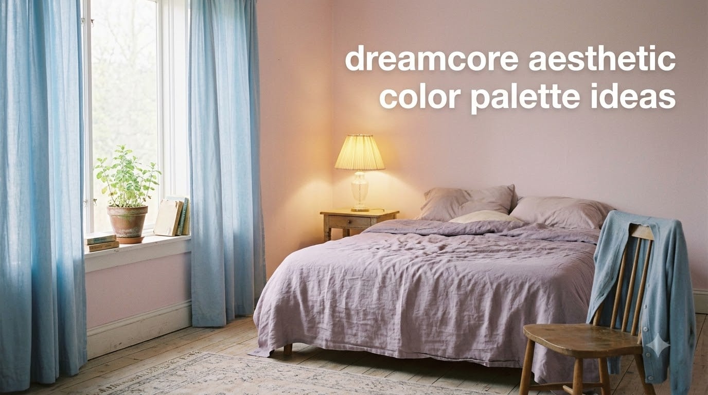
If you’ve ever scrolled past an image of an empty mall bathed in pale pink light and felt suddenly, strangely nostalgic, you already understand the dreamcore aesthetic color palette. It’s a palette built from soft pastels that look slightly faded, slightly sun-bleached, and a little too quiet to be real. In this guide, I’ll walk you through the seven signature dreamcore colors with hex codes, four mood variations you can copy today, the color theory behind the dreamy mood, and a step-by-step process for building your own dreamcore palette from scratch. You’ll also get copy-paste CSS variables and a clear answer to the question everyone asks first: what makes dreamcore colors different from regular pastel colors?
Table of Contents
What Is the Dreamcore Aesthetic?
Dreamcore is a surreal internet aesthetic inspired by dreams and half-remembered memories, defined by soft pastel colors, hazy lighting, liminal spaces, and nostalgic imagery. Yes, dreamcore is a real aesthetic, and it sits in the same family as weirdcore, liminal space, and nostalgiacore. It first appeared on Tumblr and Pinterest in the early 2020s and exploded on TikTok between 2023 and 2026 through soft, looping clips of empty hallways, motel pools at dusk, and grainy childhood bedroom photos.
What sets dreamcore apart from other “core” aesthetics is its emotional contradiction. The visuals feel comforting and unsettling at the same time. You see a pastel bedroom that should feel safe, but the lighting is too flat, the shadows are too soft, and the room looks untouched for years. That tension is the whole point, and the colors do most of the heavy lifting. Clean, candy-bright pastels read as kidcore or soft girl. Dreamcore pastels look like they’ve been left in the sun for a decade. They are desaturated, low-contrast, and slightly cool, which is exactly why they feel like a memory instead of a moment.
The Core Dreamcore Color Palette: 7 Signature Colors
The dreamcore aesthetic color palette is built on seven soft, faded pastels – pale pink, baby blue, lavender, mint green, dusty peach, cream, and faded yellow – all slightly desaturated so they feel washed-out and dreamy rather than bright or candy-like. Every color below comes with a name, hex code, and RGB value so you can drop it straight into Figma, Procreate, CSS, or your wall paint calculator.
- Prelude Pink – #F8D7E3 – RGB(248, 215, 227) – A pale, powdered pink that anchors the entire dreamcore mood.
- Cold Purple – #B7B5E2 – RGB(183, 181, 226) – A dusty lavender with a cool blue undertone.
- Sky Static – #C9E0F1 – RGB(201, 224, 241) – A light baby blue that reads like an overexposed photograph.
- Soft Mint – #C8E6D5 – RGB(200, 230, 213) – A chalky, desaturated mint that never tips into bright.
- Quiet Peach – #F6D7C1 – RGB(246, 215, 193) – A warm dusty peach that softens cooler dreamcore hues.
- Daydream Cream – #F4ECDD – RGB(244, 236, 221) – An off-white cream that reads as “memory of sunlight.”
- Hazy Yellow – #F2E6B3 – RGB(242, 230, 179) – A faded, sun-bleached yellow for highlights and distant light.
These seven are the foundation. Most dreamcore palettes you’ll see on Pinterest or ColorMagic will use at least four of them together. If you only remember three, remember lavender, pale pink, and pale blue – that trio alone carries about 80% of dreamcore’s signature look, and artists on the r/dreamcoreaesthetic subreddit consistently describe it as the foundational combination.
Why These Colors Create the Dreamcore Mood
The dreamcore mood isn’t built from any single color. It’s built from how those colors relate to each other, and especially from how they fail to be bright. Three principles do the work: low saturation, even value, and cool undertones with occasional warm accents.
Low Saturation Is Everything
Every dreamcore color has been pulled away from its pure pigment. Pure pink is a loud, almost neon hue. Prelude Pink has the pink family stripped out of it until it feels like a whisper. Most professional dreamcore artists I follow desaturate their starting pastels by 25-40% to land in the right zone. That’s the difference between “pretty pastel” and “dreamcore pastel,” and it’s the single most common mistake beginners make. If your pastels still pop, they aren’t dreamcore yet.
Values Stay Close Together
Value means how light or dark a color is. In dreamcore, all seven core colors sit in a narrow middle band of lightness. Nothing is true black, nothing is true white, and nothing is deeply saturated. That tight value range is what makes dreamcore images feel flat, hazy, and memory-like. A normal photo has a wide range from deep shadow to bright highlight. A dreamcore image compresses that range so the eye never finds a hard edge. The result feels like a dream because real dreams don’t have contrast.
Cool Undertones Create Emotional Distance
Look closely at Prelude Pink, Cold Purple, and Sky Static. None of them are pure hues – they all carry a small amount of blue. That cool undertone is what separates dreamcore from a warm, cozy aesthetic like cottagecore. The coolness creates a slight emotional distance, a feeling of looking at something through glass. When you add Quiet Peach or Hazy Yellow as a single warm accent against four cool dreamcore colors, you get the haunting, half-remembered feeling the aesthetic is famous for.
Designer Quick Reference: CSS Variables
If you’re a digital creator, copy this block straight into your stylesheet. It covers all seven core dreamcore colors and is the cleanest way to keep your palette consistent across designs.
:root {
  --dreamcore-prelude-pink: #F8D7E3;
  --dreamcore-cold-purple: #B7B5E2;
  --dreamcore-sky-static: #C9E0F1;
  --dreamcore-soft-mint: #C8E6D5;
  --dreamcore-quiet-peach: #F6D7C1;
  --dreamcore-daydream-cream: #F4ECDD;
  --dreamcore-hazy-yellow: #F2E6B3;
}
4 Dreamcore Mood Palettes You Can Use Today
One palette doesn’t fit every dreamcore mood. Some scenes call for soft daylight. Others call for twilight, neon nostalgia, or pure washed-out softness. Here are four ready-to-use variations I built around the seven core colors. Each one is tuned for a specific feeling, and you can copy any of them into a new project without thinking.
Soft Daydream (the default)
Soft Daydream is the safest entry point. It uses the full seven core colors at full dreamcore strength, balanced around cream and pale pink as the dominant tones.
- Background: #F4ECDD (Daydream Cream)
- Primary: #F8D7E3 (Prelude Pink)
- Secondary: #C9E0F1 (Sky Static)
- Accent 1: #B7B5E2 (Cold Purple)
- Accent 2: #C8E6D5 (Soft Mint)
Twilight Drift (darker dreamcore)
Twilight Drift is what dreamcore looks like after sunset. It deepens the lavender and blue, leans on dusty peach as the lone warm note, and feels more melancholic than the default palette.
- Background: #C9E0F1 (Sky Static, slightly muted)
- Primary: #B7B5E2 (Cold Purple)
- Secondary: #A3A1D1 (deeper lavender)
- Accent 1: #F6D7C1 (Quiet Peach)
- Accent 2: #6E6CA0 (twilight indigo)
Cloud Pop (brighter dreamcore)
Cloud Pop pushes dreamcore toward its playful edge. It still feels dreamy, but it lets more saturation through, so it works well for fashion editorials, brand identities, and youthful product design.
- Background: #FFFFFF (true white)
- Primary: #FFD6E5 (popped Prelude Pink)
- Secondary: #B8DCFF (popped Sky Static)
- Accent 1: #D5B8FF (popped Cold Purple)
- Accent 2: #F2E6B3 (Hazy Yellow)
Hazy Pastel (washed-out, low contrast)
Hazy Pastel is the most memory-like of the four. Everything is pulled toward cream so the colors barely separate. It’s the palette to use when you want the dreamcore mood to whisper instead of speak.
- Background: #F4ECDD (Daydream Cream)
- Primary: #EFE3D6 (cream-tinted Prelude Pink)
- Secondary: #E4ECE3 (cream-tinted Soft Mint)
- Accent 1: #E2DEEC (cream-tinted Cold Purple)
- Accent 2: #ECE0CF (cream-tinted Quiet Peach)
Tip: I keep all four palettes in a single Figma file and switch between them depending on the project. Soft Daydream for mood boards, Twilight Drift for night scenes, Cloud Pop for branding, Hazy Pastel for album art.
How to Build Your Own Dreamcore Color Palette
The seven core colors cover most projects, but you’ll eventually want to build your own variation. Here’s the exact process I use to make sure any palette I create still reads as dreamcore instead of drifting into generic pastel.
Step 1: Pick a single anchor color
Start with one dreamcore color you love, usually Prelude Pink or Cold Purple. Everything else will be tuned around it. If you start with three colors at once, you’ll spend more time fighting balance than building mood.
Step 2: Add two complementary hues
Pick one warm and one cool dreamcore color to sit alongside your anchor. A common trio is Prelude Pink plus Cold Purple plus Soft Mint. Trios almost always read more dreamcore than four- or five-color palettes.
Step 3: Desaturate every color by 25-40%
This is the step most beginners skip. Take each color and pull saturation down until it starts to look “off” or “dusty.” Then back off 5%. That last 5% is the dreamcore zone. You can do this in Figma’s color picker, in Photoshop’s Hue/Saturation panel, or in any free tool like Coolors or Khroma.
Step 4: Compress the value range
Drop a white card on top of your palette in your design tool. If any color looks dramatically brighter or darker than the others, pull it back toward the middle. Dreamcore palettes should feel evenly lit, like an overcast afternoon.
Step 5: Add one warm accent and stop
Once your base palette is set, add one warm accent – usually Quiet Peach or Hazy Yellow – and stop. The warm note keeps the palette from feeling cold or dead. More than one warm accent breaks the spell.
Mistakes to Avoid
Don’t use neon or fully saturated colors. Don’t use pure black or pure white – they shatter the soft value range. Don’t rely on dark moody colors alone; if you want “dark dreamcore,” stay in the Twilight Drift zone, not full black-and-grey. And don’t use clean, unmuted pastels like baby pink or sky blue straight from a kidcore palette – they’ll look too crisp and the dreamy mood will disappear.
Where to Use a Dreamcore Aesthetic Color Palette
Once you have a palette you love, the next question is where to actually use it. The dreamcore aesthetic color palette is unusually flexible because every hue is built to sit next to the others without clashing. Here are the use cases I’ve personally tested, with what worked best for each.
Digital art and illustration: Start every piece with Prelude Pink or Cold Purple as your base wash, then layer details in Sky Static and Soft Mint. Add grain or VHS noise last; it amplifies the dreamy feel dramatically.
Pinterest mood boards and Pinterest pins: Stick to three to five dreamcore colors per pin, with Daydream Cream as the background. The low-contrast palette photographs beautifully against Pinterest’s white UI.
Phone wallpapers and lock screens: Hazy Pastel works best because the cream-tinted colors blend into a soft glow on OLED screens. Pure-pastel dreamcore wallpapers can look harsh on bright displays.
Interior design and room decor: Use Soft Daydream or Twilight Drift on walls, then add Quiet Peach and Hazy Yellow as accent textiles. Avoid pure white paint; use Daydream Cream (#F4ECDD) instead so the room stays in the dreamy value range.
Fashion and outfit styling: Lavender, baby blue, mint green, blush pink, and creamy yellows are the recurring dreamcore outfit palette across the r/dreamcoreaesthetic community. Pair pastels with neutrals and add one pearl or chiffon piece to keep the silhouette soft.
Branding and graphic design: Cloud Pop is the strongest choice because the slight extra saturation keeps logos readable. Pair it with thin, slightly imperfect typography for an authentic dreamcore feel.
Dreamcore vs Weirdcore Color Palettes
The most common question after “what are dreamcore colors?” is how they differ from weirdcore. The short answer: dreamcore is warmer, softer, and more pastel, while weirdcore often leans into harsher color clashes, sickly greens, and high-contrast neon accents.
A dreamcore palette uses low-saturation pastels with cool undertones and one warm accent. A weirdcore palette uses higher saturation, more clashing hues, and often includes unsettling colors like radioactive green or mustard yellow against pale backgrounds. Weirdcore also leans on photographic distortion, while dreamcore leans on soft blur.
If you’re torn between the two, ask yourself whether the image should feel nostalgic and safe (dreamcore) or nostalgic and unsettling (weirdcore). The colors usually answer the question for you.
Frequently Asked Questions
What are dreamcore colors?
Dreamcore colors are soft, faded pastels – pale pink, baby blue, lavender, mint green, dusty peach, cream, and faded yellow – all slightly desaturated so they feel washed-out and dreamy instead of bright or candy-like.
Is dreamcore an aesthetic?
Yes, dreamcore is a surreal internet aesthetic inspired by dreams and half-remembered memories. It emerged in the early 2020s on Tumblr and Pinterest and grew through TikTok dreamcore videos.
What aesthetic are pastel colors?
Pastel colors are used across many aesthetics, including kidcore, soft girl, cottagecore, and dreamcore. What makes pastels feel dreamcore specifically is low saturation, cool undertones, and a narrow value range so the colors feel faded and memory-like rather than crisp and candy-bright.
What is the prettiest pastel color?
Among dreamcore pastels, Prelude Pink (#F8D7E3) and Cold Purple (#B7B5E2) consistently rank as the most-loved because they anchor the dreamy, slightly cool mood. For a single standout pastel outside dreamcore, blush pink and powder blue are the most universally flattering.
What are 7 colors that go well together?
The dreamcore palette’s 7 signature colors that always work together are Prelude Pink, Sky Static, Cold Purple, Soft Mint, Quiet Peach, Daydream Cream, and Hazy Yellow. They share low saturation and a tight value range, so any combination of them reads as dreamy and cohesive.
What hex codes are dreamcore?
The most-used dreamcore hex codes are #F8D7E3 (Prelude Pink), #B7B5E2 (Cold Purple), #C9E0F1 (Sky Static), #C8E6D5 (Soft Mint), #F6D7C1 (Quiet Peach), #F4ECDD (Daydream Cream), and #F2E6B3 (Hazy Yellow).
How do you make a dreamcore color palette?
Start with one anchor color, add one warm and one cool companion, desaturate every color by 25 to 40 percent, compress the value range so no color is dramatically brighter than the others, and finish with one warm accent such as Quiet Peach.
The Dreamcore Palette, Recapped
A dreamcore aesthetic color palette is less about which colors you choose and more about how you treat them. Take the seven signature hues – Prelude Pink, Cold Purple, Sky Static, Soft Mint, Quiet Peach, Daydream Cream, and Hazy Yellow – keep them all low in saturation, close in value, and gently cool in undertone, and you’ll get the dreamy, half-remembered mood every time. From there, build your own variation with the four mood palettes and the five-step process above, and you’ll have a dreamcore color system that works across digital art, room decor, fashion, and brand design without losing the magic that makes dreamcore dreamcore. Open your design tool, drop the CSS variables in, and start playing – the palette does most of the work for you.