
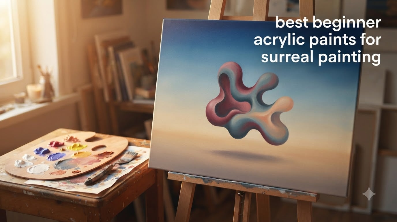
If you are hunting for the best beginner acrylic paints for surreal painting, start here. The short answer: pick a student-grade, high-pigment acrylic with a buttery body, in single-pigment colors where possible, and a lightfastness rating worth trusting. Liquitex BASICS, Amsterdam Standard Series, Winsor & Newton Galeria, and Golden SoFlat are four I have seen beginners succeed with because they blend smoothly, layer cleanly, and give you the kind of saturated, dreamlike color surrealist imagery needs.
This guide is the long answer. I will walk you through what makes an acrylic paint actually work for surreal work, how to choose between heavy body and fluid acrylics, what the real difference is between student and artist grade, and which named brands I trust for beginners. I will also cover color palette, surfaces, blending mediums, and a beginner exercise so you can paint your first surreal sky this weekend.
Table of Contents
What Makes an Acrylic Paint Good for Surreal Painting?
The best acrylic paints for surreal painting share a few specific qualities. They have a high pigment load (so colors stay saturated when dry), they hold their tint when mixed (so blending skies does not turn to mud), and they offer a workable open time so you can soften edges before the paint sets. Here is the shortlist of qualities I look for:
- High pigment load: more pigment per tube means brighter, more saturated color and better coverage.
- Single-pigment colors: colors made from one pigment mix cleanly with neighbors; colors made from multiple pigments go gray or brown fast.
- Lightfastness rating I-I or II: the paint will not fade noticeably in normal indoor light over years.
- Buttery, smooth body: holds brush and palette knife marks, but blends with a soft brush stroke.
- Reasonable open time: at least 5 to 10 minutes of workable wetness, or the ability to extend it with a retarder medium.
- Transparency or opacity labeled clearly: so you know which colors to layer over a base and which to use as a base.
Surrealist imagery lives or dies on color clarity. A melting clock by Dalí needs a clean shadow gradient. A Magritte sky needs a soft, even wash. A Miró biomorphic field needs pure, unmuddied hues. The qualities above give you the technical room to make those effects happen.
Heavy Body vs Fluid Acrylic: Which Works Better for Surrealism?
Heavy body acrylics are thick, buttery, and hold their shape on the brush or palette knife. Fluid acrylics are the same pigments in a pourable, ink-like consistency. Both are excellent for surreal work, and the choice depends on the effect you want.
Use heavy body acrylic when you want sculptural, thick application. Think biomorphic Miró shapes, impasto clouds, or textural surfaces in a Dalí dreamscape. Heavy body holds palette knife marks and stands up on the canvas, which gives surrealist imagery that tangible, dream-physical quality.
Use fluid acrylic when you want smooth gradients, glazes, or fine linework. Think Magritte’s flat blue sky, soft horizon lines, or a luminous background wash. Fluid acrylics dry slower in thin films and lay down with no visible brushstroke, which is exactly what smooth illusionist surrealism needs.
You do not need to choose one. Most surrealist painters I have spoken with keep both on the table. Heavy body for the foreground or for sculptural marks; fluid acrylic (or heavy body thinned with glazing medium) for skies, washes, and fine details.
Student Grade vs Artist Grade: What Beginners Should Buy
Student grade acrylic paint is made for learners. Artist grade is made for working professionals. The real difference is pigment concentration and price, not whether the paint will work for your art.
Student grade uses less pigment and more filler, which means colors can be slightly less saturated and mixes can shift a bit when dry. Artist grade uses more pigment per tube, which gives you cleaner mixes and stronger color payoff. Artist grade is also typically two to three times the price per tube.
For surrealist painting as a beginner, student grade is genuinely enough. I have watched beginners paint Magritte-smooth skies with Liquitex BASICS and Amsterdam Standard Series. The reason is that surrealist imagery does not require the absolute highest pigment load; it requires clean, single-pigment colors and good technique.
Upgrade to artist grade (Liquitex Heavy Body, Golden Heavy Body, Winsor & Newton Professional) when you find yourself mixing the same color over and over and want deeper saturation, or when you start selling work and want the best lightfastness. Until then, save your budget for a few good single-pigment tubes in artist grade for the colors you mix most.
Beginner-Friendly Acrylic Paint Brands Worth Knowing
There are about six brands beginners consistently succeed with. None of them is wrong, and most surrealist painters I know keep at least three on their shelf.
Liquitex BASICS is the most recommended beginner acrylic globally. It is a fluid acrylic with a good pigment load, a wide color range, and a forgiving consistency for blending. It is my default recommendation for a first surrealist set.
Amsterdam Standard Series is a heavy body acrylic from Royal Talens. The pigment load is unusually high for a student-grade line, which makes it a favorite for beginners who want saturated color without paying artist-grade prices. It is widely available in Europe and increasingly online elsewhere.
Winsor & Newton Galeria is the student line from a heritage British brand. It is a heavy body acrylic with a smooth consistency and good lightfastness. It is widely available and works well for traditional surrealist imagery.
Golden SoFlat is a newer matte acrylic with a velvet finish that hides brushstrokes. If you are painting flat, illusionist surrealism (Magritte-style), the matte surface is genuinely useful.
Arteza Acrylic is a budget-friendly option that has improved significantly. It is widely available, ships globally, and works for practice pieces. I would not rely on it for gallery work, but for learning surrealist techniques on a budget, it does the job.
Apple Barrel is the craft-store option. It is cheap, comes in small bottles, and is fine for sketchbook practice or underpainting. Pigment load is low, so do not expect vivid surrealist color from it. Use it to learn technique, then upgrade.
Surrealist-Friendly Color Palette Guidance
A surrealist palette starts with the basics of any painted image: a warm and a cool of each primary, plus white and black. From there you add the colors that give surrealist imagery its dreamlike feel.
Here is a starter palette I would build for any beginner surrealist:
- Titanium white (single pigment, opaque)
- Ivory black (or Mars black for warmer darks)
- Ultramarine blue (single pigment, granulating, perfect for skies)
- Phthalo blue (single pigment, intense, mixes cleanly)
- Cadmium yellow medium (single pigment, warm, vibrant)
- Yellow ochre (single pigment, earthy, for muted surrealist tones)
- Quinacridone magenta (single pigment, intense, replaces old-fashioned purples)
- Alizarin crimson (single pigment, deep, for surrealist shadows)
- Burnt sienna (single pigment, warm, for biomorphic forms)
- Iridescent gold or interference violet (for accents)
Single-pigment colors are the secret to clean surrealist mixing. When ultramarine and cadmium yellow both come from a single pigment each, they mix into a clean, slightly green-tinted gray. When you use cheaper versions made from blends, the same mix turns to mud. This is the single biggest difference between amateur and professional-looking surrealist color.
Surrealist Techniques You Can Do with Acrylic
Acrylic is a forgiving medium for surrealist techniques. The four I use most often are blending, glazing, dry brush, and impasto.
Blending is the workhorse of soft surrealist skies. You lay down two colors side by side and soften the seam with a soft brush while both are wet. Acrylic dries fast, so work in small sections or extend your open time with a retarder medium or a slow-drying blending gel.
Glazing is laying a transparent or semi-transparent layer of paint over a dry base. Glazes build luminous depth, especially in shadows and skies. Mix your paint with glazing medium (a 1:1 ratio is a starting point) to keep the glaze transparent.
Dry brush uses a brush with very little paint, dragged lightly across a dry surface. It produces broken, textural marks that work well for clouds, dust, or surrealist texture on objects like rocks, walls, or fabric.
Impasto is laying paint on thick, usually with a palette knife. Heavy body acrylic is built for this. Impasto gives biomorphic forms and surrealist objects a sculptural, physical presence on the canvas.
Each technique depends on the others. Glazes over impasto give you luminous shadow on a sculptural surface. Blended skies behind impasto objects give you Magritte-style illusion with Dalí-style form. Do not commit to one technique; surrealism rewards mixing.
Using Interference and Iridescent Acrylics for Dreamlike Effects
Interference acrylics are transparent paints loaded with mica flakes. The color shifts depending on the viewing angle and the color underneath. A layer of interference violet over deep blue can shift from violet to teal as you move your head. That optical shift is exactly the dreamlike, slightly unreal effect surrealist painting wants.
Use interference paints sparingly. They are an accent, not a base color. A thin layer over a dried sky, a highlight on a melting clock, or a shimmer on a biomorphic form is plenty. Golden and Liquitex both make reliable interference acrylics in violet, blue, green, gold, and copper.
Surfaces and Canvas Preparation for Surreal Acrylic Painting
Most surreal acrylic painting is done on stretched canvas or wood panel. Stretched cotton canvas is forgiving, affordable, and easy to find. Wood panel is stiffer, which lets you work in glazes and fine detail without the surface flexing under your brush.
Whichever surface you choose, prep it with two coats of gesso. Acrylic gesso gives you a slightly absorbent surface that holds paint without sucking the binder out of it. Lightly sand between coats with 220-grit sandpaper for a smoother finish if you are painting illusionist surrealism.
Avoid very smooth surfaces like glass or glazed ceramic for your first pieces. Paint will sit on top without grabbing, and your surrealist imagery will not hold up to handling.
How to Fix Muddy Colors: A Beginner Pain Point
If your surrealist paintings keep turning brown or gray when you mix, the problem is almost always one of three things.
First, you are probably using blended-pigment colors. Phthalo green mixed from two pigments turns brown when you add white. Phthalo green from a single pigment turns pale, clean mint. Switch to single-pigment paints and the muddiness drops by half.
Second, you are probably mixing too many colors at once. Three colors plus white is usually the maximum for a clean surrealist mix. Four plus white reliably goes gray.
Third, your brush is probably loaded with the previous color. Rinse thoroughly between mixes, or keep a dedicated brush per color. The five-second brush wipe saves more surrealist paintings than any other beginner habit.
Paint Your First Surreal Sky: A Beginner Exercise
This is the exercise I give beginners who want a surrealist painting on their wall by Sunday night.
Step 1: Mix a base sky color from ultramarine blue and a touch of titanium white. Lay it down in a thin, even wash across the top two-thirds of your canvas.
Step 2: While the base is still wet, mix a slightly lighter horizon tint (more white, a touch of yellow ochre). Lay it along the bottom edge of the sky and blend the seam with a soft brush using horizontal strokes.
Step 3: Let the sky dry completely. Mix a transparent glaze of alizarin crimson with glazing medium (about 1:1). Lay the thinnest possible layer along the horizon for a sunset glow.
Step 4: Let the glaze dry. Paint a single surrealist object in the foreground. A floating rock, a melting clock, a single impossibly large apple. Keep the object simple and let the sky do the work.
That is your first surrealist painting. It will not be a Dalí, but it will teach you blending, glazing, single-pigment mixing, and surrealist composition in a single sitting.
Five Surrealist Painters to Study
Studying the source painters is how surrealist technique gets into your hands. Here are five I send every beginner to, in order of accessibility for new painters.
René Magritte is the easiest to study first. His skies are smooth gradients; his objects are flat and precise. He teaches you blending and clean edges.
Salvador Dalí teaches impasto and sculptural form. Look at the texture of his melting clocks. That is heavy body acrylic with palette knife work.
Joan Miró teaches biomorphic color field composition. Flat shapes, single-pigment colors, juxtapositions.
Max Ernst teaches texture and frottage. Less relevant for acrylic technique, but useful for how surrealist imagery uses pattern.
Leonora Carrington teaches dreamlike color and organic surrealist forms. Her work is a touchstone for surrealist painters working in a more mystical mode.
Frequently Asked Questions
What kind of acrylic paint is best for beginners?
Student-grade acrylic paint with a high pigment load and single-pigment color options is best for beginners. Liquitex BASICS, Amsterdam Standard Series, and Winsor and Newton Galeria are the most common starting points. They are forgiving, blend smoothly, and cost less than artist-grade lines while still giving you the color quality you need to learn.
What is the best acrylic paint for surrealism?
Acrylic paint with high pigment load, single-pigment colors, good lightfastness, and a workable open time is best for surrealism. Both heavy body and fluid acrylics work; heavy body for sculptural biomorphic forms, fluid acrylic for smooth illusionist skies. Liquitex Heavy Body, Golden Heavy Body, and Liquitex BASICS are reliable choices.
Are student-grade acrylic paints good enough for surreal painting?
Yes, student-grade acrylics are good enough for surreal painting, especially while you are learning. Amsterdam Standard Series and Liquitex BASICS both have pigment loads high enough for saturated surrealist color. Upgrade to artist grade when you find yourself mixing the same color repeatedly and want deeper saturation.
Are heavy body or fluid acrylics better for surrealism?
Both work, and most surrealist painters keep both on the table. Heavy body is better for thick impasto, sculptural biomorphic forms, and palette knife work. Fluid acrylic is better for smooth gradients, glazes, and fine linework. For Magritte-style illusionist surrealism use fluid; for Dali-style sculptural surrealism use heavy body.
What colors do surrealist painters use?
Surrealist painters use a balanced palette of single-pigment primaries and secondaries plus a few accent colors. A common starter palette is titanium white, ivory black, ultramarine blue, phthalo blue, cadmium yellow, yellow ochre, quinacridone magenta, alizarin crimson, and burnt sienna. Add iridescent gold or interference violet for dreamlike accents.
What surfaces work best for surreal acrylic paintings?
Stretched cotton canvas and wood panel are the two best surfaces for surreal acrylic paintings. Stretched cotton is forgiving and affordable; wood panel is stiffer and better for glazes and fine detail. Prep either surface with two coats of acrylic gesso, sanding lightly between coats for a smooth finish if needed.
The Best Beginner Acrylic Paints for Surreal Painting: Closing Thoughts
Pick one student-grade acrylic set with high pigment load and single-pigment colors. Liquitex BASICS, Amsterdam Standard Series, or Winsor & Newton Galeria are the safest starting points. Build a palette around the nine single-pigment colors I listed above. Practice blending skies and glazing shadows. Paint your first surreal sky this weekend. The best beginner acrylic paints for surreal painting are the ones that get out of your way and let the imagery take over.