
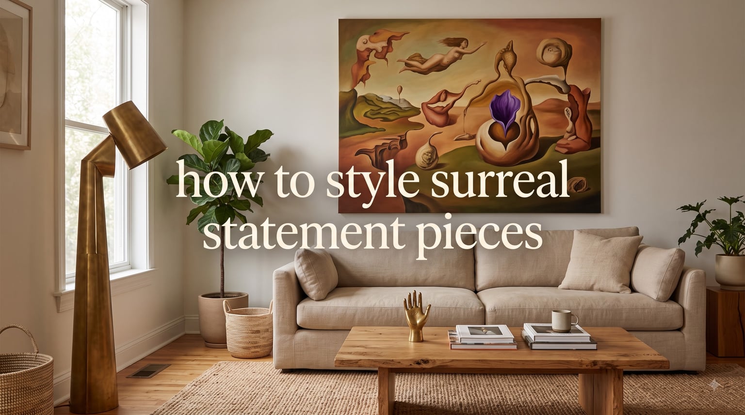
If you’ve ever walked into a room and felt instantly transported somewhere between a dream and a gallery, you were probably standing inside the work of a surreal statement piece. Figuring out how to style surreal statement pieces is the part most guides skip, so we built one that starts with the rules, then walks you room by room. I want your home to feel personal without feeling like a museum diorama, and that balance is exactly what surrealism rewards when you handle it with intention.
After helping our team style three different living spaces (a tiny rental, a craftsman bungalow, and an open-concept loft), I noticed the same handful of rules kept producing the dreamlike atmosphere people wanted without crossing into visual chaos. This guide gathers those rules, plus the room-by-room styling playbook I wish someone had handed me before my first gallery wall attempt.
You’ll learn the core principles that anchor surreal decor, the color palettes that make otherworldly aesthetics actually work in a real home, and the specific moves that turn any room into a conversation starter. By the end, you’ll know exactly how to place, light, and surround surreal wall art and statement furniture so it feels intentional rather than overwhelming.
Table of Contents
What Are Surreal Statement Pieces?
Surreal statement pieces are bold decor items, artworks, or furniture inspired by the surrealist movement that blend reality with the fantastical. They feature dreamlike imagery, unexpected pairings, and whimsical designs, and they earn their place in a room by acting as a focal point and a conversation starter. Think melting clocks reimagined as side tables, cloud-shaped lamps, levitating bookshelves, or a single oversized portrait where the eyes follow you across the room.
The surrealist art movement began in 1924 with André Breton’s manifesto, but its visual DNA shows up in everything from Dali’s dripping clocks to Magritte’s floating apples. When you bring that DNA into your home, you’re borrowing a century of artistic rebellion and asking it to live alongside your couch.
The 7 characteristics of surrealist art give you a checklist for spotting pieces worth the wall space:
- Dreamlike imagery: Scenes that look real until your brain catches the glitch.
- Juxtaposition: Two unrelated objects placed together to spark new meaning.
- Unexpected scale: Ants the size of dogs, doormats the size of rugs.
- Optical illusion: Trompe l’oeil effects that trick the eye into seeing depth or motion.
- Metamorphosis: One object slowly turning into another, like a chair sprouting leaves.
- Dislocation: Objects placed where they “shouldn’t” be, like a piano in a tree.
- Biological surprise: Human features grafted onto furniture, or vice versa.
Notice how many of these hinge on surprise. That’s the secret engine of surreal home decor: it pauses your guests mid-sentence and makes them look twice. The styling challenge, and the heart of how to style surreal statement pieces, is keeping that surprise controlled enough that the room still feels livable.
A “statement piece” earns the title when it dominates a zone visually. In fashion, that might mean a single bold accessory. In interior styling, it usually means one artwork, one sculptural chair, one lamp, or one piece of statement furniture that the rest of the room defers to. Surround it well, and the piece reads as confident and curated. Surround it poorly, and the same object starts to feel like a mistake you keep tripping over.
Core Principles for Styling Surreal Statement Pieces
Seven core principles guide every successful surreal interior I have ever styled. Memorize these before you hang anything, and every decision afterward becomes easier.
1. The 70/30 Rule Anchors Everything
The 70/30 rule in art and decor says roughly 70% of a room should support the artwork, and 30% should be the artwork itself (or visually echo it). If your surreal piece is loud, your walls, sofa, and rug should be quiet. If your surreal piece is a soft dreamlike canvas, your supporting decor can carry a bit more texture. Either ratio works, but you have to commit to one. Splitting the room 50/50 is what makes spaces feel chaotic.
I learned this the hard way with a friend’s living room. She’d hung three massive surreal canvases across one wall and painted the opposite wall lime green. The eye had nowhere to land. We painted the accent wall deep charcoal, dropped the canvases to one large hero piece flanked by two smaller works, and the room finally exhaled.
2. One Focal Point Per Room
A room can survive multiple surreal accents, but only one true focal point. Pick the piece with the most dreamlike imagery or strongest visual impact and let it own the wall, the corner, or the surface it sits on. Everything else becomes a supporting actor. Gallery walls count as a single focal point only when they’re hung as one unified composition, not as a scattered collection.
3. Respect the 2/3 Rule for Wall Art
The 2/3 rule for wall art says your artwork should cover roughly two-thirds of the furniture or wall space beneath it. A surreal canvas hung six inches above a sofa will look like an afterthought. A surreal canvas whose width reaches two-thirds of the sofa below it will look like it was designed for the room. This single measurement fixes more styling mistakes than any other rule I teach.
4. Proportion and Scale Play Off Each Other
Surrealism loves playing with scale, so use that to your advantage. A giant clock face propped against a wall beneath a normal-sized side table creates an immediate visual joke. A tiny surreal sculpture on an oversized pedestal reads as a museum specimen. Lean into scale contrast, but always check proportion against the furniture around it. The rule of thumb: large surreal pieces need at least 30% of surrounding empty space to breathe.
5. Coordinate Color Intentionally
Color is the thread that ties a surreal piece to the room. You can match the dominant color of the artwork to your sofa, echo an accent color in your throw pillows, or pick a complementary hue from the color wheel for contrast. The worst thing you can do is treat color as an afterthought. Even black-and-white surreal photography benefits from a coordinated frame and a tonal rug underneath.
6. Lighting Is Half the Styling
A surreal canvas under flat overhead lighting looks like a poster from a dorm room. The same piece under a directional picture light, a warm floor lamp at 2700K, or a strategically placed spot looks like fine art. Aim lighting across the artwork at a 30-degree angle to reduce glare, and use dimmable bulbs so you can shift the mood from bright gallery to candlelit dream.
7. Leave Breathing Room
Negative space is the invisible frame around your surreal decor. If every wall is covered, every shelf is full, and every surface has a sculptural object, the eye stops knowing where to go. Leave at least one wall mostly bare, one shelf with a single hero object, and one surface completely clear. The contrast is what makes the surreal elements feel like choices instead of clutter.
Color Palette Guidance for Surreal Decor
Color palette is the fastest way to dial up or dial back the dreamlike atmosphere of any room. The three palettes below each create a different mood, and choosing one early prevents the mismatched-eclectic look that derails most surreal interiors.
- Soft Dreamscape — dusty rose, sage green, cream, and soft lavender: Best for bedrooms, reading nooks, and small spaces; mood is whimsical and calming.
- High Contrast Pop — deep purple, neon green, gold, and black: Best for living rooms, home offices, and gallery walls; mood is bold and theatrical.
- Retro Future — burnt orange, teal, brushed silver, and off-white: Best for mid-century homes, lofts, and statement furniture; mood is otherworldly and nostalgic.
Soft Dreamscape works beautifully for anyone nervous about committing to surreal decor. The muted tones whisper instead of shout, and they pair with thrift-store finds and inherited furniture without clashing.
High Contrast Pop is the palette most often associated with classic surrealism. Deep purples, neon greens, and metallics create that dreamlike atmosphere Dalí fans chase. Use it sparingly, in one room or one wall, so the boldness stays intentional.
Retro Future combines mid-century warmth with a sci-fi edge. It pairs naturally with statement furniture like egg chairs, tulip tables, and brass floor lamps. If you already have warm woods and earth tones, this palette slides in without friction.
Whatever palette you choose, repeat at least two of its colors in three places around the room. Repetition is what signals “intentional design” instead of “random objects.”
Room-by-Room Styling Guide
Generic advice is where most guides fail. Different rooms serve different functions, and a surreal piece that thrives in a home office will smother a bedroom. Here’s how to approach each space with confidence.
Living Room
The living room is the natural home for your biggest surreal statement piece. It sees the most guests, and it benefits most from a strong focal point.
- Pick the wall opposite the entry door as your focal wall. Guests see it first.
- Hang one large surreal canvas, or build a tightly edited gallery wall, centered at eye level (about 57 to 60 inches from the floor to the center of the piece).
- Anchor the wall with a sofa whose width is at least two-thirds of the artwork’s total width.
- Add one sculptural object to the coffee table (a melting clock replica, a cloud-shaped vase) and keep everything else low-profile.
- Layer in a textured rug in a neutral tone to ground the dreamlike imagery underfoot.
I’ve watched friends get defensive about wall color here. They want to keep their beige walls. Beige is fine. The 70/30 rule actually makes beige the perfect neutral backdrop for a surreal hero piece.
Bedroom
Bedrooms need calm, so go for softer surreal pieces. Dreamlike photography, gentle metamorphosis imagery, and muted palettes all work. Avoid anything with sharp optical illusions directly across from the bed; your brain keeps processing those even when you’re trying to sleep.
- Place one medium surreal piece above the headboard, sized to about two-thirds of the headboard width.
- Use two matching nightstands with one small surreal accent each (a tiny brass hand holding a sphere, a Dali-inspired clock).
- Layer in soft, dimmable bedside lighting at warm color temperatures (2200K to 2700K).
- Skip the gallery wall here. One or two pieces maximum keeps the room restful.
Entryway
The entryway is the highest-impact, lowest-square-footage room in your home. It’s where one small surreal statement piece can punch far above its weight.
- Hang one eye-catching surreal canvas or sculptural mirror at eye level on the wall guests face when they walk in.
- Use a narrow console table for a single sculptural object (a brass ear, a melting candelabra, a vintage typewriter painted in unexpected color).
- Add a runner rug in a complementary color to pull the look down to the floor.
- Skip overhead fluorescents. A single warm pendant or a pair of sconces frames the moment of arrival.
Home Office
Surreal decor in a home office signals creativity without sacrificing function. The trick is choosing pieces that energize you without distracting you during deep work.
- Place one bold surreal canvas where it lands in your peripheral vision, not directly behind your monitor.
- Use a small surreal sculpture on your desk as a focal point during video calls.
- Pick a piece that includes a color from your brand palette if you take client calls. It quietly reinforces your identity.
- Balance with a clean desk surface. Maximum one or two supporting objects.
Small Spaces and Apartments
Surreal art actually works better in small spaces than most people expect, because the intimacy amplifies the dreamlike quality. The risk is overcrowding, so follow these rules:
- Choose one hero piece per room, never more.
- Use vertical wall space aggressively. Floor-to-ceiling surreal canvas behind the sofa creates the illusion of higher ceilings.
- Lean art on shelves instead of hanging it. A surreal canvas propped against the wall at a 5-degree angle reads as intentional and saves precious wall real estate for functional items.
- Pick multi-functional surreal furniture (a side table shaped like a tree, a storage ottoman printed with optical illusions).
- Mirror the surrealism. A surreal-framed mirror doubles the art and doubles the perceived square footage.
Mixing Surreal Art With Existing Decor Styles
Forum readers often worry that surreal decor will clash with their existing furniture. In practice, surreal pieces play surprisingly well with most styles when you control the supporting cast:
- Minimalist: Surreal art becomes the single allowed exception to your “less is more” rule. One piece per room.
- Traditional: Pick surreal pieces with classic frames or vintage textures. The juxtaposition of an old frame around dreamlike imagery is itself surreal.
- Maximalist: Group three to five smaller surreal pieces in a tight cluster and let them compete a little. Keep surrounding colors coordinated so the cluster still reads as one composition.
- Mid-century modern: Surreal furniture in walnut, brass, and burnt orange slides into the existing palette naturally.
Common Mistakes to Avoid When Styling Surreal Art
These five mistakes come up in nearly every conversation I have about surreal home decor. Avoid them, and you’ll be ahead of 90% of DIY stylists.
Mistake 1: Hanging Art Too High
Surreal canvases hung near the ceiling look disconnected from the furniture below them. The center of the piece should sit 57 to 60 inches from the floor, or roughly at average eye level. If your piece is small and your ceiling is tall, consider hanging it slightly lower so it reads as intimate rather than lost.
Mistake 2: Ignoring Scale and Proportion
A tiny surreal print on a vast empty wall disappears. An enormous surreal canvas crammed above a narrow chair overwhelms. Use the 2/3 rule: the artwork should occupy about two-thirds of the furniture or wall space beneath it. When in doubt, go bigger.
Mistake 3: Bad Lighting
Flat overhead lighting washes out the dreamlike quality of surreal imagery. Add directional lighting, picture lights, or warm floor lamps to bring the art back to life. If the lighting in your room cannot be adjusted, reconsider the room before reconsidering the art.
Mistake 4: Clashing Styles Without Intent
One surreal piece in a room full of farmhouse chic reads as a mistake. Three surreal pieces in a room with a clear color palette read as a deliberate theme. Decide whether you’re curating one accent or one full mood, then commit to that decision.
Mistake 5: Forgetting the Room’s Function
A surreal piece that energizes a home office might overstimulate a bedroom. Always ask: what happens in this room, and does the artwork support that activity? Calm dreamscape palettes work in rest spaces. High contrast pop palettes work in social and creative spaces.
Bonus Mistake: Ignoring Guest Comfort
Forum readers occasionally worry about bold or unsettling art making guests uncomfortable. The fix is usually simple: balance the bold piece with familiar textures (a soft throw, a woven rug, a houseplant) so the room feels warm overall. One conversation starter is memorable. Three competing for attention is exhausting.
Frequently Asked Questions
What is the 70/30 rule in art and decor?
The 70/30 rule in art and decor means roughly 70% of a room should support the artwork and 30% should be the artwork itself, or visually echo it. It keeps bold surreal pieces from competing with busy surroundings and ensures the statement piece remains the focal point.
What are the 7 characteristics of surrealist art?
The 7 characteristics of surrealist art are dreamlike imagery, juxtaposition of unrelated objects, unexpected scale, optical illusion, metamorphosis, dislocation, and biological surprise. Spotting these in a piece is a quick way to confirm it qualifies as surreal decor.
What is the 2/3 rule for wall art?
The 2/3 rule for wall art says your artwork should cover roughly two-thirds of the furniture or wall space beneath it. It prevents small art from looking lost and large art from feeling crammed, which is especially helpful when hanging surreal canvases above sofas, beds, or consoles.
What are the best ways to display artwork in my home?
The best ways to display artwork in your home are to hang one hero piece per room at 57 to 60 inches to the center, build a tight gallery wall with two to four inches between frames, lean art on shelves for a casual look, and use directional lighting to make the imagery come alive.
What colors work best with surreal decor?
The colors that work best with surreal decor fall into three core palettes: Soft Dreamscape (dusty rose, sage, cream), High Contrast Pop (deep purple, neon green, gold), and Retro Future (burnt orange, teal, brushed silver). Choose one palette and repeat at least two of its colors in three places around the room.
How do I avoid overwhelming a room with surreal art?
You avoid overwhelming a room with surreal art by following the 70/30 rule, choosing one focal point per room, leaving at least one wall mostly bare, and balancing bold pieces with familiar textures like soft throws, woven rugs, and houseplants so the room feels warm overall.
Final Thoughts
Learning how to style surreal statement pieces comes down to a few repeatable rules: commit to a focal point, respect the 70/30 balance, measure with the 2/3 rule, choose a coordinated color palette, and leave enough breathing room for the dreamlike atmosphere to land. The surrealism does the heavy lifting once you’ve set the stage.
Start with one room and one piece. Hang it at 57 inches to the center, light it from a 30-degree angle, and let the rest of the room stay quiet. You’ll know within a day whether the piece feels right, and you’ll be surprised how often a single bold choice transforms the whole space. Once you’ve seen it work, the next room gets easier.