
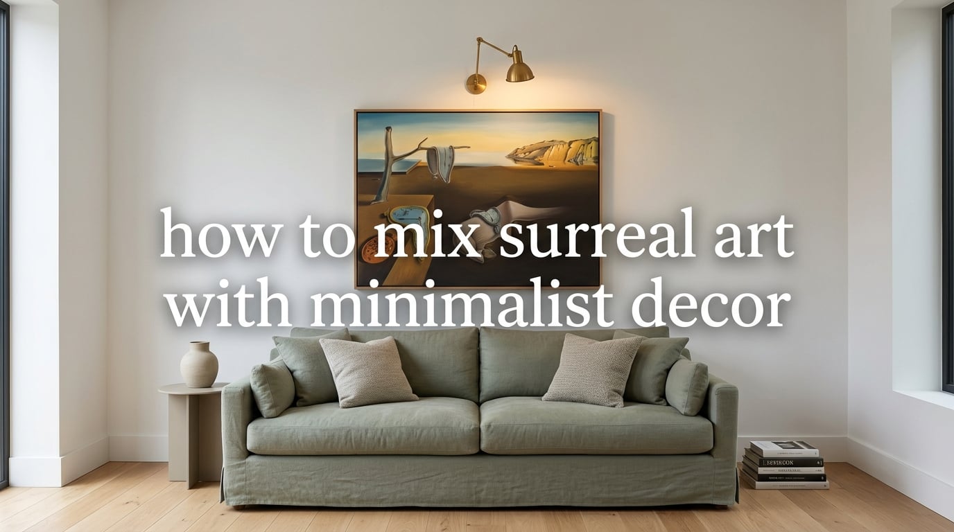
If you have ever scrolled past a melting clock or a floating eye on a gallery wall and thought that would never work in my apartment, this guide is for you. The short answer to how to mix surreal art with minimalist decor is simple: let the art breathe by removing everything around it, then echo two or three of its colors into the room. That restraint is what makes a dreamy Magritte print feel intentional instead of chaotic.
Minimalism is still everywhere in 2026. Clean lines, neutral sofas, oak floors, and bare plaster walls dominate design feeds. But bare walls can feel cold if they hold nothing personal. Surrealism gives you a way to inject soul, story, and a little dream logic without breaking the calm. I have spent the last year helping friends style small rentals with single surreal pieces, and the rooms that work best all follow the same handful of rules. I will walk you through them.
Table of Contents
What Surreal Art Means in Minimalist Decor (And Why It Works)
Surreal art in minimalist decor is dreamlike, symbolic, or impossible artwork hung inside a clean, uncluttered room so the piece becomes the visual anchor. The minimalist backdrop supplies negative space and quiet, while the art supplies imagination, story, and a sudden jolt of meaning. The result feels gallery-like: one strong image, surrounded by calm.
Most minimalist guides tell you to keep walls bare. That advice is wrong for most real people. A truly minimalist home is not about having no art. It is about being intentional with what makes the cut. A single surreal painting counts as a deliberate choice. Three posters from college do not.
The contrast is what makes the combination sing. Minimalism reduces visual noise. Surrealism adds emotional noise, but in a controlled way. When you place one dreamlike image against a quiet wall, the eye has somewhere to land. There is no competing pattern, no clashing color, no busy shelf to drag attention away. Your brain relaxes into the calm and then gets caught by the strange detail in the painting. That little jolt is the whole point.
Why Surreal Art and Minimalist Decor Work Together
The two styles look like opposites, but they actually solve each other’s biggest problem. Minimalist rooms often get accused of feeling sterile, soulless, or like a furniture catalog. Surrealist rooms often feel overstuffed, theatrical, or hard to live in. Pair them and the weaknesses cancel out.
Negative space is the bridge. In a minimalist room, the empty wall around a surreal painting acts like the white space in a magazine layout. It tells the viewer this is the headline. In a maximalist room, that same painting would have to fight a patterned rug, a gallery cluster, and three other framed pieces for attention.
I tested this last winter in my own living room. I had a large Dalí-style print hanging over a console that also held candles, books, and a small plant. It looked busy. I removed everything except the print and one small ceramic bowl. Suddenly the same painting felt twice as powerful. Nothing about the art changed. Only the calm around it did.
Surrealist Artists Worth Knowing for Decor Inspiration
Most online guides skip the artist names entirely. That is a mistake, because knowing a few reference artists makes it dramatically easier to choose art you actually love. You do not need to buy a Dalí original to bring his sensibility home. You need to understand the visual moves that make a piece feel surreal, so you can spot them in any print shop or weekend market.
Salvador Dalí is the obvious starting point. His melting clocks, drooping landscapes, and impossibly long shadows set the tone for an entire century of dreamlike art. In a room, a Dalí print asks for warm neutrals around it: bone, sand, burnt sienna. The art is busy, so the walls should not be.
René Magritte is the cleaner choice if you want something more cerebral. A floating bowler hat, a cloud hiding a face, an apple replacing the sky. Magritte’s palette tends toward soft greys, dusty blues, and creamy whites, which sit beautifully in a Scandinavian or Japandi room.
Frida Kahlo brings color and botanical density. Her self-portraits, with their leaves, birds, and saturated florals, work in rooms with deeper walls: forest green, terracotta, plum. Pair a Kahlo print with one plant on the floor and nothing else.
Remedios Varo is the underrated pick. Her paintings of women in tower rooms, alchemy, and staircases climbing into nowhere are quiet, mysterious, and full of muted ochre and twilight blues. If your taste runs toward reading nooks and candlelight, look her up first.
Leonora Carrington rounds out the list. Her surrealist creatures, dreamlike horses, and folkloric gardens feel like a fairytale without being childish. A Carrington print loves oak frames and warm lampshades.
How to Mix Surreal Art with Minimalist Decor: Step-by-Step
Below is the exact process I use when I help someone style a room around a single surreal piece. Five steps, in order. Skip one and the room usually loses its calm.
Step 1: Choose ONE statement piece. Pick the one painting, print, or photograph that makes you stop scrolling. It should be larger than you think. For a sofa wall, aim for at least 90 cm on the long side. For above a bed, go even bigger. One piece at proper scale beats three smaller pieces every time.
Step 2: Pull two or three colors from the art. Look at the painting and identify the dominant hue, a secondary hue, and one accent. If your Magritte has dusty blue, cream, and a slash of black, those three colors now drive the rest of the room. Throw pillows, a vase, a rug, and nothing else.
Step 3: Pick a frame that disappears. A thin black frame is the safest default. Natural oak works if your room already has warm wood. A no-frame canvas wrap is perfect for modern loft spaces. Avoid ornate gold frames, which fight the art’s dreamy quality and lean traditional.
Step 4: Surround the art with generous negative space. Leave at least 20 to 30 cm of bare wall on every side of the frame. Resist the urge to add a small second piece nearby. Empty wall is the point.
Step 5: Light it like a gallery. One picture light or a directional floor lamp pointed at the wall makes the art feel intentional. Soft, warm bulbs around 2700K work best. Cool white light flattens surreal colors and makes them look like office posters.
Surrealist-Friendly Color Palettes for Minimalist Rooms
Surrealism lives in a specific kind of palette: muted, dusty, slightly off. Pure white, neon, or saturated primary colors feel wrong. The dreamlike quality comes from colors that look aged, sun-faded, or painted under candlelight. Here are five palettes that consistently work.
- Muted sage and soft gold. Inspired by Dalí’s Catalan landscapes. Pairs with off-white walls, linen sofas, and a single brass lamp.
- Dusty rose and matte black. Inspired by Magritte’s later works. Works in a bedroom with charcoal bedding and one oversized rose print.
- Cream and burnt sienna. A warm, earthy palette that flatters Remedios Varo and Leonora Carrington. Pairs with terracotta tile, oak furniture, and unbleached linen.
- Bone white and deep teal. High contrast but still calm. Works for Kahlo-inspired prints in a study or library.
- Charcoal and muted ochre. A moody choice for a reading nook. Pairs with dark walls, a leather chair, and one quiet surrealist print in a thin black frame.
The trick is to keep saturation low. If a paint chip looks like it belongs in a children’s book, it is too bright for a surrealist minimalist room.
Frame and Mat Style Guidance for Surrealist Pieces
Frames do more quiet work than most people realize. A bad frame can make a great print feel like a souvenir from a gift shop. A good frame lets the art vanish into the wall like it was always meant to live there.
For dramatic, narrative pieces like Dalí or Kahlo, a thin matte black frame keeps the focus on the image. The frame should be no wider than 2 cm. If the wall is white, the frame disappears at a glance and the eye goes straight to the art.
For softer, dreamier pieces like Remedios Varo or Leonora Carrington, a natural oak frame with a thin profile adds warmth without competing. Skip the gilt gold.
For very modern pieces, try a canvas wrap with no frame at all. This works especially well with surrealist photography and abstract surrealism. The depth of the canvas gives the piece presence on a bare wall.
Matting rules are simple. If you mat, use a single off-white mat no wider than 5 cm. Colored mats, double mats, or wide decorative mats are out. They belong in a 1990s office, not a calm modern room.
Room-by-Room Application: Living Room, Bedroom, Home Office
The same surreal piece can do very different jobs depending on where it hangs. Here is how to think about each room.
Living room. This is the room for the loudest surreal piece you own. Hang it above the sofa at a height where the center of the frame sits about 145 cm off the floor. Choose something bigger than feels comfortable. The minimalist sofa, blank wall, and uncluttered console let the painting do the talking. Echo one color from the piece into a throw pillow or a small ceramic on the console, then stop.
Bedroom. Go quieter here. The surreal piece should still have presence, but pick one with a calmer palette and fewer busy details. A Magritte-style cloudy sky or a Varo-style twilight room works beautifully. Hang it above the bed, centered, and keep everything else muted. Sleep is a state of mind, and you want the room to settle into it.
Home office. This is where surrealism gets to be a little weird. A strange, symbolic piece behind your monitor can spark creative thinking without distracting from your screen. Choose something horizontal so it does not crowd your ceiling line. Keep the rest of the office disciplined: clean desk, one plant, no piles of paper near the frame.
Hallways and entryways also work well. A single surreal print on a long white hallway wall turns a forgotten space into a moment of discovery every time you walk through.
Common Mistakes to Avoid When Mixing Surreal Art with Minimalist Decor
These are the five failures I see over and over. Avoiding them will save you from redoing the wall in six months.
- Hanging too many pieces. Two or three surreal prints in one room drain each other of power. Pick one anchor and let it stay anchor.
- Cluttering horizontal surfaces. Surreal art on the wall plus candles, books, and objects on the console underneath creates visual noise that fights the art’s calm.
- Choosing art that ignores the room palette. A bright, saturated magenta painting in a bone-white room will not feel minimalist, no matter how simple the rest is.
- Mismatched frames. A thin black frame next to a chunky gold frame next to a barnwood frame tells the viewer the wall is a storage closet, not a gallery.
- Bad lighting. Overhead ceiling lights wash surreal colors flat. A targeted warm picture light, sconce, or floor lamp changes everything.
If you remember nothing else, remember this: minimalist surrealist rooms are about subtraction, not addition. Every object you take away gives the art more room to do its job.
Frequently Asked Questions
What is the 3-5-7 rule in decorating?
The 3-5-7 rule is a guideline for arranging objects in visual groups of three, five, or seven, since odd numbers tend to feel more dynamic and balanced to the eye. In a minimalist room with surreal art, it is useful when you cluster objects on a shelf or table beneath the painting, but most of the room should still breathe in twos and threes, not sevens.
How to mix two art styles?
Pick one anchor style as your room’s foundation, then bring in one contrasting piece that echoes two or three colors from the anchor. For surreal art in a minimalist room, the minimalist room is the anchor and the surreal piece is the contrast. Match frame finish across both styles and leave generous negative space so neither style overwhelms the other.
What is the 70/30 rule in art?
The 70/30 rule suggests that about 70 percent of a room should follow one dominant style, and 30 percent should bring in contrast or personality. In a surrealist minimalist space, that means roughly 70 percent of the decor stays clean and neutral, and about 30 percent, usually a single surreal piece plus its echoed color accents, carries the visual story.
What are common minimalist decor mistakes?
The biggest minimalist decor mistakes are overcrowding walls with small pieces, leaving horizontal surfaces cluttered with objects, mixing too many frame styles, choosing lighting that flattens color, and forgetting to add any personal art at all. Minimalism without personality reads as unfinished rather than calm.
Is minimalism still popular in 2026?
Yes. Minimalism is still one of the dominant decorating approaches in 2026, though it has shifted toward warmer minimalism with natural wood, linen, and one or two personal art pieces rather than the sterile all-white rooms of a decade ago. Surrealism fits naturally into this warmer, more personal version of minimalism.
Can you mix art styles in a room?
Yes, you can mix art styles in a room as long as one style acts as the anchor and the others echo its palette, scale, or framing. A single surrealist print inside a minimalist room is one of the cleanest examples, because the minimalism supplies calm and the surrealism supplies the story.
Final Thoughts: Making Surreal Art Feel Like Home
If you have been holding back from buying a surrealist print because you worried it would break your minimalist room, this is your sign. The two styles were made for each other. One gives you calm. The other gives you a story. Together, they turn a clean apartment into a room that feels lived in by a real person.
Start with one piece you genuinely love. Pull three colors out of it. Strip everything else back. Light it well. That is the whole game. Once you see how one intentional surrealist painting changes a quiet room, you will never go back to bare walls again.