
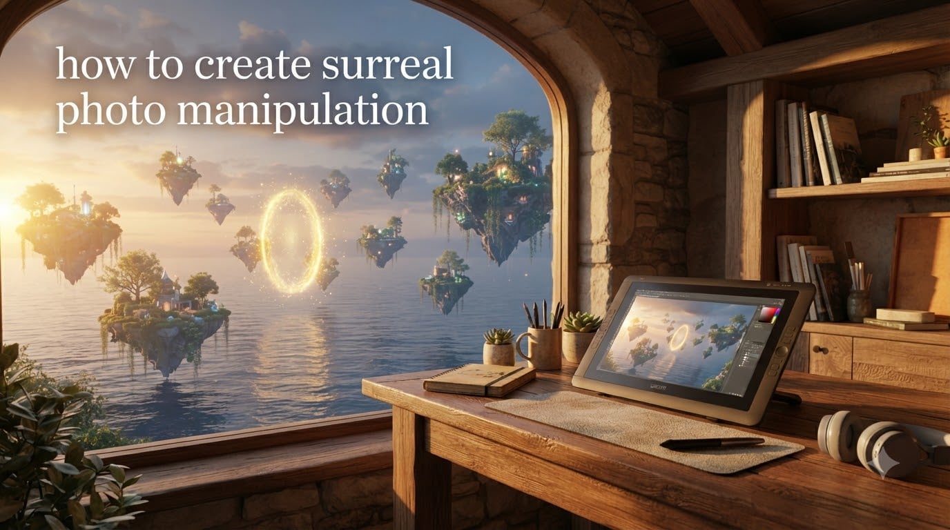
Surreal photo manipulation is the art of combining and altering photographs in software like Photoshop to create dreamlike, impossible scenes that look believable. You start with a concept, gather source photographs, cut subjects out with layer masks, blend them with adjustment layers and blending modes, then match lighting, shadows, and color across every element so the final composite feels like a single photograph of an impossible scene.
If you have ever wanted to turn an imaginative concept into a believable finished image, this guide walks you through the complete process. From choosing the right tools to matching lighting across multiple photos, I will cover the techniques that separate obvious composites from genuinely surreal artwork.
Table of Contents
What Is Surreal Photo Manipulation?
Surreal photo manipulation combines photography and digital editing to produce images that depict impossible, dreamlike, or irrational scenes. The roots trace back to surrealism as an art movement, formally launched by André Breton’s 1924 Manifesto of Surrealism, which sought to unlock the creative potential of the unconscious mind. Artists like Salvador Dalí and René Magritte pioneered the visual language of impossible juxtapositions that digital artists now recreate with software.
A surreal composite typically features recognizable real-world elements arranged in unexpected ways. Think of floating islands, miniature people walking across a table, or oceans suspended in midair above a city street. The goal is not random chaos but rather a coherent scene that feels emotionally resonant even though it defies physical laws.
Surreal photo manipulation serves many purposes today. It is a foundational skill for concept art, advertising, book covers, fine-art surreal photography, and social media content. The rise of AI tools like Adobe Generative Fill has made it more accessible than ever, but understanding the core Photoshop techniques remains essential for creating polished, believable results.
Tools and Software for Surreal Photo Manipulation
Adobe Photoshop remains the industry standard for surreal photo manipulation. It offers the most complete set of compositing tools including layer masks, blending modes, adjustment layers, perspective warp, and content-aware fill. If you are serious about surreal work, a Photoshop subscription is worth the investment.
However, you do not need Photoshop to get started. Several capable alternatives exist at different price points:
GIMP (Free) — Open-source editor with layer masks, blending modes, and most compositing tools Photoshop offers. The learning curve is steeper, but it handles surreal projects well.
Affinity Photo — A one-time purchase alternative with non-destructive editing, advanced selection tools, and a dedicated compositing persona.
Procreate (iPad) — Excellent for hybrid illustration-photography surreal work, especially when you want to paint directly over photographs.
Pixlr (Browser-based) — Free online editor suitable for basic compositing when you need a quick result without installing software.
Adobe Generative Fill, available in Photoshop, has changed the workflow for beginners. You can use it to extend backgrounds, remove unwanted elements, and even generate new surreal objects that blend into your scene. It handles many tedious tasks that once required advanced painting skills.
For source images, you will need stock photos. Unsplash, Pexels, and Pixabay offer free high-resolution images suitable for compositing. Always check the license terms and credit artists when required. If you plan to sell or exhibit your surreal work commercially, paid stock from Adobe Stock or Shutterstock provides stronger legal protection.
How to Create Surreal Photo Manipulation: Step-by-Step Workflow
This seven-step workflow covers the process from initial concept to finished image. Each step builds on the previous one, so work through them in order even if you are tempted to skip ahead.
Step 1: Develop Your Concept
Before opening any software, sketch out your idea. A rough pencil drawing or a mood board collected from references works perfectly. Ask yourself: what emotion do I want the viewer to feel? What is the central impossible element? How will the scene be composed?
Professional surreal artists like Erik Johansson plan extensively before shooting. He creates physical props and miniature sets, then photographs them knowing exactly how the final composite will look. You do not need to go that far, but having a clear concept saves hours of aimless editing later.
Step 2: Gather and Photograph Source Images
Collect every photograph you will need for the composite. This includes your main subject, background, any additional elements, and textures. When shooting your own photos, try to match the lighting direction and quality across all shots. Photographing near a window at the same time of day helps maintain consistency.
If using stock photos, pay attention to the angle, lighting direction, and resolution of each source. Mismatched perspective or lighting direction is one of the most common reasons composites look obviously fake. Reddit photography communities consistently advise studying color theory and lighting fundamentals before diving into technical Photoshop tricks.
Step 3: Cut Out Subjects with Layer Masks
Open your base image in Photoshop and place your additional elements as separate layers. Use the Pen Tool, Select and Mask, or the Quick Selection Tool to create precise selections around each subject. Always convert selections to layer masks rather than deleting pixels permanently.
Layer masks give you non-destructive editing. You can refine edges at any time without losing original image data. For soft edges like hair, use Select and Mask with the Refine Edge Brush Tool. For hard edges like buildings or products, the Pen Tool creates the cleanest paths.
Step 4: Blend Elements with Blending Modes
Blending modes control how each layer interacts with the layers below it. The five most useful modes for surreal compositing are:
Multiply — Darkens. Useful for shadows and dark textures.
Screen — Lightens. Perfect for adding light effects, fog, or glow.
Overlay — Increases contrast. Great for adding texture overlays.
Soft Light — Gentle contrast. Ideal for subtle texture and atmosphere.
Color Dodge — Intense lightening. Creates dramatic highlight effects.
Do not feel overwhelmed by Photoshop’s 27 blending modes. Start with these five and you will handle 90 percent of surreal compositing situations. Adjust opacity on each blended layer to control intensity.
Step 5: Match Lighting and Shadows
This is where most beginners struggle. Every element in your composite must share the same light source direction, shadow angle, and light quality. If your background light comes from the upper left, every floating object and added subject must cast shadows toward the lower right.
Create a new layer set to Multiply blending mode and paint soft black shadows using a low-opacity brush. For highlights, create a layer set to Screen or Color Dodge and paint with white or a warm tone. Match the shadow hardness and softness to your reference photos. Shadows closer to objects are sharper; shadows farther away become softer and more diffuse.
Step 6: Apply Color Grading
Color grading unifies elements from different source photos into one cohesive mood. Use adjustment layers for non-destructive color work:
Curves — Adjust the S-curve for contrast. Push highlights up and pull shadows down for a cinematic look.
Color Balance — Shift highlights toward warm tones and shadows toward cool tones (or vice versa) to create mood.
Hue/Saturation — Desaturate or boost specific color channels to unify the palette.
Gradient Map — Apply a duotone or tritone color scheme across the entire image for dramatic effect.
Place adjustment layers above all your composite elements and set them to affect all layers below. This ensures every element receives the same color treatment.
Step 7: Final Adjustments and Export
Add atmospheric effects like fog, particles, or light rays using Screen blending mode layers. Apply a subtle vignette to draw the eye toward your focal point. Sharpen the final composite with a High Pass filter set to Overlay at reduced opacity.
Export your finished piece as a high-quality JPEG for web display or a TIFF for print. Save the layered PSD file so you can return and make changes later. Creating surreal photo manipulation takes patience, and you will often revisit earlier steps as you refine the image.
Essential Photoshop Techniques for Surreal Effects
Beyond the basic workflow, several specific techniques appear repeatedly in professional surreal work. Mastering these will dramatically improve your composites.
Layer Masks and Clipping Masks
Layer masks hide portions of a layer without deleting them. Paint with black to hide, white to reveal, and gray for partial transparency. Clipping masks restrict a layer’s visibility to only the pixels of the layer below it, making them perfect for adding textures to specific objects or applying adjustment layers to single elements rather than the entire image.
Transform and Distort
Use Edit > Transform > Distort to adjust perspective on placed elements so they match your background. The Perspective Warp tool (Edit > Perspective Warp) lets you define planes in your scene and reshape elements to match perspective lines. This is essential when combining photos shot from different angles.
Channel Mixer and Gradient Maps
The Channel Mixer adjustment layer lets you remix color channels for unique color effects. A gradient map applied to a Soft Light layer creates instant mood shifts. These two tools, combined with Curves, form the backbone of surreal color grading.
Content-Aware Fill and Generative Fill
Content-Aware Fill (Edit > Content-Aware Fill) intelligently removes unwanted objects from your source photos. Adobe Generative Fill goes further by generating new content based on text prompts. Use it to extend backgrounds, fill gaps, or create surreal elements that blend naturally into your scene.
Matching Lighting, Shadows, and Color Across Elements
Lighting consistency separates believable composites from obvious cutouts. Every element must appear to exist in the same physical space under the same lighting conditions. This requires paying attention to three factors: light direction, shadow behavior, and color temperature.
Light direction determines where highlights and shadows fall on each object. Before you start compositing, identify the dominant light source in your background image. Note its angle relative to the scene. Then ensure every added element has highlights and shadows matching that direction.
Shadow behavior follows predictable rules. Contact shadows (where an object touches a surface) are sharp and dark. Cast shadows become softer and lighter as they move away from the object. Ambient occlusion creates subtle darkening in crevices and corners where light has difficulty reaching. Replicating these three shadow types makes a significant difference in realism.
Color temperature unification is the third critical factor. Source photos often have different white balance settings, creating a warm-cool mismatch that makes composites feel disjointed. Use Curves or Color Balance adjustment layers to match the color temperature of each element to your background. A common technique from Reddit compositing communities involves converting everything to black and white first, matching contrast levels with per-object Curves layers, then applying color grading on top.
Common Beginner Mistakes and How to Fix Them
Even experienced editors fall into these traps. Recognizing them early saves significant frustration.
Hard, obvious edges around masked subjects — The classic “cut-out look” happens when layer masks have sharp, unnatural edges. Fix this by feathering your mask edges slightly (Select and Mask > Feather) and using the Refine Edge Brush for hair and fur. Subtle edge blur makes objects feel like they belong in the scene.
Ignoring shadow direction — Placing a shadow pointing the wrong direction instantly breaks the illusion. Draw a light direction arrow on a reference layer and check it frequently as you work. Every shadow in your composite should align with that arrow.
Color cast mismatch — Combining warm-toned subjects with cool-toned backgrounds creates visual dissonance. Use the Match Color command (Image > Adjustments > Match Color) as a starting point, then fine-tune with Color Balance adjustment layers.
Wrong perspective or scale — A person photographed from above placed into a scene shot from below looks immediately wrong. Pay attention to the camera angle in each source photo and use Transform > Distort to correct perspective before blending.
Over-editing — Pushing saturation, contrast, and effects too far creates an obviously processed look. Pull back to about 70 percent of what you think looks good. Subtlety makes surreal composites feel more dreamlike and less cartoonish.
Surreal Photo Manipulation Ideas to Try
If you are ready to practice, these techniques produce striking results and teach fundamental skills along the way.
Double Exposure
Overlay a portrait with a landscape or texture using Screen or Lighten blending mode. The result merges two subjects into one ethereal image. This technique teaches you about blending modes and masking in a forgiving format since there is no “correct” result.
Faceless Portraits
Replace or obscure a subject’s face with objects, textures, or other imagery. Artists like Natalia Seth have built entire portfolios around this concept. It teaches precise masking around complex shapes like hair and ears.
Magic Portals
Create a doorway, mirror, or window that reveals a different world on the other side. This is excellent practice for matching perspective lines between two separate scenes and creating smooth transitions between realities.
Floating Objects
Place everyday objects in impossible positions: chairs suspended in clouds, books flying through a storm, fish swimming through city streets. You will practice shadow creation and lighting consistency with every element you add.
The Droste Effect
Create an image that contains a smaller version of itself, which contains an even smaller version, and so on. This recursive effect uses smart objects and transform tools to achieve its hypnotic result.
Surreal Landscapes
Combine different environments into one impossible scene: a desert meeting an arctic glacier, a forest growing upside down from the sky, or a city floating above the clouds. Artists like Erik Johansson specialize in this style and are excellent references for studying compositing precision.
Hybrid Illustration-Photography
Combine photographed elements with hand-drawn or digitally painted illustrations. Procreate on iPad works particularly well for this style. Paint surreal additions directly onto your photograph to create a mixed-media effect.
Frequently Asked Questions
How to make a surreal photo in Photoshop?
Open a background image, place additional elements as separate layers, cut out subjects using layer masks, blend with blending modes like Multiply and Screen, then match lighting and color using adjustment layers. The key is ensuring every element shares the same light direction, shadow angle, and color temperature for a cohesive result.
How to make photo manipulation in Photoshop?
Start by gathering source photographs with matching lighting and resolution. Cut subjects out using Select and Mask or the Pen Tool, convert selections to layer masks for non-destructive editing, composite elements on separate layers, then unify the scene with Curves, Color Balance, and Hue/Saturation adjustment layers.
How to make a photo look surreal?
Introduce impossible elements like floating objects, scale changes, or scene blending. Use blending modes to merge photos, layer masks to create seamless transitions, and color grading to set a dreamlike mood. Even simple techniques like double exposure or adding fog can make a standard photo feel surreal.
Can you give me some examples of surreal photography?
Notable surreal photographers and digital artists include Erik Johansson, who creates impossible landscapes from hundreds of composite photos; Brooke Shaden, known for emotionally charged fine-art surrealism; and Tommy Ingberg, whose minimalist black-and-white composites explore psychological themes. Historical influences include Salvador Dalí and René Magritte.
Conclusion
Learning how to create surreal photo manipulation is a journey that rewards patience and experimentation. Start with a simple concept, master the seven-step workflow, and gradually add advanced techniques like Generative Fill and hybrid illustration to your toolkit. Every surreal artist develops a unique style through practice, and your first composite does not need to be perfect. Pick one idea from this guide, gather your source photos, and start building something impossible today.