
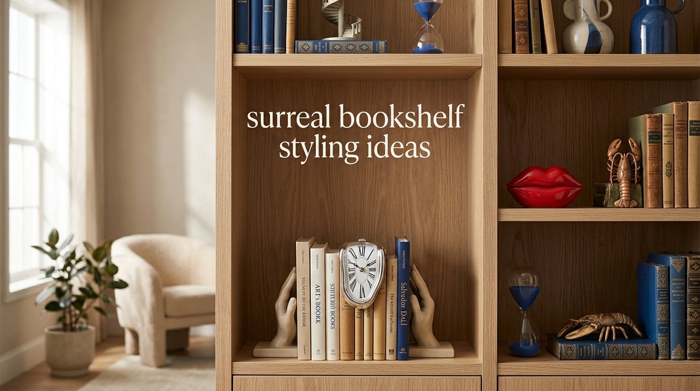
Surreal bookshelf styling ideas turn ordinary shelves into dreamlike vignettes that feel plucked from a Magritte painting or a Dalí dreamscape. I started experimenting with this look after visiting the Edward James Foundation at West Dean, and the lesson stuck: a bookshelf can be functional storage and a piece of art at the same time.
In this guide, I’m sharing the surrealist principles I use in my own home, plus the object categories that consistently make shelves feel playful, intentional, and a little uncanny. You’ll get the rule of three, scale variation, surreal object ideas, room-by-room guidance, and answers to the most common questions I hear from readers.
Table of Contents
Core Styling Principles for Surreal Bookshelves
Surreal styling starts with classic shelf composition, then bends the rules just enough to feel strange and wonderful. These seven principles are my non-negotiables before I place a single object.
Embrace the rule of three
The rule of three in shelf styling means grouping decor in odd numbers, especially three, because odd clusters read as more visually interesting and natural to the eye. A single melting clock propped between two stacked art books creates tension that two or four objects never do.
Layer objects in front of books
Layering is what separates a styled shelf from a storage shelf. Place taller items toward the back, medium objects in the middle, and a low accent piece in front. On my own shelves, I keep one small surreal figurine permanently in the foreground as a focal anchor.
Vary scale dramatically
Surrealism loves scale play, where something tiny sits next to something massive. Pair a five-inch ceramic lobster with a tall stack of oversized art books. The size jump is what makes the eye linger.
Leave real negative space
Negative space is the empty breathing room that lets each object matter. I leave at least 30 percent of every shelf open. Crowded shelves kill the dreamlike feeling because nothing reads as surprising.
Mix symmetry and asymmetry on purpose
Anchor one side of a shelf with a pair of candlesticks or bookends, then break the symmetry with a single surreal sculpture in the middle. The balance feels intentional rather than rigid.
Repeat a motif sparingly
One surreal element per shelf reads as a deliberate surprise. Five surreal objects on the same shelf reads as a gift shop. I treat surreal decor like a punctuation mark, used for emphasis, not the whole sentence.
Edit ruthlessly, then edit again
I photograph every styled shelf before declaring it done. Photos catch the imbalance my eye misses in person. Reddit decorators on r/HomeDecorating call this the “screenshot test,” and it’s saved me from clutter more times than I can count.
Surreal Object Ideas to Anchor Your Shelves
The right objects make the surrealist language legible. Below are the categories I keep returning to, with examples for every budget.
Melting clocks and warped timepieces
The melting clock is the universal symbol of surrealist design, made famous by Dalí’s The Persistence of Memory. A small silicone melting clock propped against a row of philosophy books instantly sets the tone. Look for them in soft pastel tones to keep the look playful rather than heavy.
Lips-shaped and Mae West objects
Sculptural lips, lips-shaped sofas, lip motifs on vases or boxes all reference the surrealist fixation on the human body as furniture. A glossy red lip-shaped trinket box on a stack of fashion books is one of my favorite conversation pieces.
Lobster motifs and crustacean art
From Dalí’s lobster telephone to contemporary ceramic lobsters, the sea creature keeps surfacing in surreal interiors. A small brass lobster paperweight beside a stack of cookbooks reads as wit, not kitsch.
Sculptural bookends
Bookends are the easiest place to inject surreal character without committing to a full theme. Look for bookends shaped like hands, melting forms, animal hybrids, or single eyes. I swapped my plain brass bookends for a pair of porcelain hands last year, and the shelf instantly felt intentional.
Optical illusion art and trompe l’oeil prints
Small framed prints of impossible architecture, levitating objects, or Magritte-style floating bowler hats add depth without taking up surface area. Lean them against taller books rather than hanging them, which keeps the shelf feeling relaxed.
Whimsical figurines and oddities
Curio cabinets exist for a reason. Tiny bronze deer, ceramic frogs in suits, glass eyeballs, and taxidermy-style butterflies all read as surrealist when paired with serious hardcovers. The juxtaposition is the entire point.
Lobster telephones, bird cages, and conversation-piece oddities
Save the boldest objects for the room’s focal shelf. A vintage birdcage, a small bust with a missing nose, or a telephone with the receiver attached to a lobster (a faithful Dalí replica is widely available) becomes the shelf’s anchor. Keep surrounding objects quiet so the oddity can speak.
Books as the Foundation With a Surrealist Twist
Books aren’t just storage in a surreal styled shelf. They are color, texture, and pattern that anchor the dreamlike objects around them.
Color-block the spines
Pulling books by color rather than genre is the fastest way to make a shelf look curated. For surreal styling, I lean into bold groupings: a row of acid-green spines beside a row of matte black, then a single neon-pink book as the surprise.
Mix vertical and horizontal stacks
Horizontal stacks of three books create natural platforms for small objects. A surrealist sculpture on top of a horizontal stack feels theatrical, like a stage set. Vertical books fill the negative space between.
Feature art books face-out
Turn art, photography, and coffee-table books so the cover faces out. Pick covers with bold imagery: a Dalí monograph, a Bauhaus retrospective, a René Magritte poster book. The cover becomes the artwork.
Rotate books seasonally
Swap four or five titles every few months to keep the shelf feeling alive. In fall, I bring out my surrealist art monographs. In spring, poetry collections with cream and pastel spines.
Use books to balance surreal scale
A tall stack of hardcovers can shorten the visual height of an oversized sculpture. A single art book laid flat can elevate a small oddity to eye level. Books are the silent architecture of surreal styling.
Color Palettes That Channel Surrealism
Color is the fastest way to make a shelf feel surreal rather than just cluttered. The palettes that work best borrow directly from surrealist painters.
Dalí desert palette
Think warm sand, burnt sienna, dusty pink, and a single accent of cobalt blue. This is the palette of the Catalan landscape and feels naturally dreamlike. Use neutral book spines and add one or two objects in cobalt to anchor the look.
Magritte muted contrasts
Magritte’s interiors often pair dove gray, oxblood, forest green, and cream. The result feels quiet and strange. Let your books carry the muted tones, then place a single surreal object in a saturated jewel tone for surprise.
Pop surrealism brights
Contemporary surrealism goes louder: hot pink, electric blue, acid yellow, and glossy black. This palette works in smaller doses. Pick one shelf as the pop shelf and let the rest of the room stay neutral.
Monochrome with one disruptor
Build an entire shelf in cream, white, and bone, then place a single red lips-shaped object in the middle. The disruptor is what makes it surreal. Without it, the shelf just looks minimal.
Negative space as color
Sometimes the most surreal palette is the wall behind the shelf. A deep navy, forest green, or matte black wall turns every object on the shelf into a frame. I painted my home office built-ins Benjamin Moore Soot, and the same objects suddenly looked 10 times more surreal.
Tip boxes for color cohesion
Pull a paint chip from your wall color before styling. Hold each object in front of it. If the color fights the wall, the shelf will feel busy even when the objects are calm.
Surreal Styling for Every Room
The same surreal object can read very differently depending on where it lives. Here’s how I approach the four most common shelves in a home.
Living room built-ins
Built-in shelves in a living room are the highest-stakes canvas because guests see them first. Keep the surreal moments to two or three per wall. Anchor the center of each shelf with a single oversized object: a tall vase, a leaning canvas, a sculptural bust. Surround it with quiet books and one small oddity.
Home office shelves
Surreal objects on office shelves keep the room feeling human during long workdays. I keep a melting clock on the shelf above my monitor and rotate one whimsical figurine per month. The shelf becomes a small visual reset every time I look up.
Bedroom bookcase
Bedroom shelves should feel soft and personal. Lean toward the Magritte palette: muted tones, romantic objects, a single framed portrait or poem. Avoid anything too jarring; surrealism in a bedroom works best as a whisper, not a shout.
Reading nook
A reading nook is the one place where surrealism can go fully maximalist. Stack books in chaotic piles, drape a faux fur throw over a chair, and crowd a side table with candles, trinkets, and oddities. The dreamlike overload matches the act of getting lost in a book.
Display cabinets and curio shelves
Glass-front cabinets are surrealism’s natural home. Treat the inside as a shadow box. Layer objects at three or four depths, light from above with a small LED puck, and include at least one element that looks wrong at first glance. That’s the moment of surprise surrealism is built on.
Open kitchen shelving
Kitchen shelves can take a light surreal touch. Pair everyday objects (a wooden mortar, ceramic crocks, glass jars) with one piece of dreamlike art. A small framed Magritte print propped against the wall above the shelf is often enough.
Common Mistakes to Avoid
Surreal styling fails in predictable ways. Here’s what I watch for whenever I style a shelf for a client or a friend.
Overcrowding the shelf
More objects do not mean more surreal. The dreamlike feeling collapses into clutter when every inch is filled. I aim for 30 percent negative space, and I measure it by standing back and looking for visible gaps.
Theme overload
One melting clock is poetic. Five melting clocks is a gift shop. The surreal effect comes from contrast, so the strange object needs ordinary objects around it to register as strange.
Ignoring scale
If every object on a shelf is the same height, the eye slides right past it. Vary from under three inches to over twelve inches on the same shelf to create the visual rhythm that surrealism demands.
Mixed materials without a thread
Surreal styling tolerates wild objects, but they still need a material thread. Pick one dominant finish per shelf: all matte ceramics, all brass tones, all clear glass. The thread is what makes the diversity feel intentional.
Forgetting the books
Readers on r/bookshelf often complain that “decor shelves” feel empty because there are no books at all. The best surreal shelves treat books as part of the composition, not as background storage. Feature them, color-block them, and lean them like sculpture.
Skipping the test photo
What looks balanced from arm’s length can look chaotic from across the room. I take one photo from the doorway before calling a shelf done. If the photo doesn’t feel intentional, I remove one object and try again.
Buying objects before planning the palette
Impulse-buying a surreal figurine without thinking about where it will live is the fastest path to a chaotic shelf. I keep a running photo on my phone of every shelf I’m planning. New objects get tested against the photo before they come home.
Frequently Asked Questions
How do you make a bookshelf look surreal?
Start with classic shelf composition (rule of three, varied scale, real negative space), then add one dreamlike object per shelf as the focal point. Melting clocks, sculptural bookends, optical illusion prints, lips-shaped objects, and lobster motifs all read as surreal without overwhelming the books around them.
What is the rule of three in shelf styling?
The rule of three means grouping decor in odd numbers, especially three, because odd clusters feel more natural and visually interesting than pairs or quads. On a surreal shelf, three can be two stacked books plus one melting clock, or one small figurine flanked by two candlesticks.
What objects work best for surrealist bookshelf styling?
Melting clocks, lobster motifs, lips-shaped decor, sculptural bookends shaped like hands or eyes, optical illusion prints, taxidermy-style butterflies, vintage birdcages, and small bronze figurines. The common thread is a sense of wonder, wit, or the uncanny rather than any single visual style.
What color palette feels most surreal?
Borrow directly from surrealist painters. The Dalí desert palette uses warm sand, dusty pink, and cobalt blue. Magritte palettes are muted dove gray, oxblood, and cream. Pop surrealism goes louder with hot pink, electric blue, and acid yellow. Monochrome shelves with one disruptor color also feel strongly surreal.
How do I balance surreal objects with the books on my shelf?
Treat books as the architecture and the surreal object as the punctuation. Use horizontal stacks of three books as pedestals for small oddities. Color-block the spines to create calm blocks that let one strange object pop. Leave at least 30 percent negative space so neither the books nor the decor feels crowded.
Conclusion
Surreal bookshelf styling ideas work because they take a familiar piece of furniture and turn it into a small piece of theatrical art. Start with the rule of three, vary your scale, leave real negative space, then place one dreamlike object per shelf as the punctuation mark.
Pick a palette that fits your room, choose objects that make you smile when you walk past, and remember that the empty space is just as much a part of the design as the lobster paperweight or the melting clock. Style one shelf this week and see how the rest of the room starts to feel a little stranger, and a lot more interesting.